
Project Giving Kids
Client: Project Giving Kids (PGK)
Services: Interaction Design & UI Design
Deliverables: Updated Sitemap; High Fidelity Mockups, Prototype
Date: March of 2020
SUMMARY
Project Giving Kids was a pro bono UX/UI design project where I helped a nonprofit incorporate new educational materials into their website. To do so, I updated their sitemap and their “Learn” pages and created mockups of webpages that made it easy for parents and teachers to find the new lesson plans.
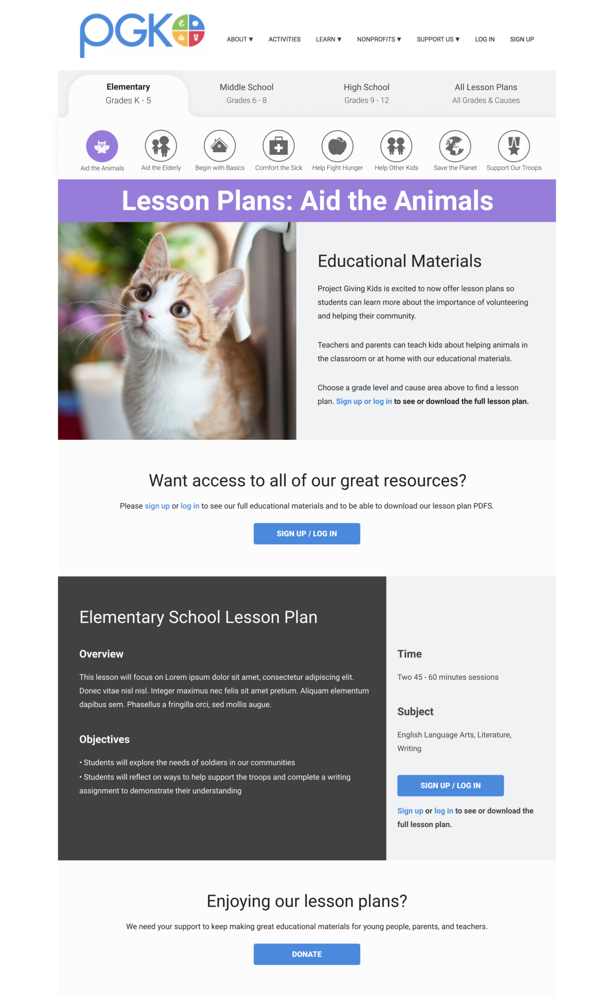
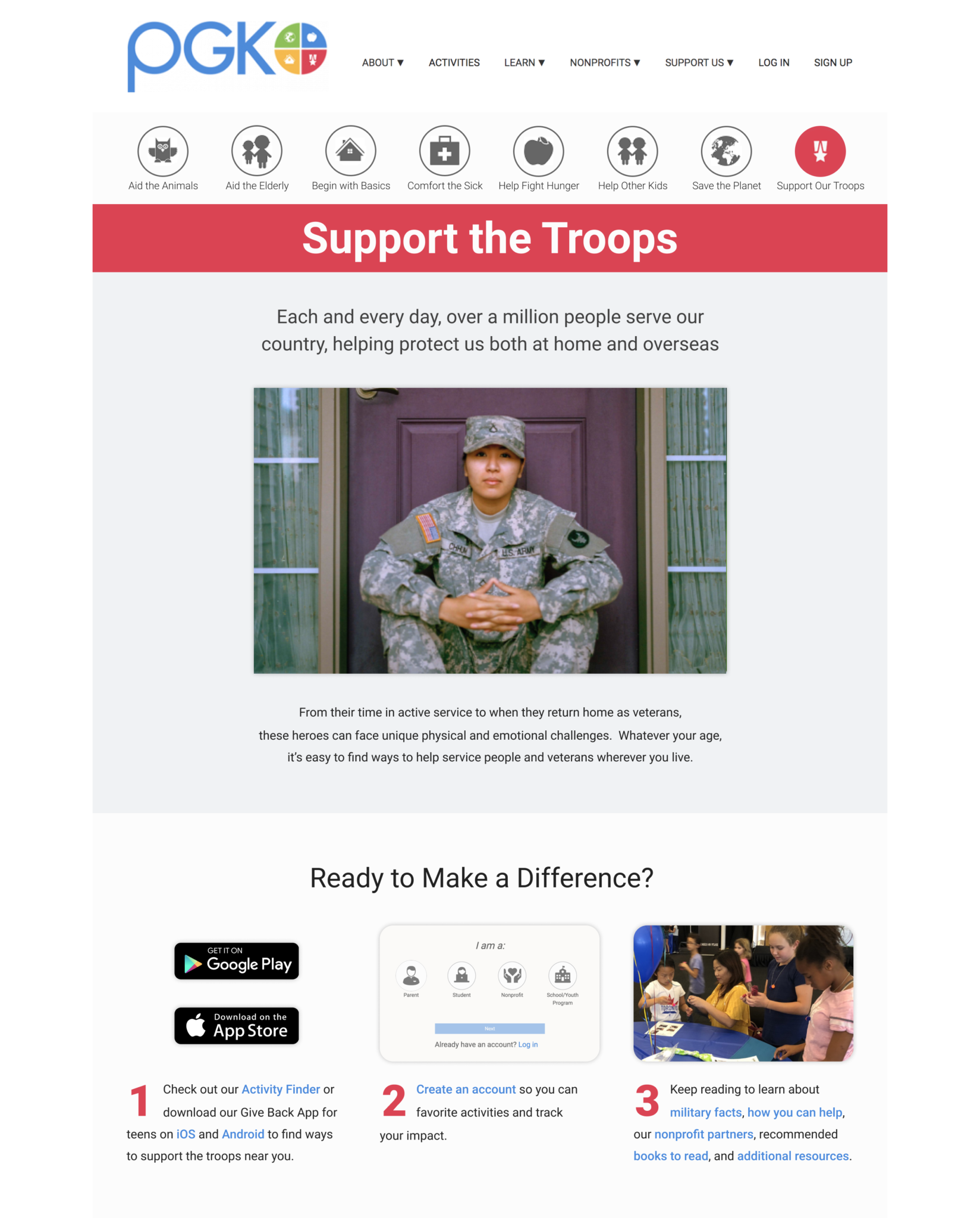
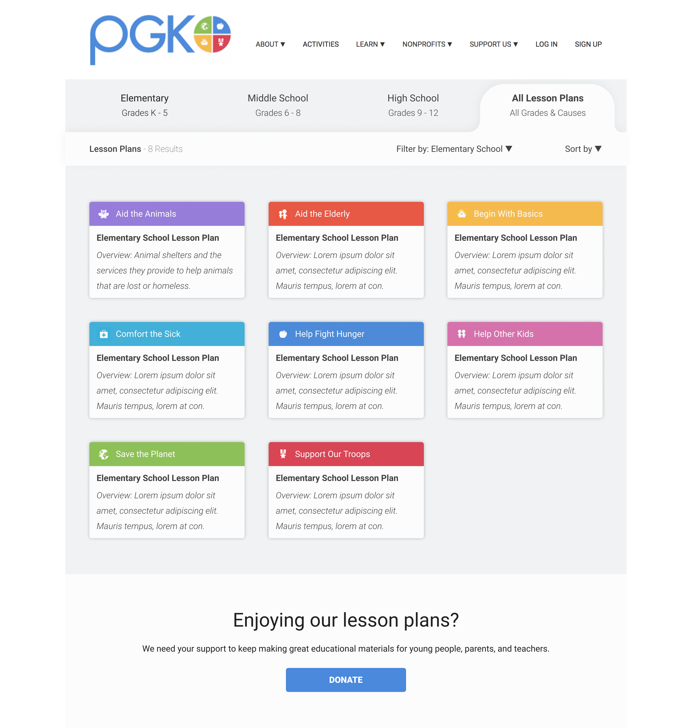
Some of the final high fidelity website screens
Background
Background
Project Giving Kids is a nonprofit with the goal of connecting youth to service projects, cultivating empathy in children, and connecting families to other local nonprofit organizations. They offer interactive tools that help users find volunteer activity ideas and provide information and facts about the cause areas they focus on.
Goals
PGK wants to ensure that youth understand the importance of their service projects and the reasons behind why they volunteer. In addition to offering activity ideas on their website, PGK wanted to offer lesson plans and educational materials for teachers and parents to incorporate their service projects into learning opportunities.
Project Giving Kids' goals for this project were as follows:
- Redesign the Learn pages to highlight the new lesson plans
- Design new pages for the educational materials
- Update the top navigation and sitemap to incorporate the new website features
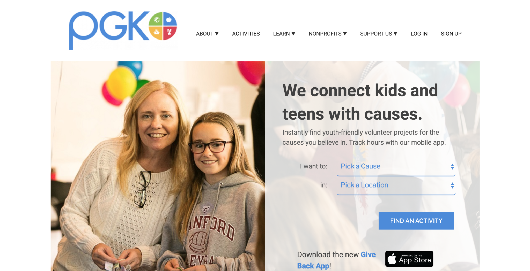
The Project Giving Kids' homepage
Navigation
With the addition of new educational materials and new pages, we needed to reconsider the website’s sitemap and navigation. I worked on updating the sitemap of the website and created a new top navigation bar with the goal of incorporating the new educational materials, adding landing pages to all primary links, and reducing the number of primary navigation links.

The Original Top Navigation: On the original website, the primary navigation links were About, Activities, Learn, Nonprofits, Support Us, Log In, and Sign Up. Some of the primary navigation links had dropdown menus with subpages (shown above with a down arrow next to the link name) and some did not. The primary navigation links that had subpages had no landing pages.
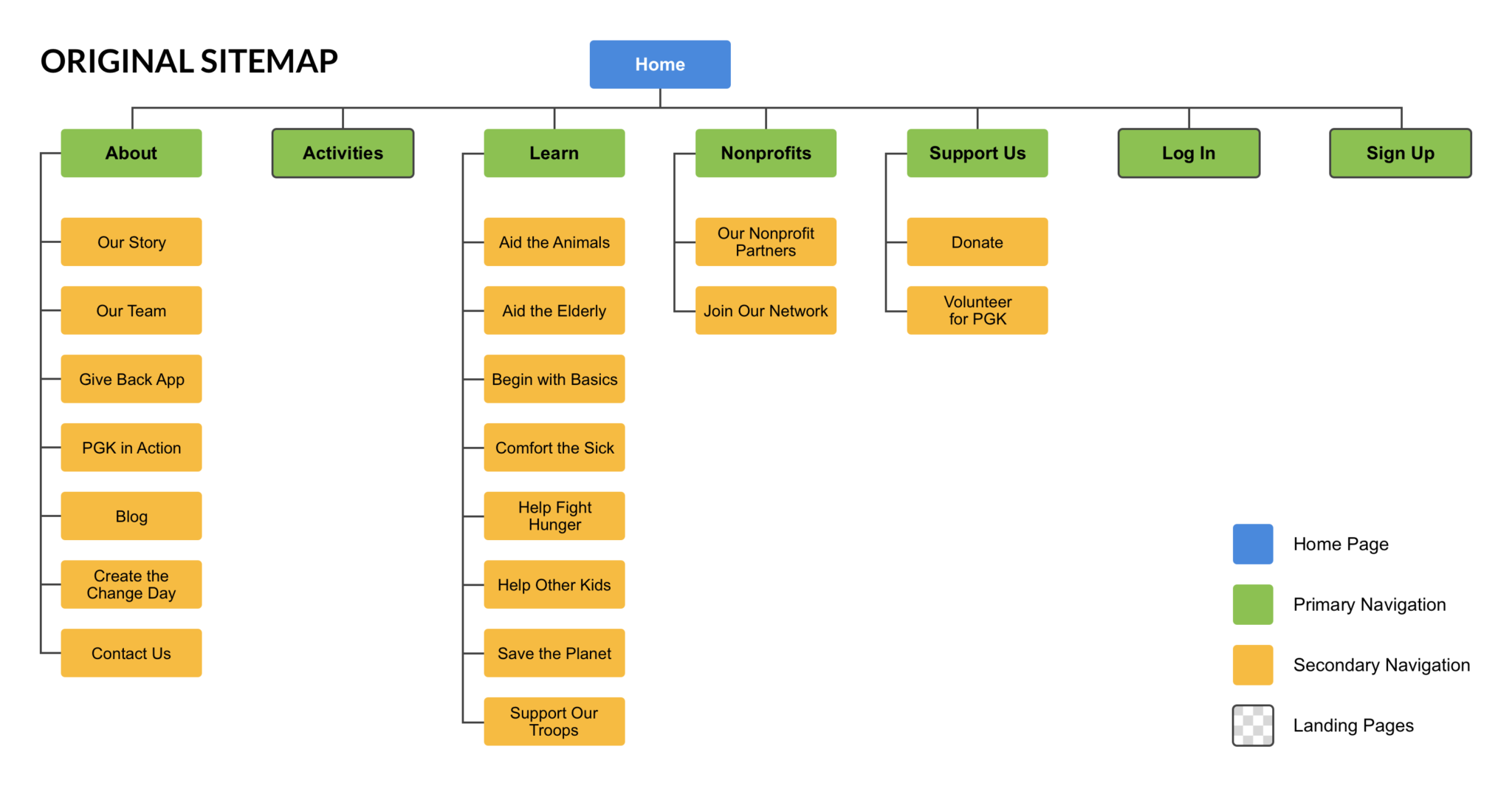
Updating the Sitemap: I researched other nonprofit websites and examined their top navigation bars for ideas on common navigation themes that nonprofit website users would be familiar with. I explored ways to reduce the number of primary links by considering the main sections that the users would need to access, designating these sections as the primary links, and merging the less important sections under these primary links. Since the main purpose of the website is to get users involved in service projects, learn about the cause areas, provide information about their organization, log in or sign up, and donate to PGK, these were selected as the primary links to be shown on the top navigation bar. The remaining webpages were organized under these links in their respective sections, with the most important pages serving as the landing pages of their section.

Design Process
Before I could create high fidelity mockups, I needed to consider the users and their goals, the client goals, PGK branding, and the current visual design of their website. Project Giving Kids has a style guide for printed publications but not for their website, which has its own design style. Since I needed to create UI mockups of an existing website, I studied the PGK website thoroughly to make sure my designs would be consistent with the current visual design.
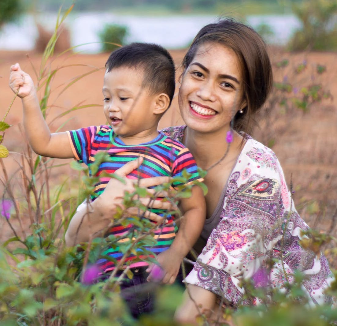

The main users of the PGK website are:
- Mothers with school-aged children who use PGK to find service activities to do with their kids
- Elementary school teachers who use PGK for ideas on service projects to incorporate into their lessons
Their goals are to involve their children/students in service projects that support the local community and help youth develop social empathy.
Learn Pages
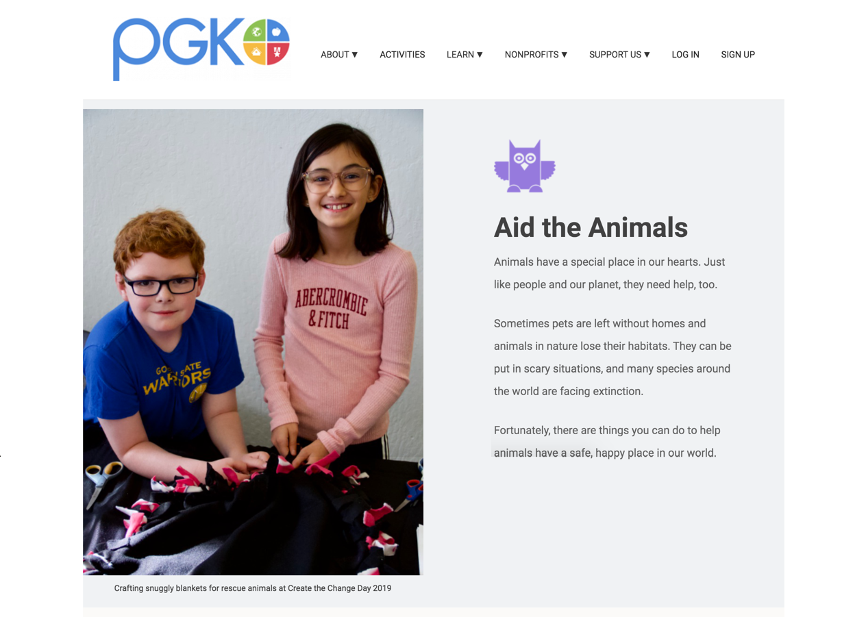
The PGK website already had “Learn” pages, where users could find information and additional resources about their main cause areas. These pages provided facts about the topic, ideas on how the users could help make a difference, activity ideas, nonprofit partners who focus on the cause, suggested books, and external online resources. My role was to update these pages to incorporate the new addition of educational materials and to help guide users to the lesson plan pages.
The original Aid the Animals "Learn" page

The wireframe of the updated "Learn" page

An updated Aid the Animals "Learn" page

ORIGINAL LEARN PAGE SECTIONS
UPDATED LEARN PAGE SECTIONS
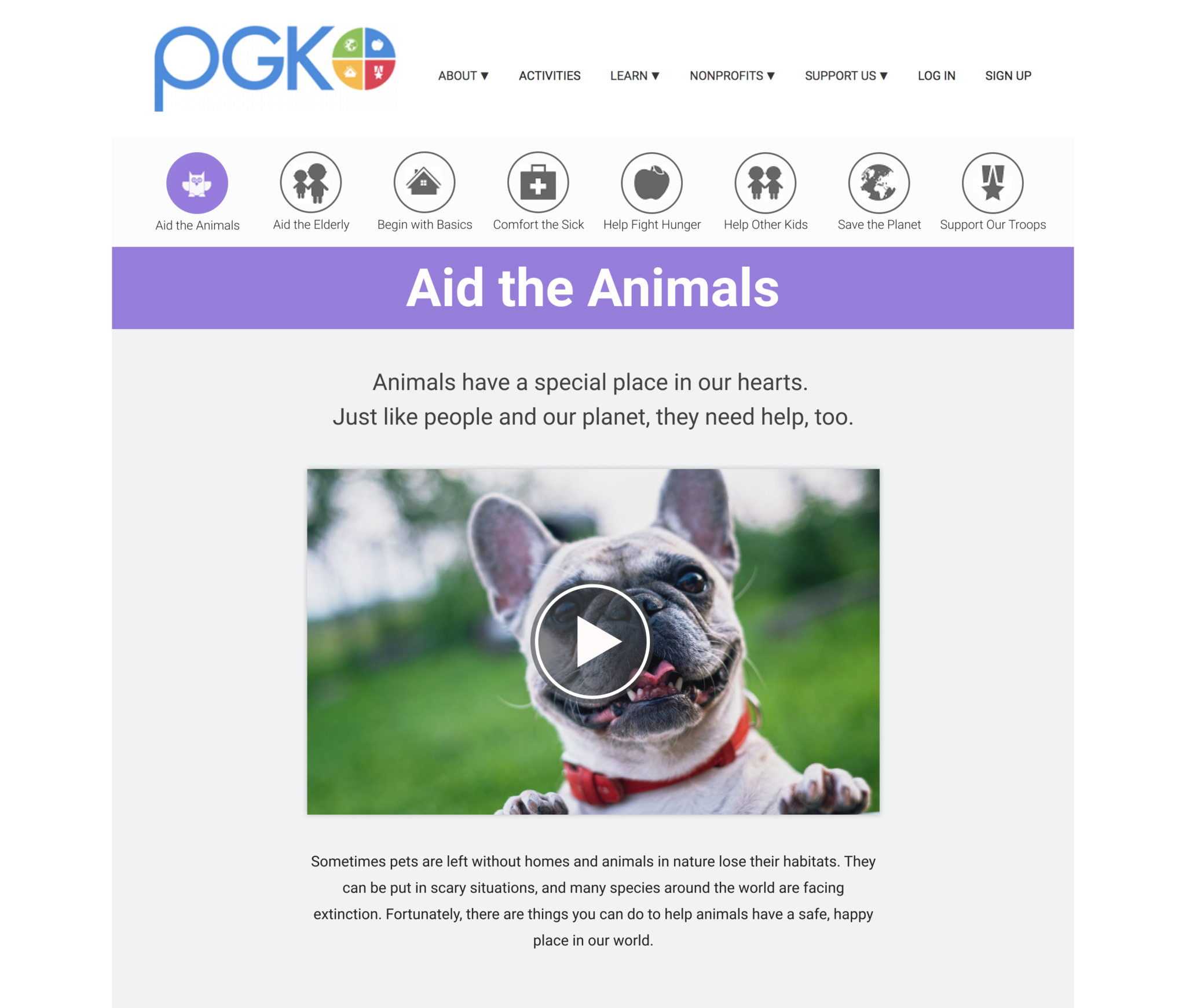
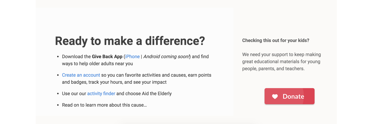
Page Navigation Bar: To help users browse the different cause areas quickly, I added a cause navigation bar below the top navigation bar. Since each cause area has its own color, the color was incorporated into the heading backdrop to distinguish the different cause areas.
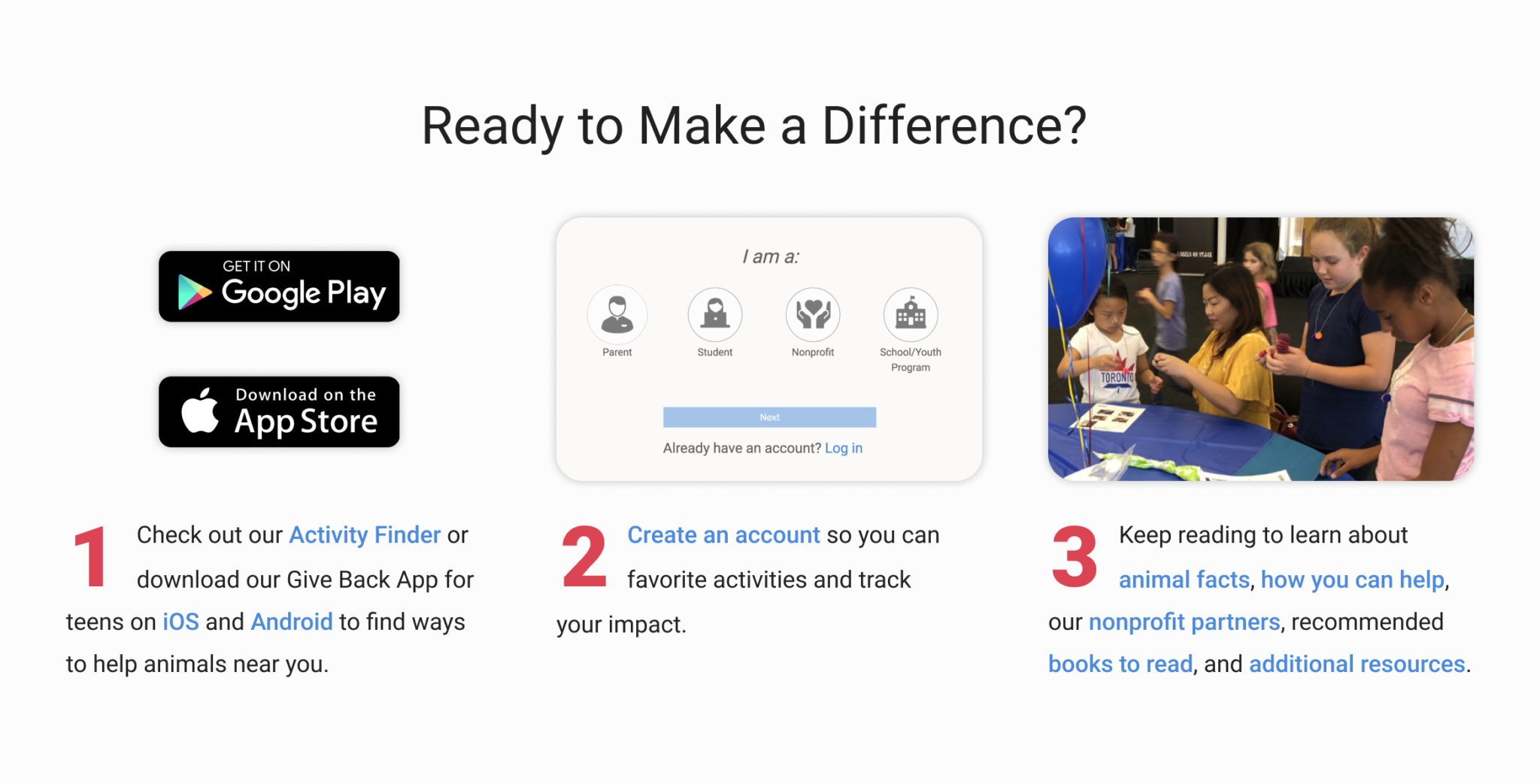
Clear Action Steps: To guide users to the main action steps, the condensed bullet points listing the steps were separated into their own columns and clearly laid out with numbers and visuals.

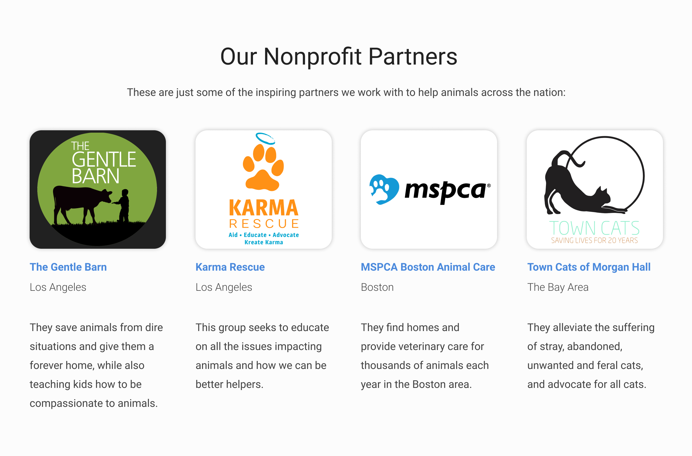
Increased Imagery: The original "Learn" pages were text heavy and light on visuals. In the redesign, photographs and nonprofit logos were included throughout the pages to make the content more engaging.
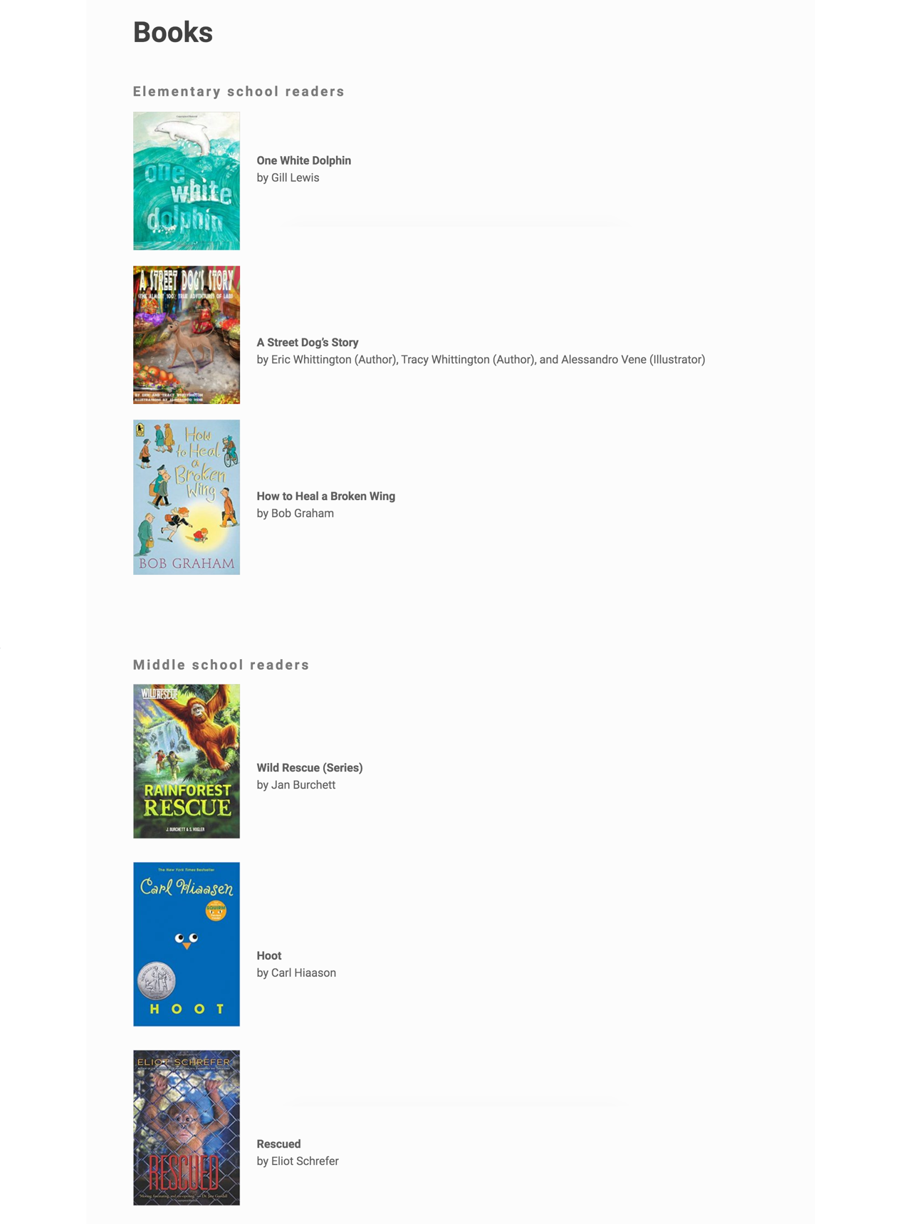
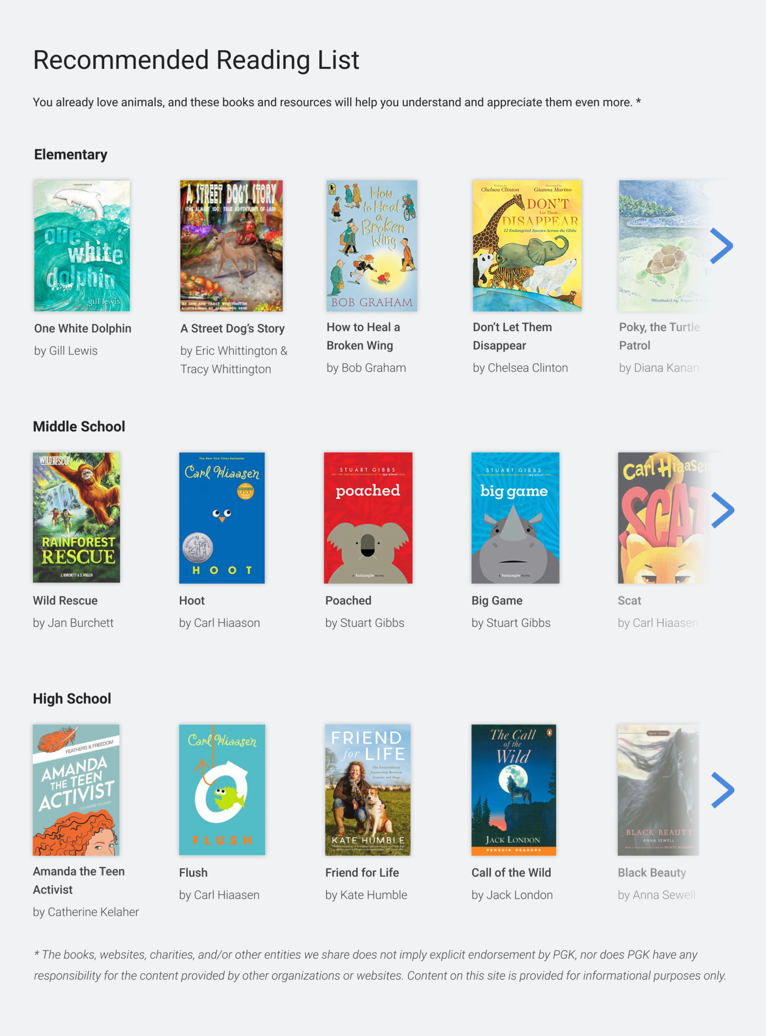
Horizontal Scrolling: To prevent excessive scrolling, I incorporated horizontal lists and clickable arrows in sections that include long lists of information. As PGK features more information and resources this will prevent excessively long webapges.
Lesson Plan Pages
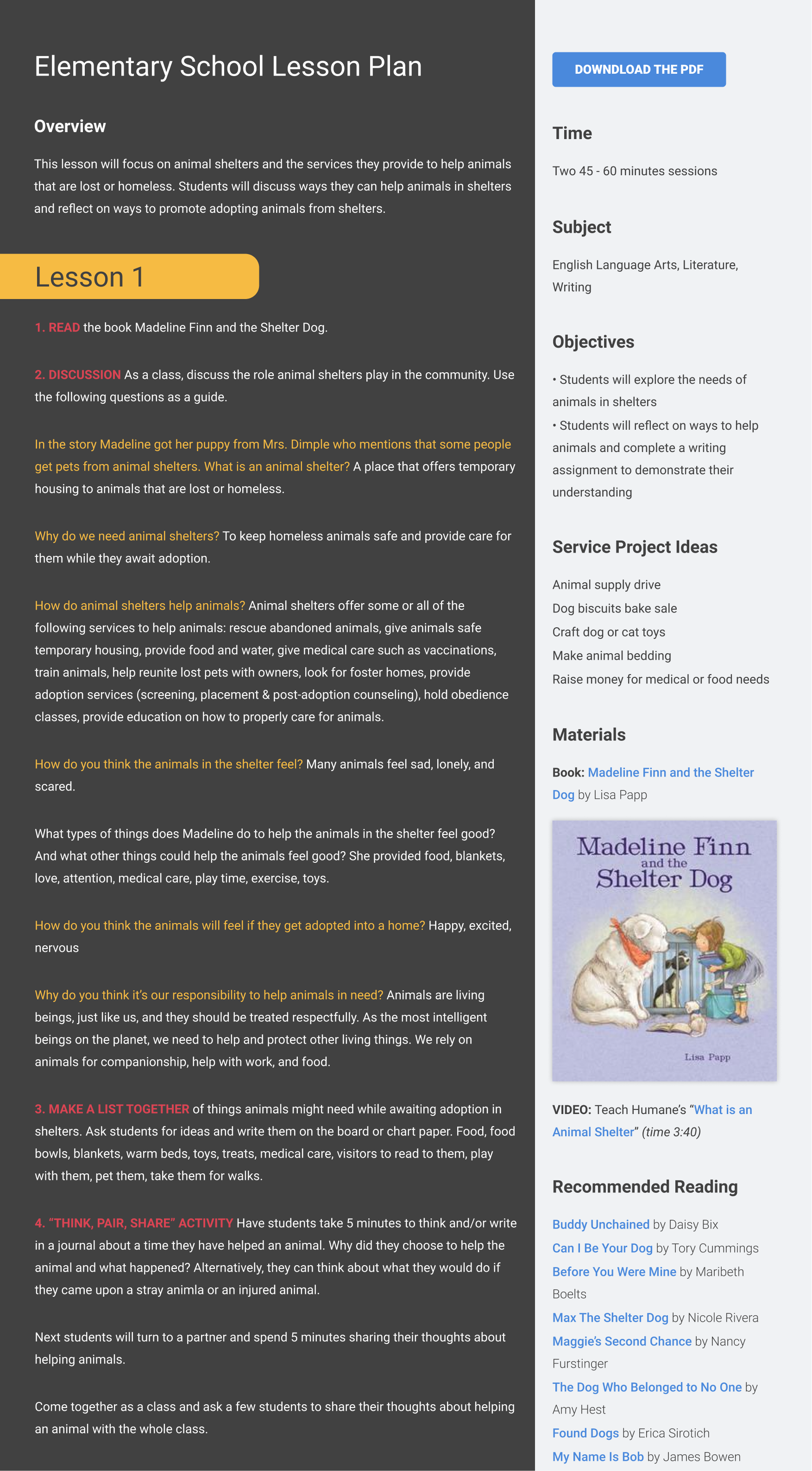
In addition to updated "Learn" pages, Project Givings Kids needed new "Lesson Plan" pages to showcase their new and expanding educational materials. Though they wanted to offer these resources for free, they wanted users to have an account to see the full lesson plans. My role was to help users quickly find a lesson plan and to create two versions of the Lesson Plan pages: the complete, longer version for members and a shortened, preview version for user who aren't signed in.
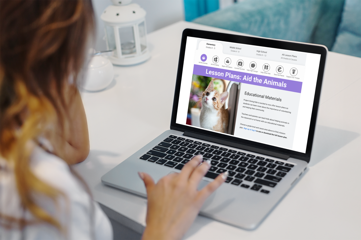
The "Aid the Animals" Lesson Plan Page, viewed by somebody not signed yet
The "Aid the Animals" Lesson Plan Page, viewed by somebody not signed yet
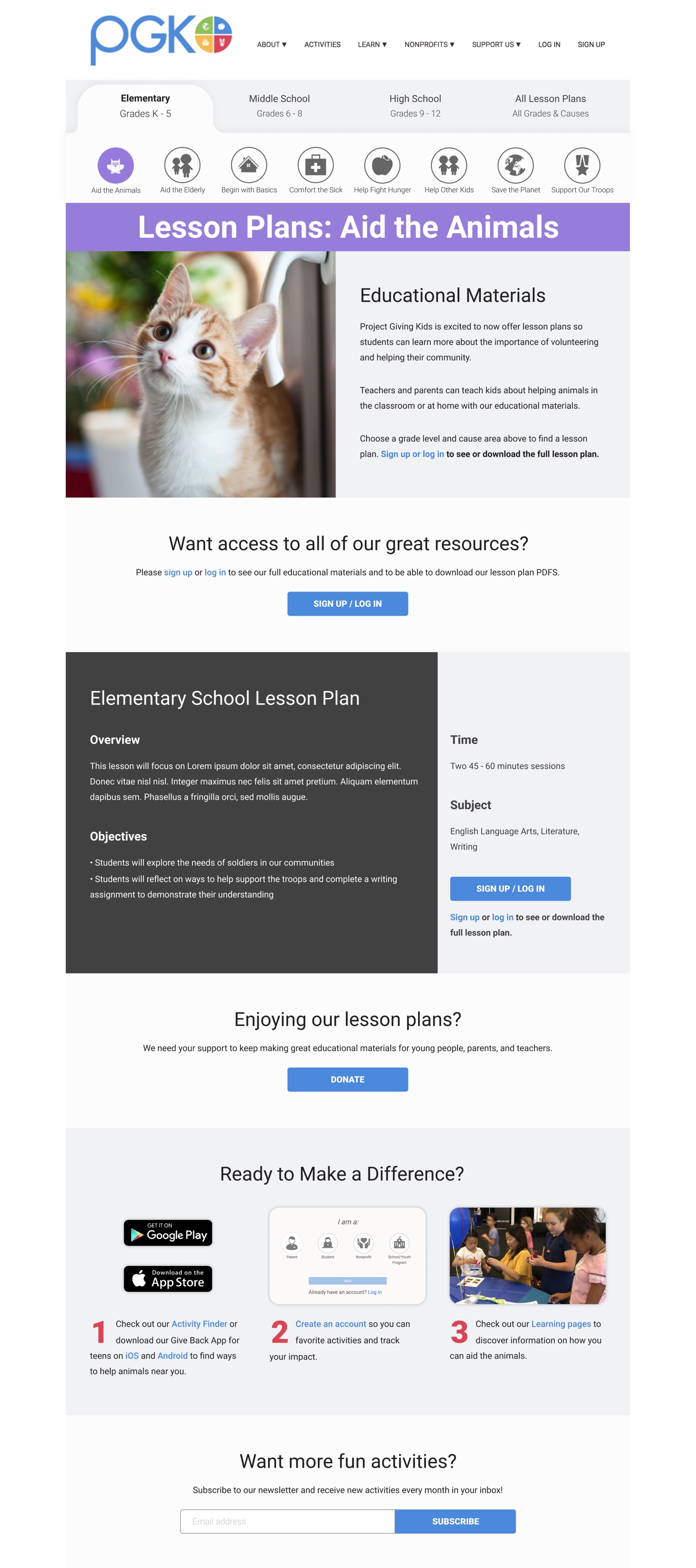
The full "Aid the Animals" Lesson Plan Page, viewed by somebody who is signed in
The full "Aid the Animals" Lesson Plan Page, viewed by somebody who is signed in

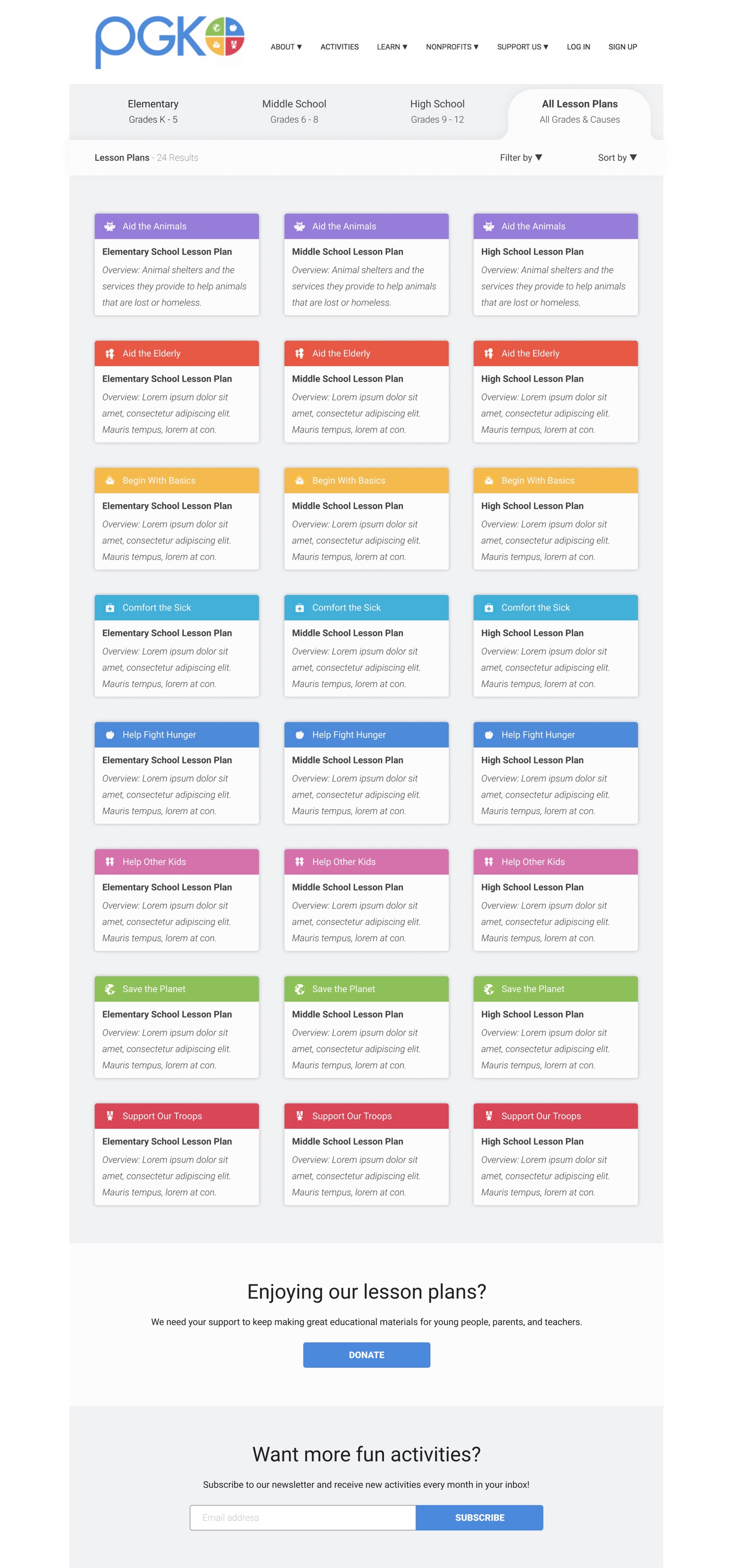
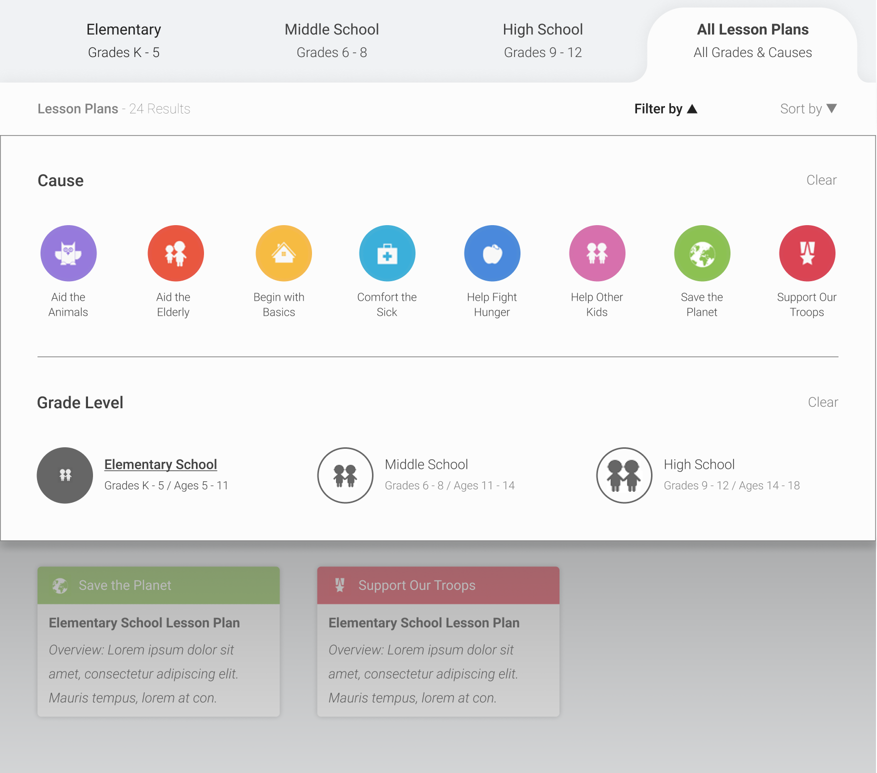
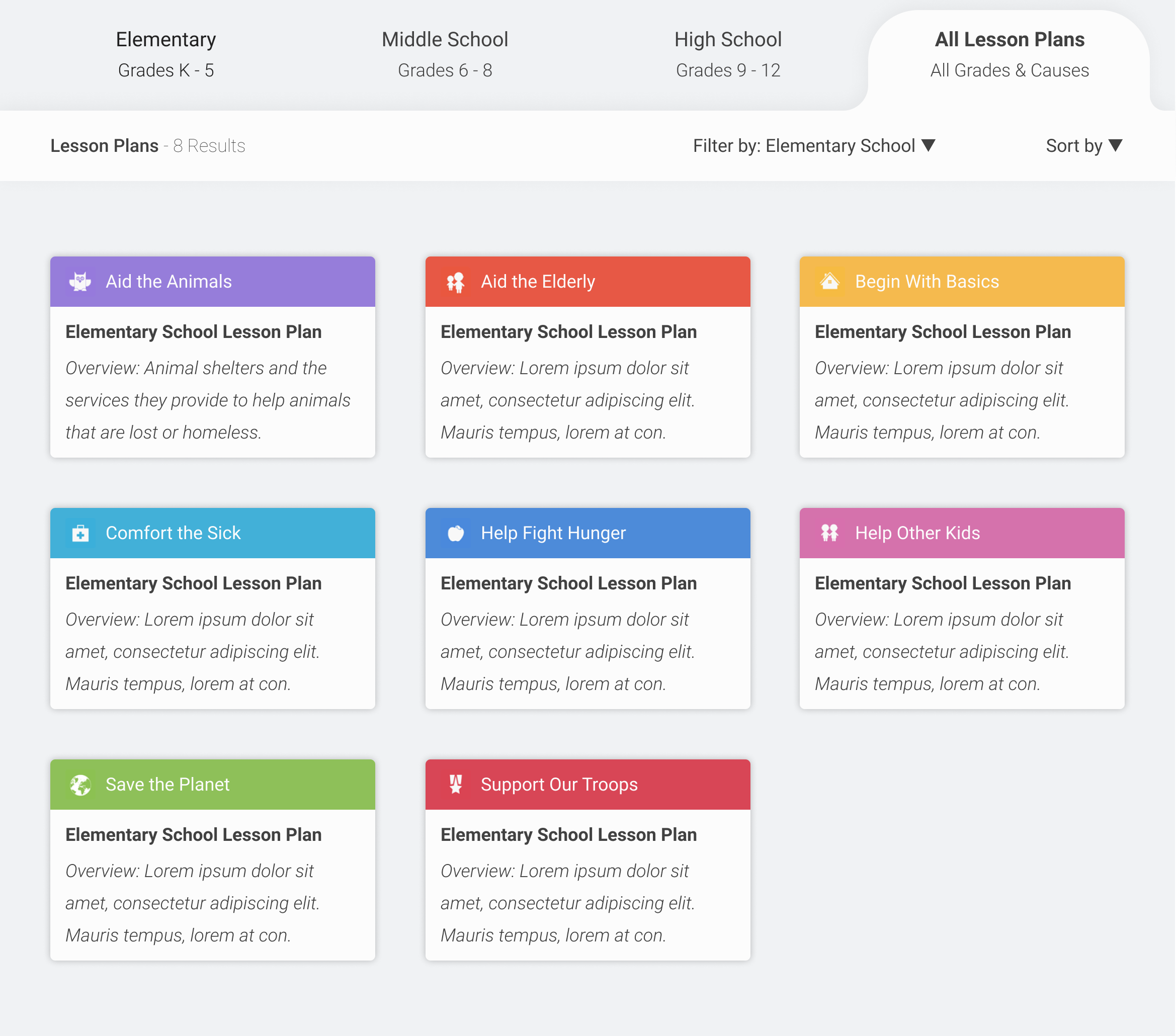
The "View All" lesson plans page which features all available lesson plans
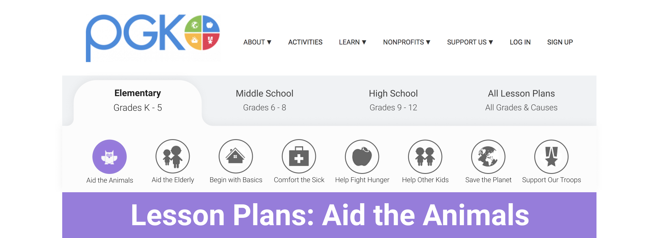
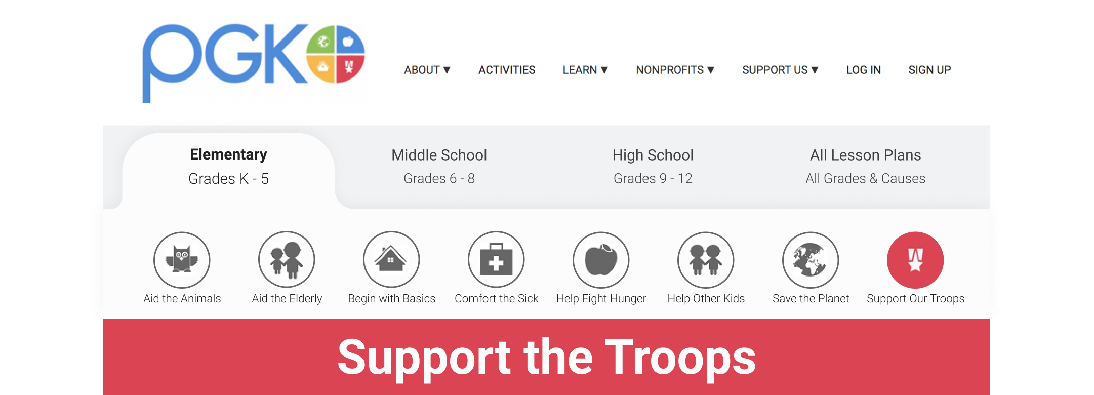
Page Navigation Bar: To help users browse the different grade levels and cause areas quickly, I added a double navigation bar below the top navigation bar. Users can pick the grade level and cause area, or they can click "All Lesson Plans" to see all available educational materials.
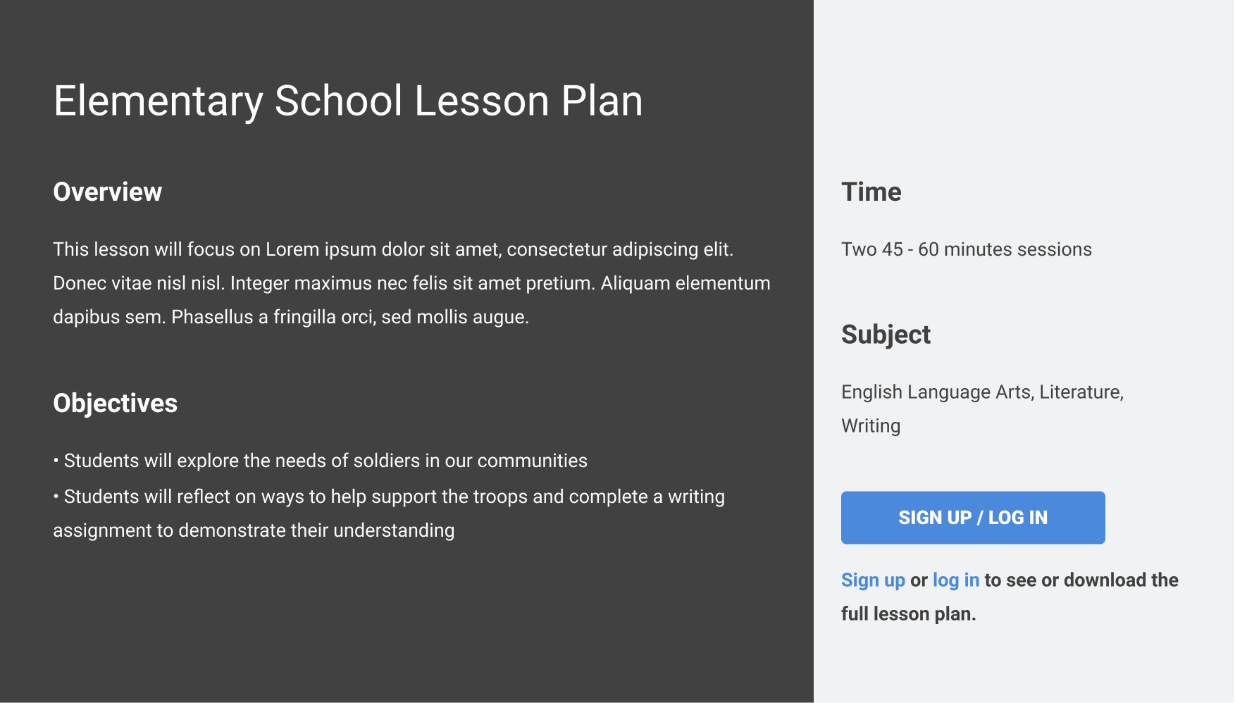
Sign In CTAs: There are numerous sign in/up CTAs throughout the page reminding users that they can see all of the amazing resources if they join PGK or to log in to their accounts.


Content Previews: Since PGK wanted users to sign up for an account or log into an existing account to see the full lesson plan or download PDFs, I created abbreviated lesson plan "previews" where users can read a summary about the lesson plan and its objectives even if they're not signed in, incentivizing them to sign in for more information.
Filters & Sorting: In addition to making a page for all of the lesson plans, I added a dropdown menu that allows users to filter and sort their search preferences. Users can quickly select a cause area and/or grade level and see all available educational materials without having to browse through everything at once.
Challenge & Iteration
The educational materials rollout and redesign coincided with the Covid-19 outbreak. With schools closed and a large number of parents staying at home with their children, PGK wanted to get their educational materials online as soon as possible. I made two temporary "modified" versions that the developers could quickly implement while they developed my full designs in the meantime.
- Version 1: The first option was to temporarily include the lesson plans on the Learn pages and only update these pages until the other pages could be built out. The page navigation bar could be excluded in development for the time being since the original top navigation bar includes all of the Learn areas as secondary links.
- Version 2: The other option was to use the existing Learn page UI and add the educational materials on the page.
Reflection
As a New Englander who used to work in the education and nonprofit fields, I was excited to team up with a Massachusetts-based nonprofit that supports youth development and offers fantastic educational resources that parents or teachers can use for free. Project Giving Kids was a great client to work with, and this project gave me additional experience working within pre-existing design systems and established UI design styles.
Being that this project corresponded with the outbreak of Covid-19, this project was extra special to me because PGK's new UI designs could help parents and teachers who have been forced to deal with the unexpected challenge of teaching students at home and encouraging positive development despite the crisis. I hope these new lesson plans make homeschooling easier and encourage youth to be more involved with their local communities.
Other Design Projects
Albert.ioUX/UI Design

Albert Academy CoursesVisual Design
Dribbble UI WorkUI & Visual Design
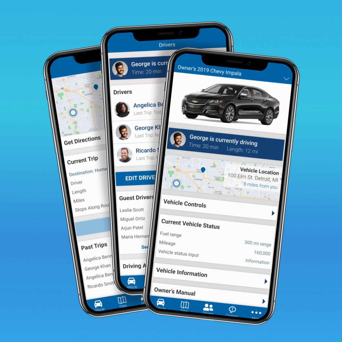
Automotive Design ChallengeUX/UI Design Case Study
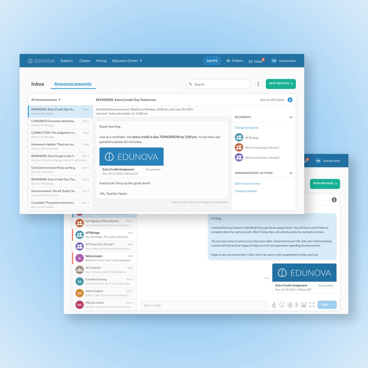
Edtech MessagingUX/UI Design Case Study
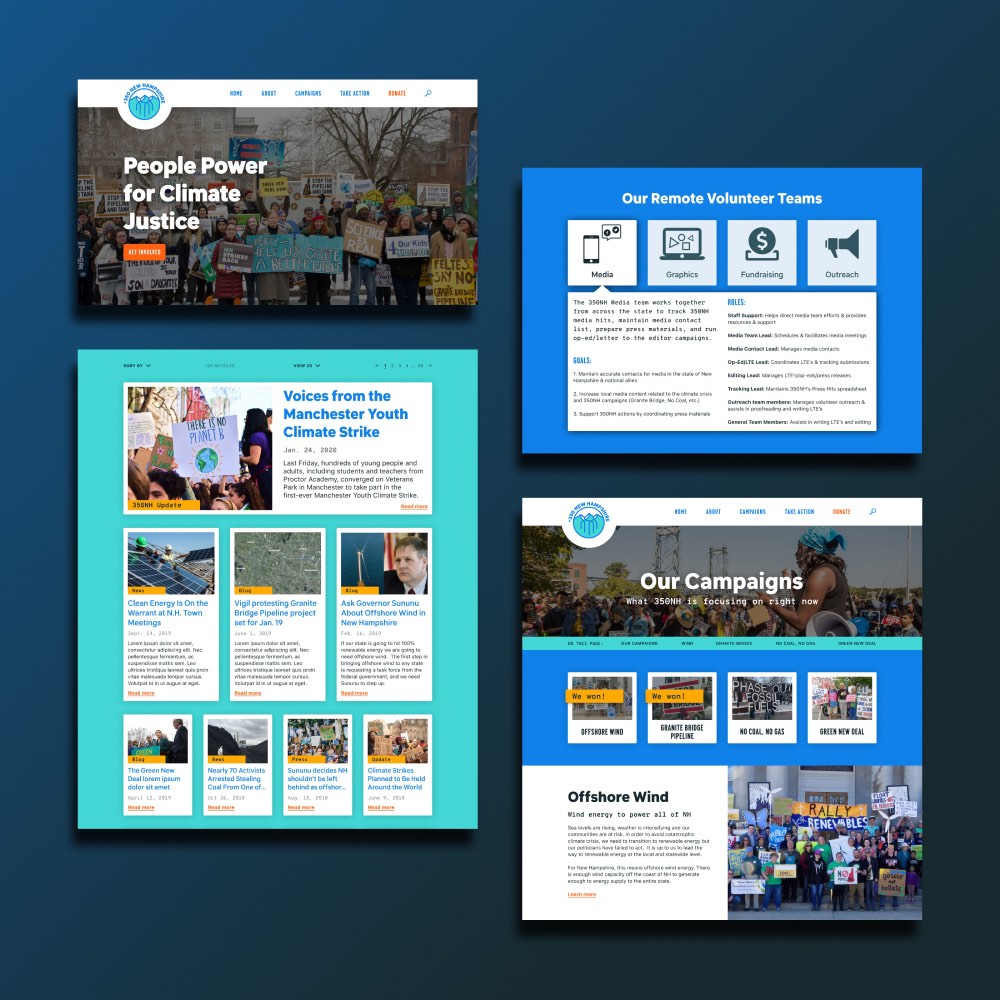
350NHUX/UI Design Case Study

Personal ArtworkArtwork
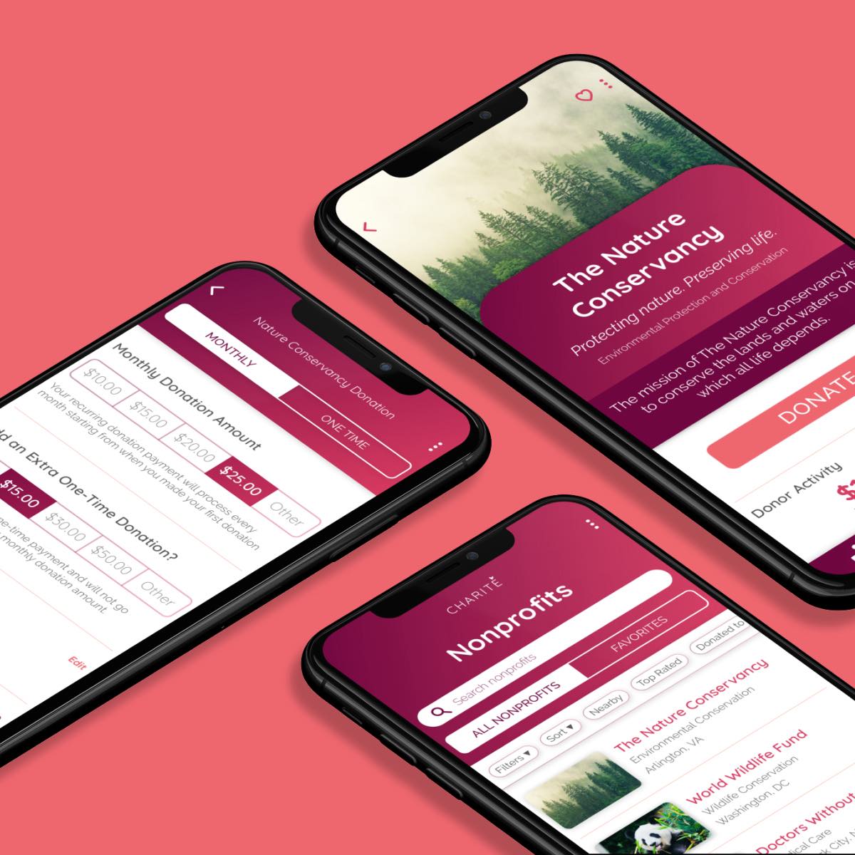
Amazon Raise-Up BuildathonUX/UI Design Case Study
DeveloperWeek 2020 HackathonUX/UI Design Case Study
The Cumin ClubUX/UI Design Case Study
Constellation BrandsBranding & UI Design Case Study