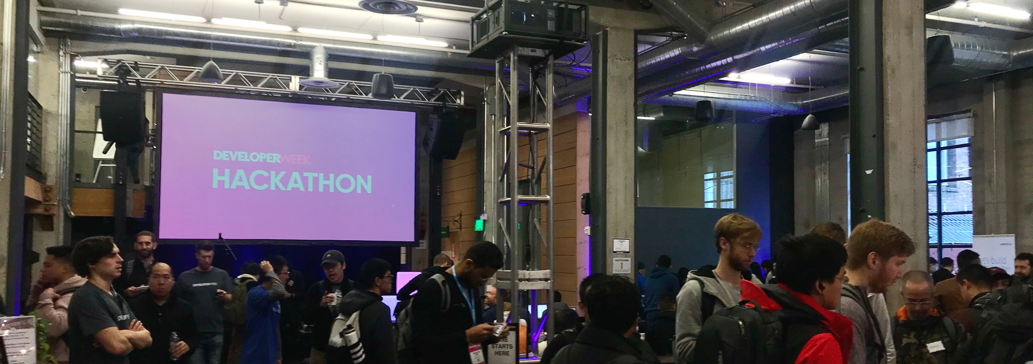
DeveloperWeek Hackathon
Challenge Sponsor: TomTom
Services: UX Design, UI Design, Interaction Design
Deliverables: Ideation, user flows, storyboards, wireframes, mockups, prototypes
Team: One UX/UI designer; one front end developer; one software engineer
Timeframe: 24 Hours, February 15 - 16, 2020
SUMMARY
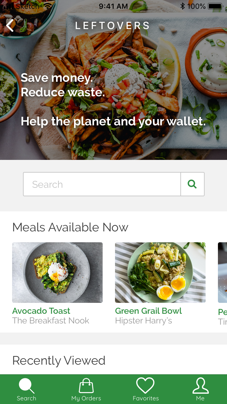
I participated in the DeveloperWeek 2020 Hackathon. With my team I created a product that connects eco-conscious consumers with discounted “leftovers” at restaurants, generating additional revenue for restaurants while reducing food waste and also providing affordable meals for customers.
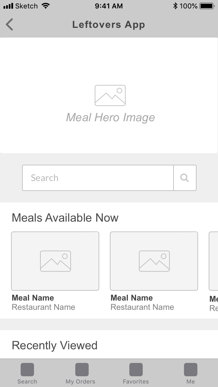
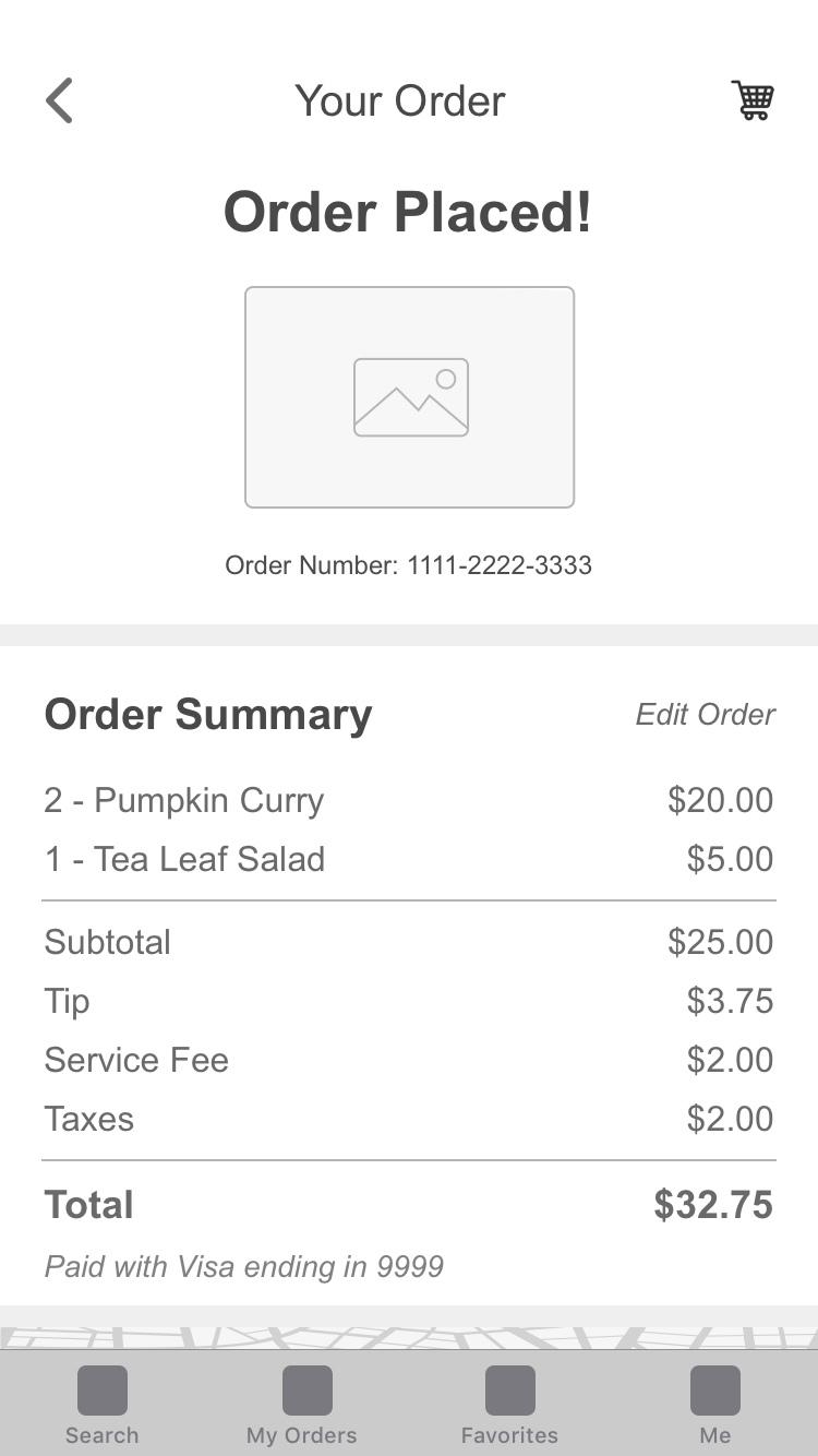
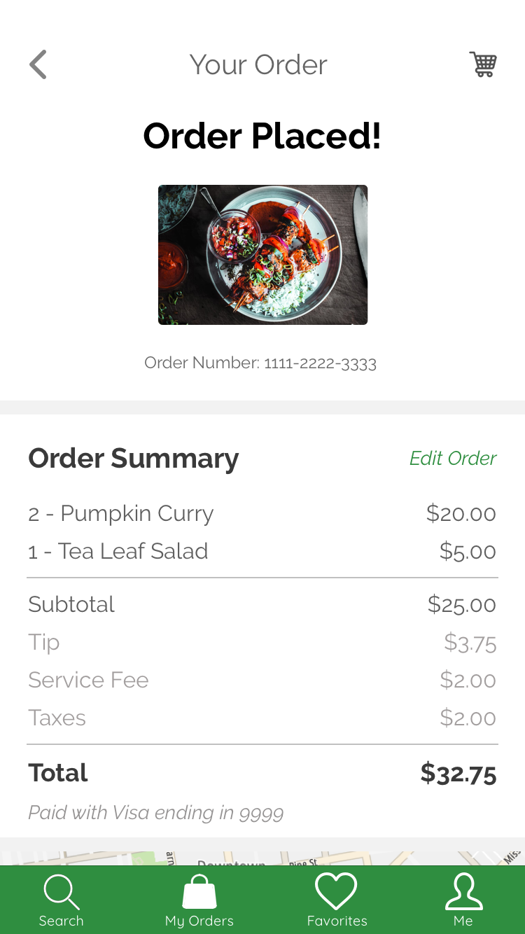
Wireframes showcasing a customer ordering a meal
Background
Prior to my first Hackathon I had assumed that Hackathons were only for developers. As a designer, I didn’t think I could contribute to a Hackathon project without extensive coding experience and therefore I had never been to one. After reading some great articles written by designers about their Hackathon experiences I realized that designers are essential for Hackathon teams, and some of the most successful projects featured great product design. Hackathons seemed like a great way to spend a weekend practicing UX/UI product design skills in a fast paced, fun environment while also gaining engineer collaboration experience, so I decided to try one out! I registered for the DeveloperWeek 2020 Hackathon and went to my very first Hackathon the weekend of February 15, 2020.
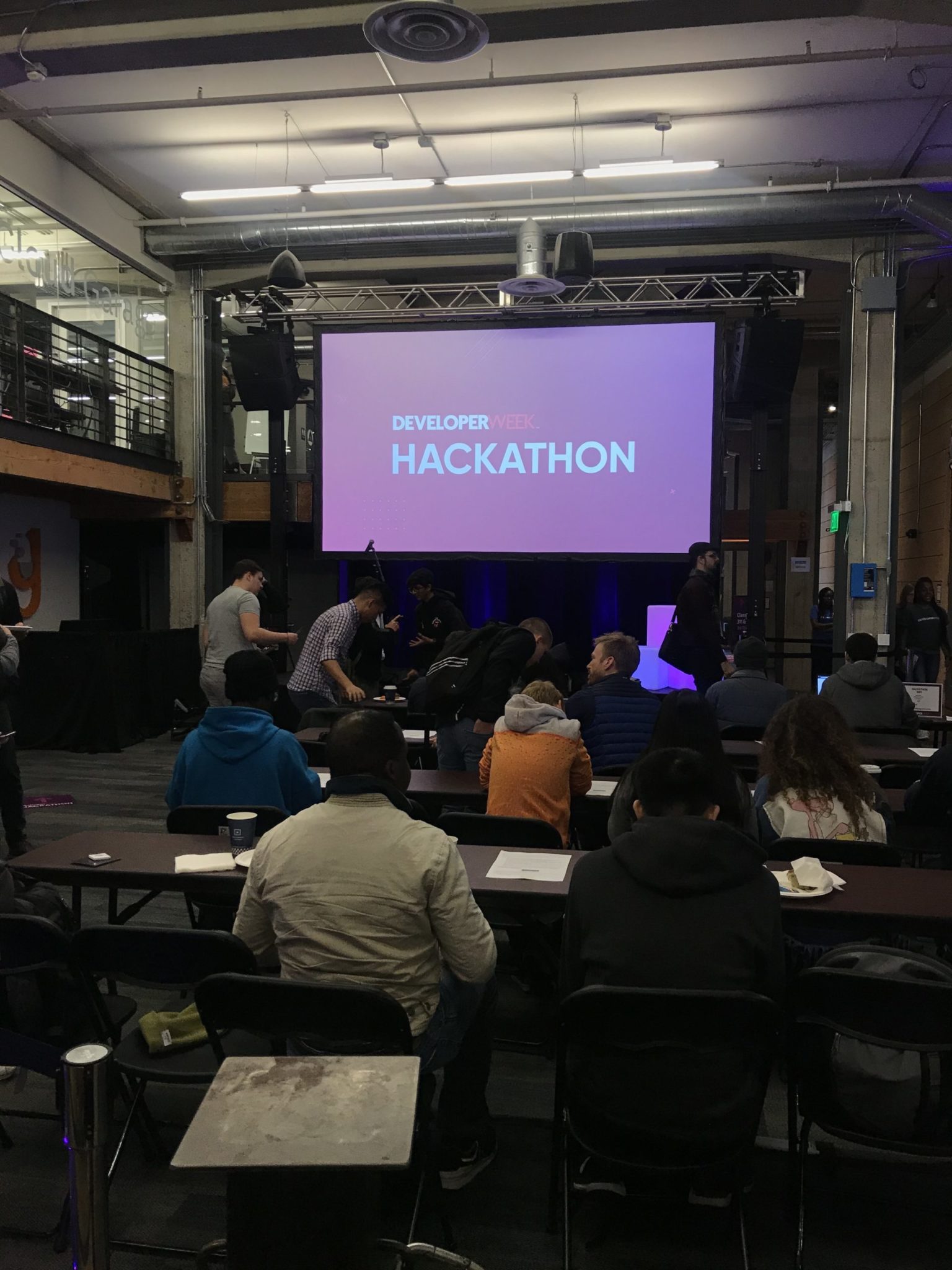
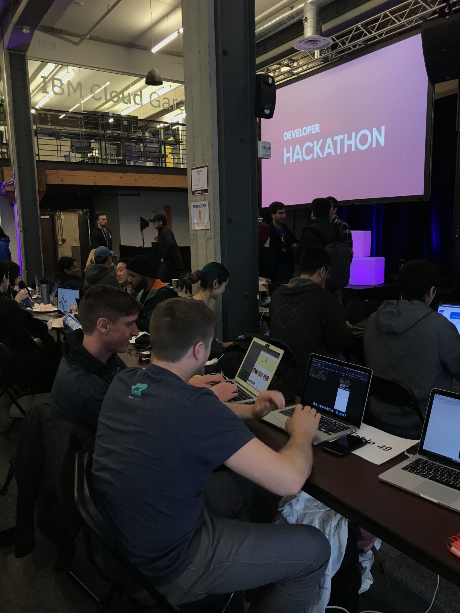
The DeveloperWeek 2020 Hackathon
The Challenge
My team and I decided to work on the TomTom challenge, which dealt with food waste and the subsequent negative environmental impact. TomTom is a location and navigational technology company with a focus on mapping software for cars (with clients including Apple and Uber). The TomTom challenge was to use their API portfolio in an app that helps eliminate food waste. Besides using their technology, TomTom would also consider business relevance, the pitch, and future considerations in their judging.

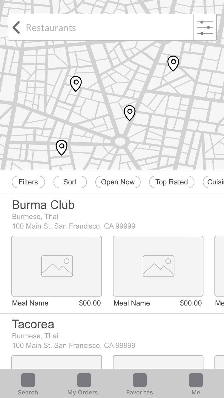
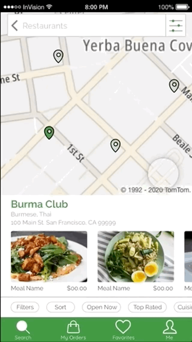
A map of San Francisco using TomTom technology
Screens of the original Ambassador App, which primarily showed a map listing nearby accounts
Problem
The TomTom challenge focused on the problem of food waste. About a third of food produced is wasted, and in the US alone about 133 billion pounds is wasted (source: USDA.gov), wasting $161 billion. Not only does this deprive food to those who need or want it, but it also has a negative environmental impact in terms of production, transportation, processing, storage, preparation, and trash disposal. The number of environmentally conscious consumers in the country is growing, and many people want to make eco-friendly decisions when it comes to their eating habits. For our product we would need to create an app that would reduce or eliminate this issue.
Goal
Our goal was to build an app that helps reduce food waste, but we also needed a business incentive of the app and the promise of profitability. Reducing food waste is better for the planet (an environmental benefit), but it can also help reduce trash disposal costs and overall food costs (a financial benefit). We decided that we wanted to make an app that would connect leftover restaurant food with customers. Going through a product design exercise thought process, I brainstormed and ideated about the user, the context, and needs, and finally the solution (the final product).
The User
There are two main users of the app: the customer and the restaurant worker. The customer would be an eco-conscious and budget conscious consumer, primarily in their 20’s - 30’s and most likely in an urban area. Their motivation to use the app would be the desire to have a good meal at a discounted price and a reduced ecological footprint. The trigger to use the app would be hunger or social plans (such as a group dinner at their home).
The restaurant worker would be in their 20’s - 40’s in an urban area who would use the app while in a busy work environment as part of their job. Their motivation for using the app would be to make more money without a large financial investment, to save money by reducing trash costs, good PR for the restaurant by being more sustainable, and attracting new customers through discounts. The trigger for using the app would be a surplus of food at the restaurant or an alert about an order.

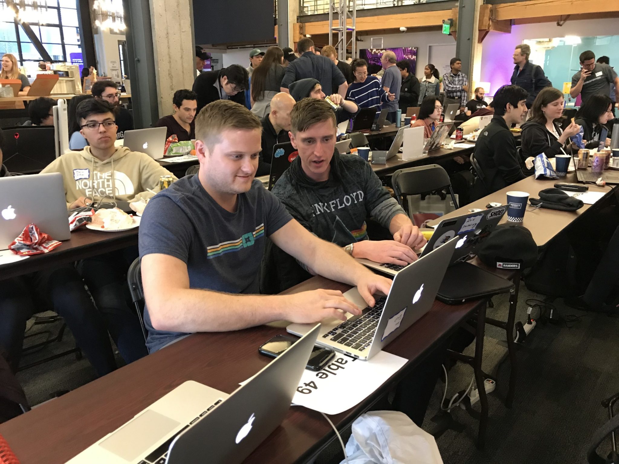
Only Hackathon teams that lolz together are the most successful
Ideation
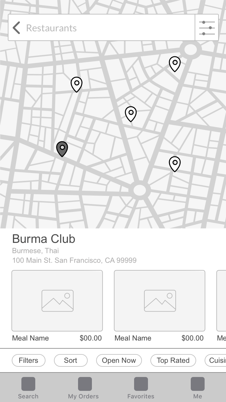
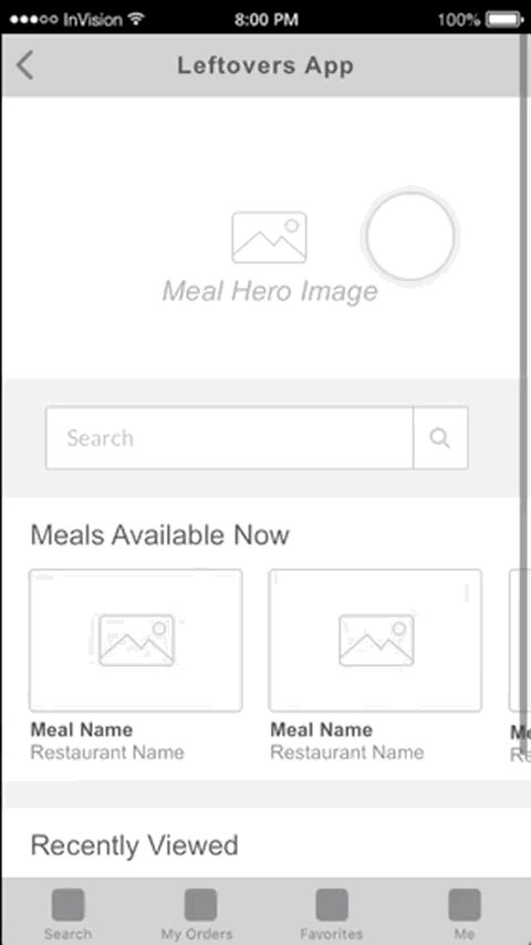
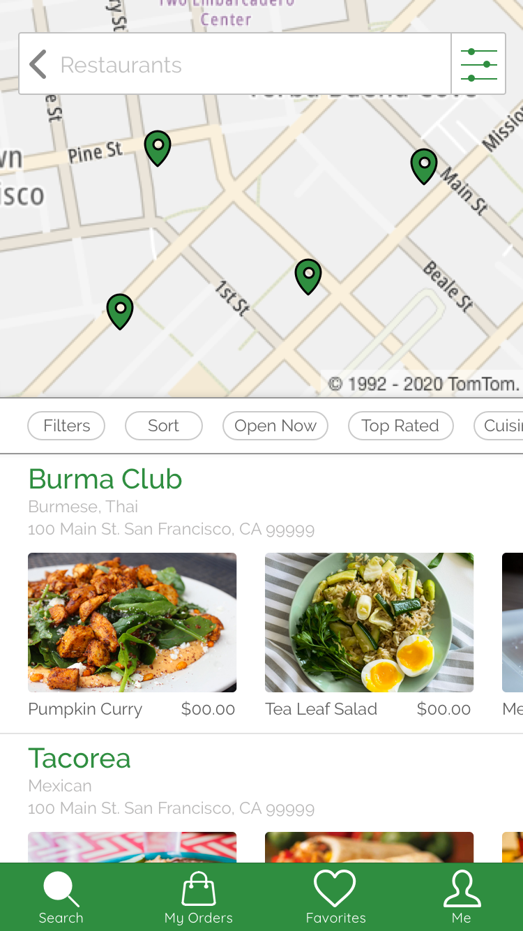
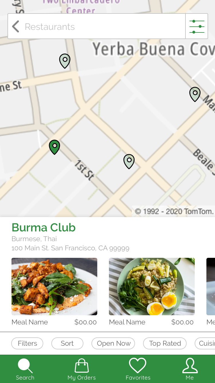
By considering the problem as well as our user, their needs, and their motivations, we could come up with ideas and solutions to incorporate into the food reduction app. The leftovers app will connect customers with reduced-cost leftovers. The customer should be able to browse the app (like Yelp or Google) and see a map and list of nearby restaurants and available leftover meals, and they should be able to buy available meals (like Uber Eats or GrubHub). They should have enough information about the restaurant and the meals to know what to expect and to feel comfortable making their order, and they should be able to use the TomTom location technology to find the restaurant for the meal pickup.
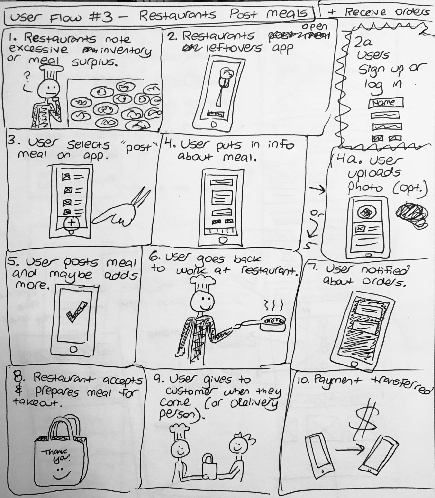
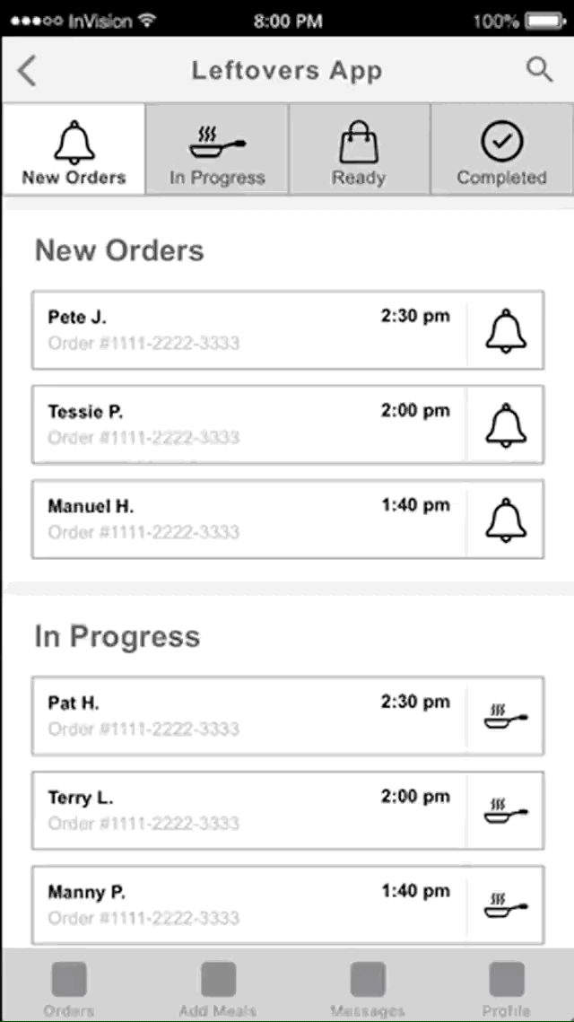
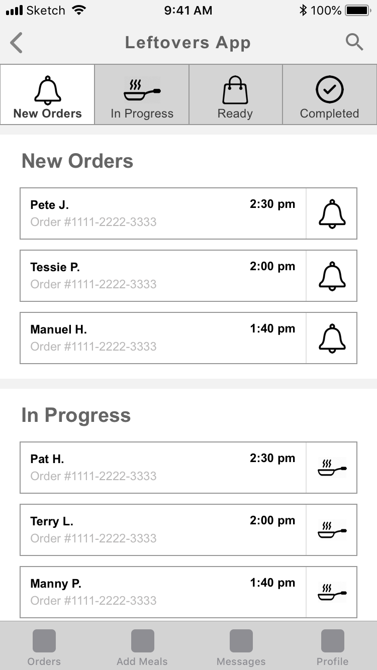
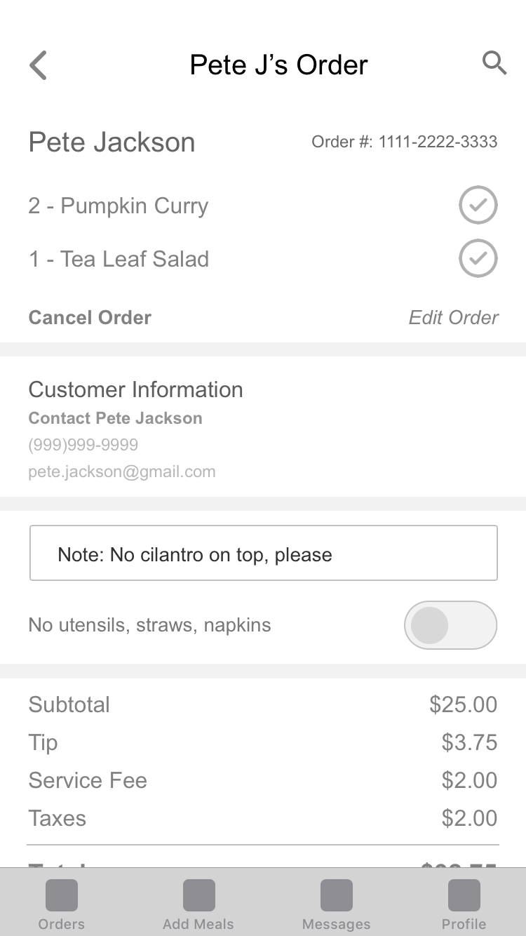
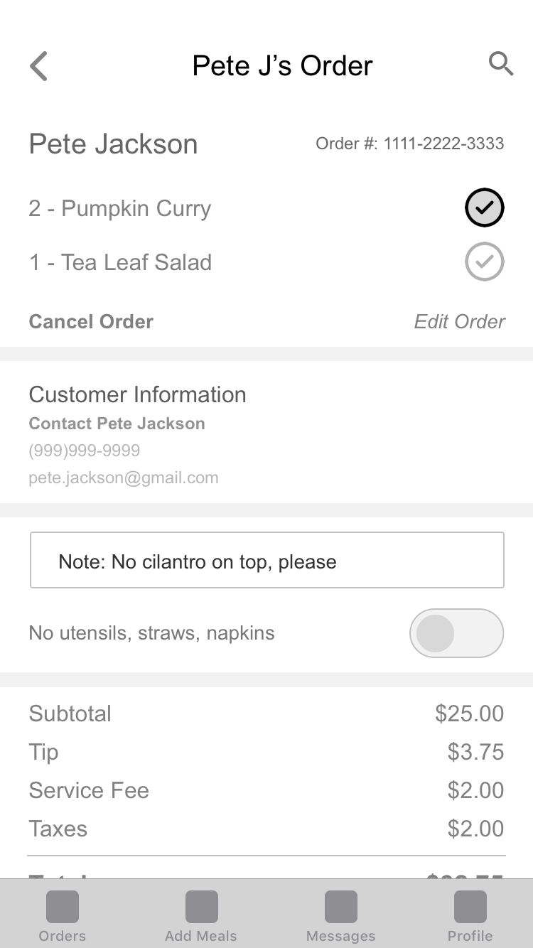
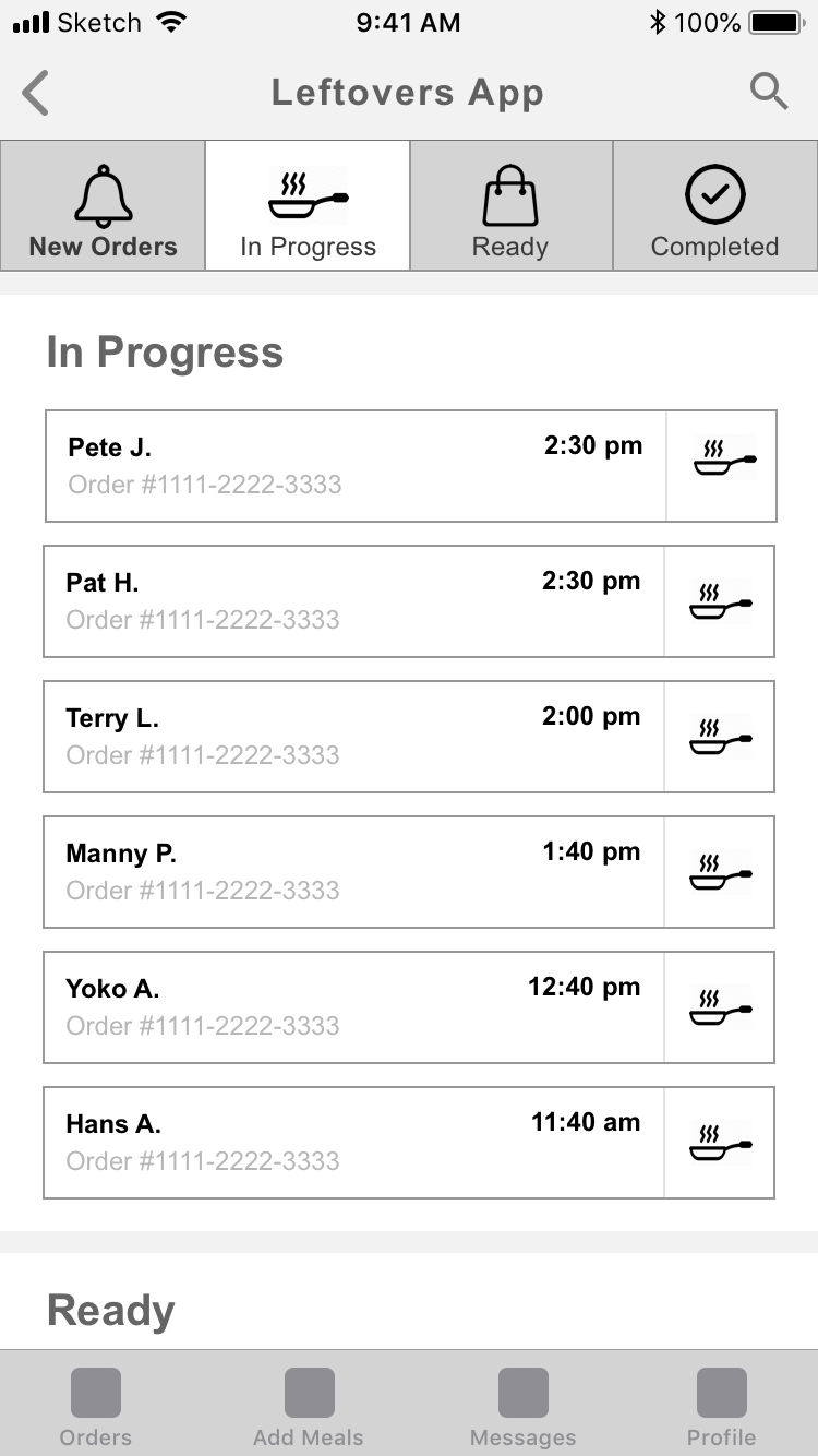
For the restaurant worker, they should be able to use the app to check all orders (new, in progress, ready, and completed) as well as post available meals to their restaurant page. They should be able to access order information and post new information, and they should be able to contact the customer if need be.
Considering our competitive analysis takeaways and our client’s goals, we created design principles to serve as the guiding force in our design decisions:
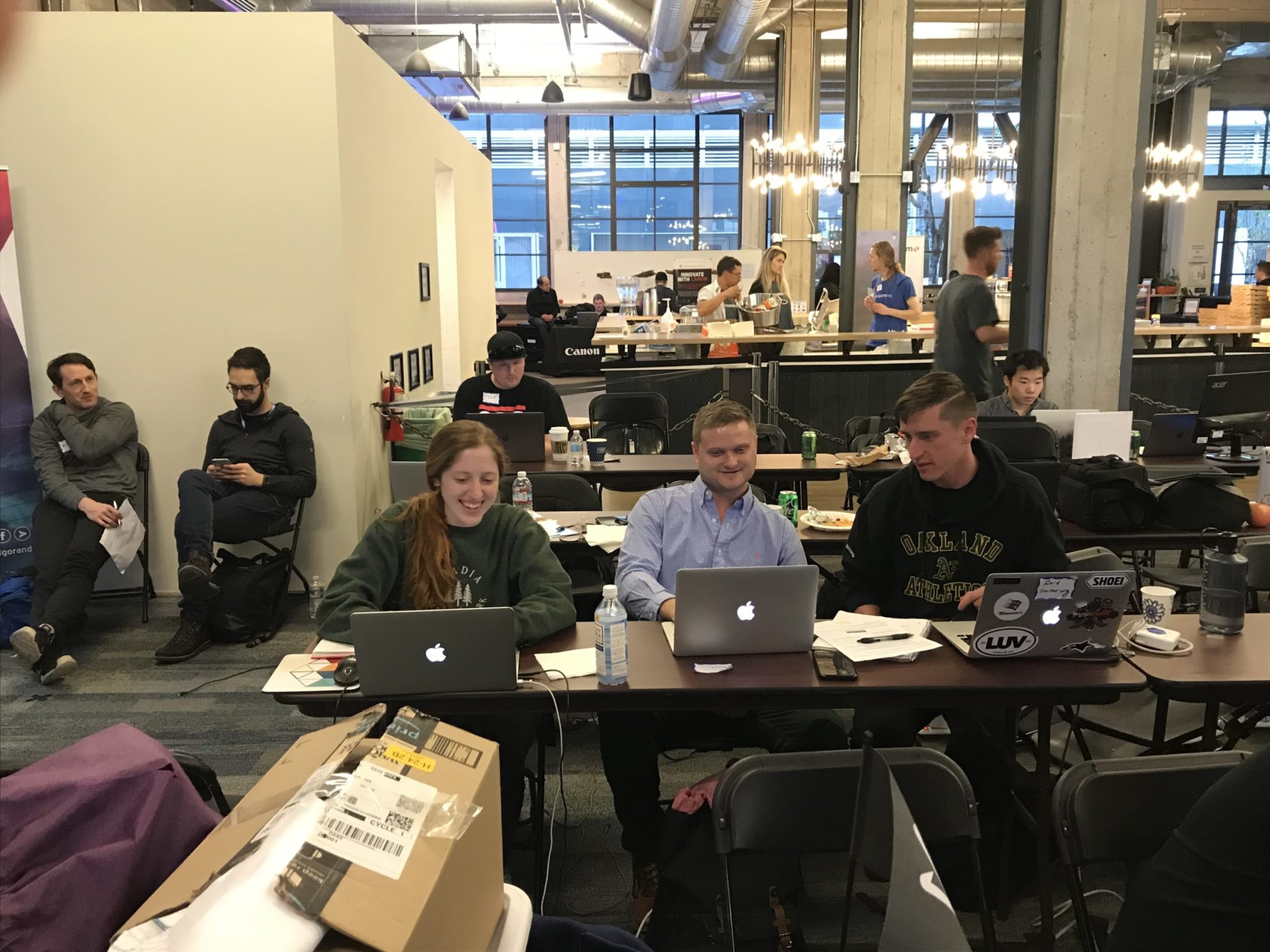
The "Leftovers" team in action
Storyboarding
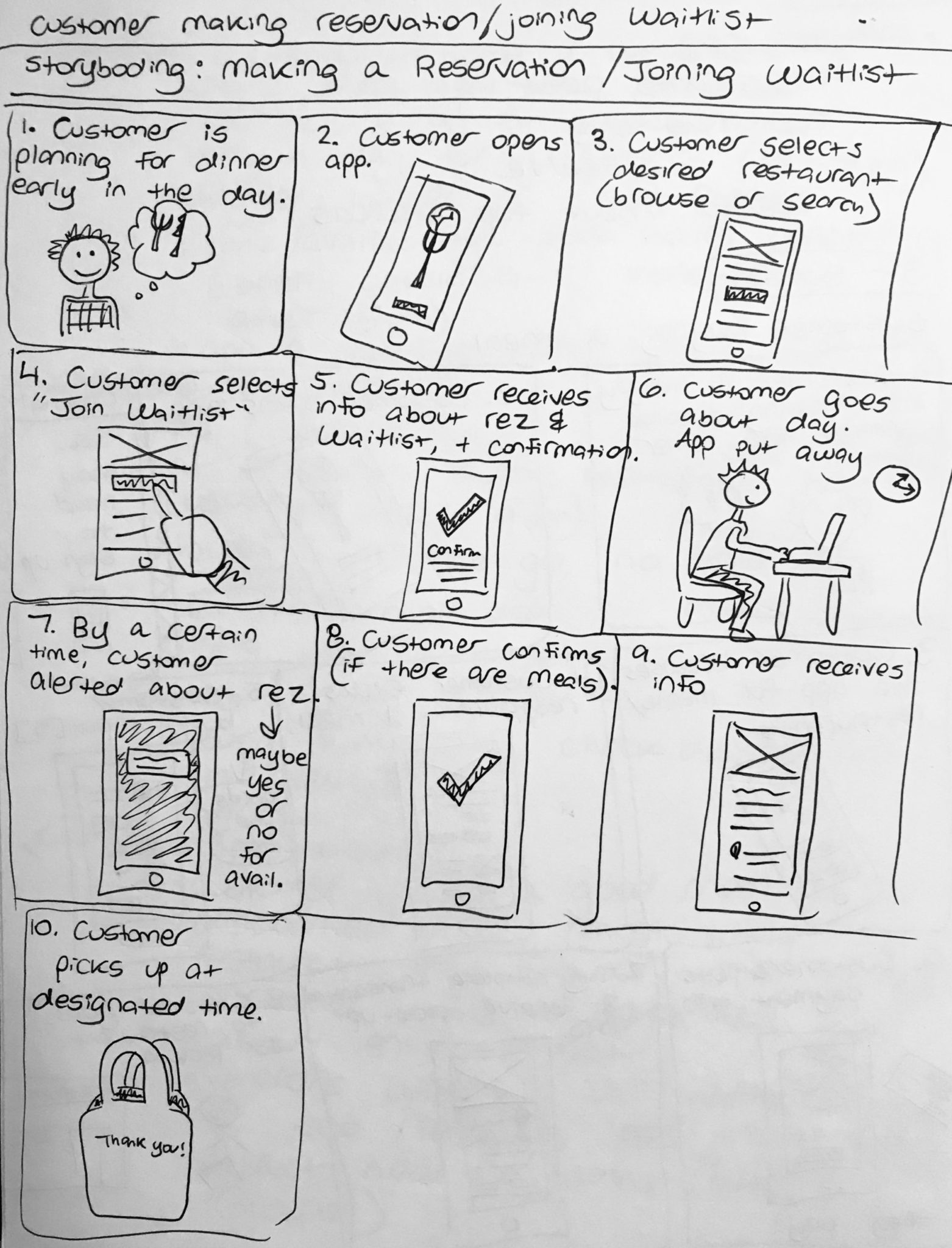
Before sketching our wireframes and exploring the user flows, I sketched out storyboards of the main app interactions for the customer placing an order, the customer joining a restaurant waitlist, and the restaurant posting a meal as well as and preparing orders.
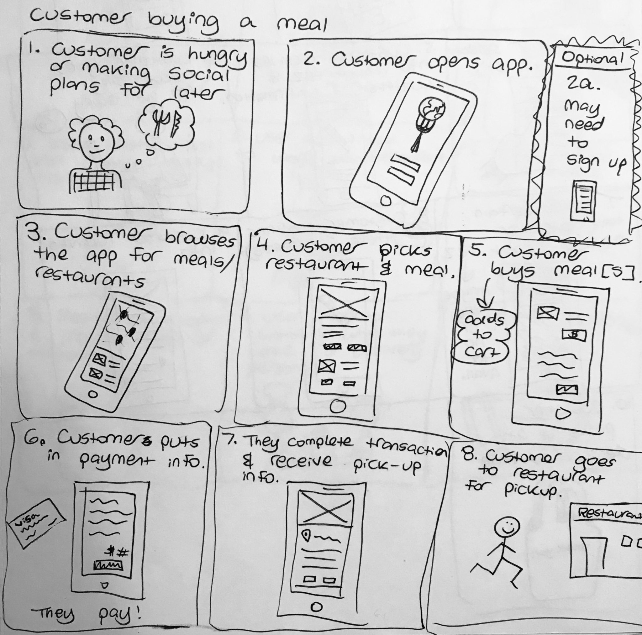
By sketching out storyboards I explored the interaction and user flows before, during, and after using the app.
Interaction Design
Through storyboarding I was able to consider the user interactions, and I was able to explore the main user flows. Based on these user flows I made two main wireframe sets and wireframe prototypes:
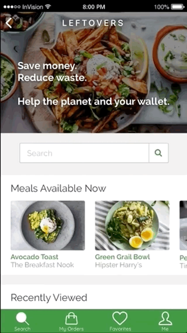
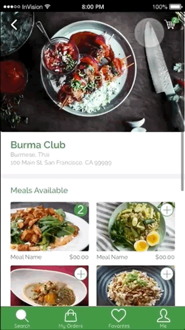
- Browsing and Ordering: A customer browsing restaurants near them, choosing a restaurant, adding available meals to their cart, reviewing their order, and completing their order for pickup from the restaurant.
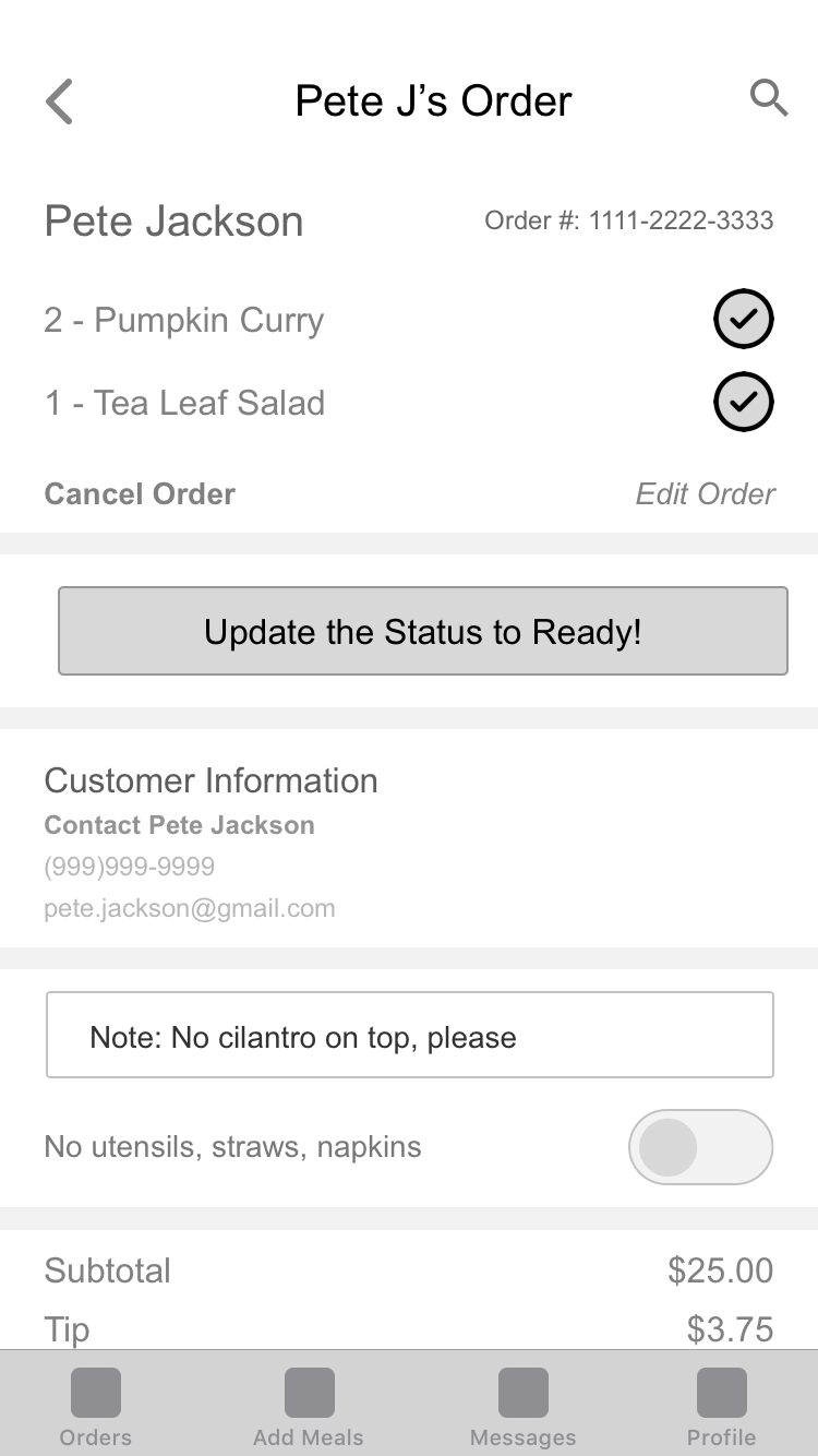
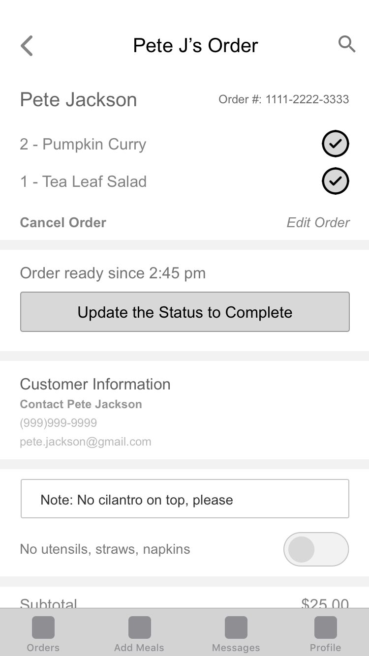
- Preparing the Order: A restaurant worker checking the orders on the app, selecting a new order, preparing (cooking) the order (and checking off the ready items on the list), changing the order status to "Ready", and finally marking the order "Complete" after the customer has picked up their meal.
The user flow of a customer searching for a meal and placing an order.
The user flow of a restaurant working checking new orders, getting the order ready, and completing the order.
Wireframes and wiframe prototypes of the main user flows
Solution & Final Product
Although we had a short timeframe to complete this challenge, we were able to produce a prototype of a customer ordering a meal as well as develop a basic TomTom API integrated software that connects a user’s search with a TomTom map of nearby restaurant location.
Through the app, customers can browse restaurant locations near them, read about the restaurant, check out available meals, and order meals for pickup. By selling "leftover" meals that they would otherwise have to throw out, the restaurants reduce the amount of food waste in the US and also make extra money.
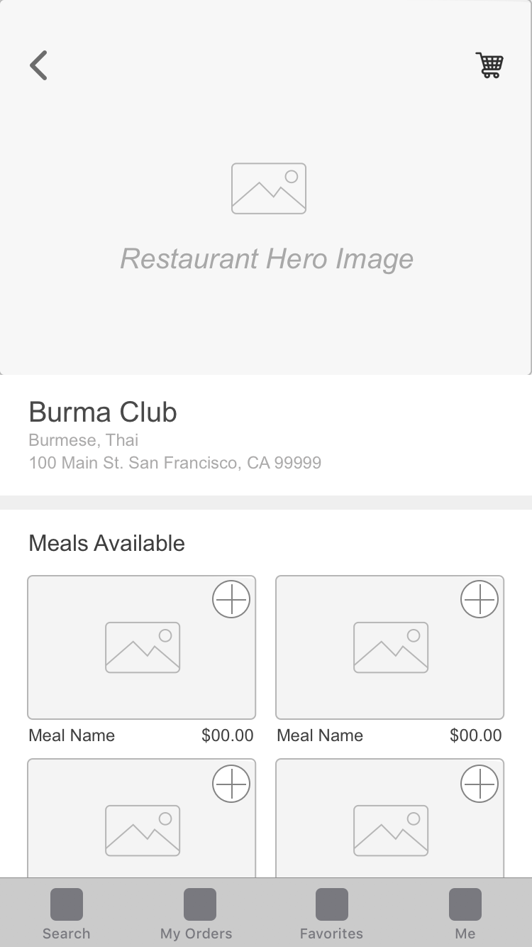
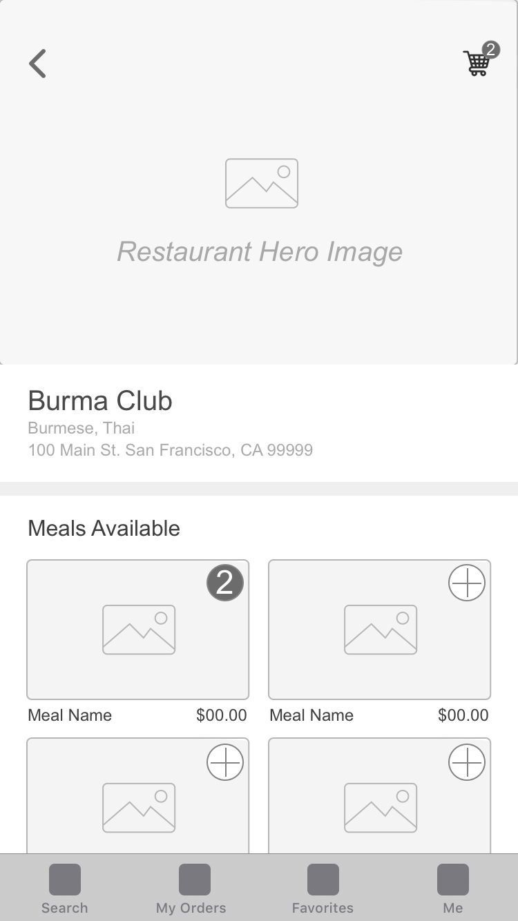
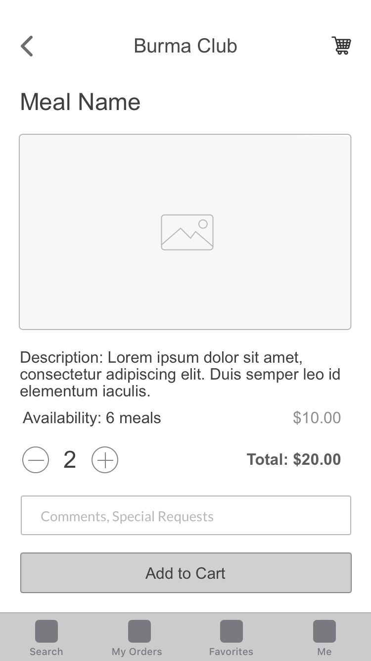
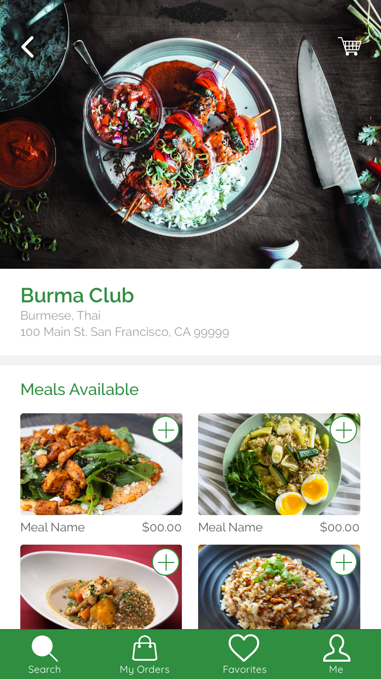
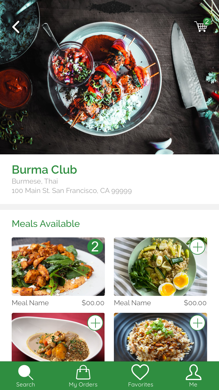
Searching & Browsing: A user searches for a restaurant on the app, sees a list and map view of restaurant locations, and specifies a pin location on the map.
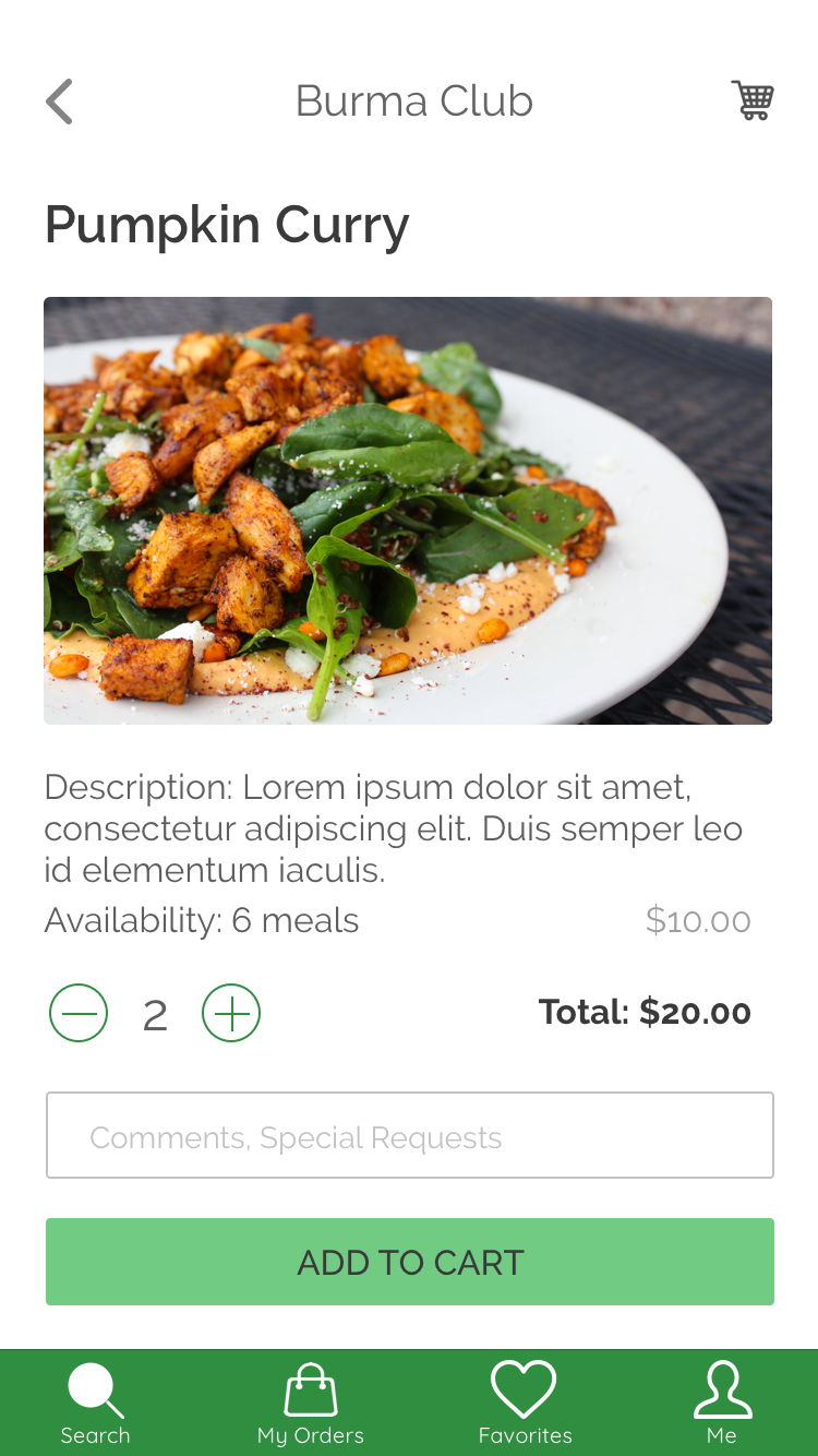
Selecting Meals: The user reviews a restaurant and takes a closer look at the available meals. They add the meals they want to their cart.
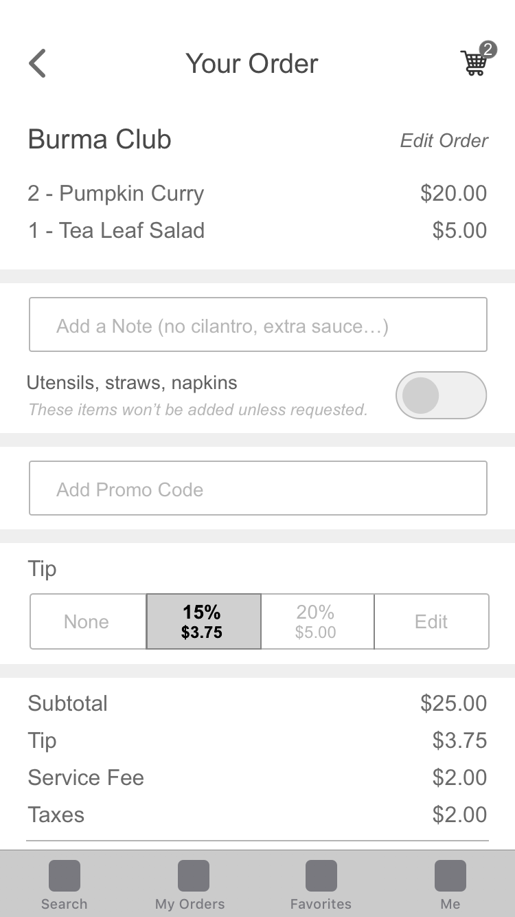
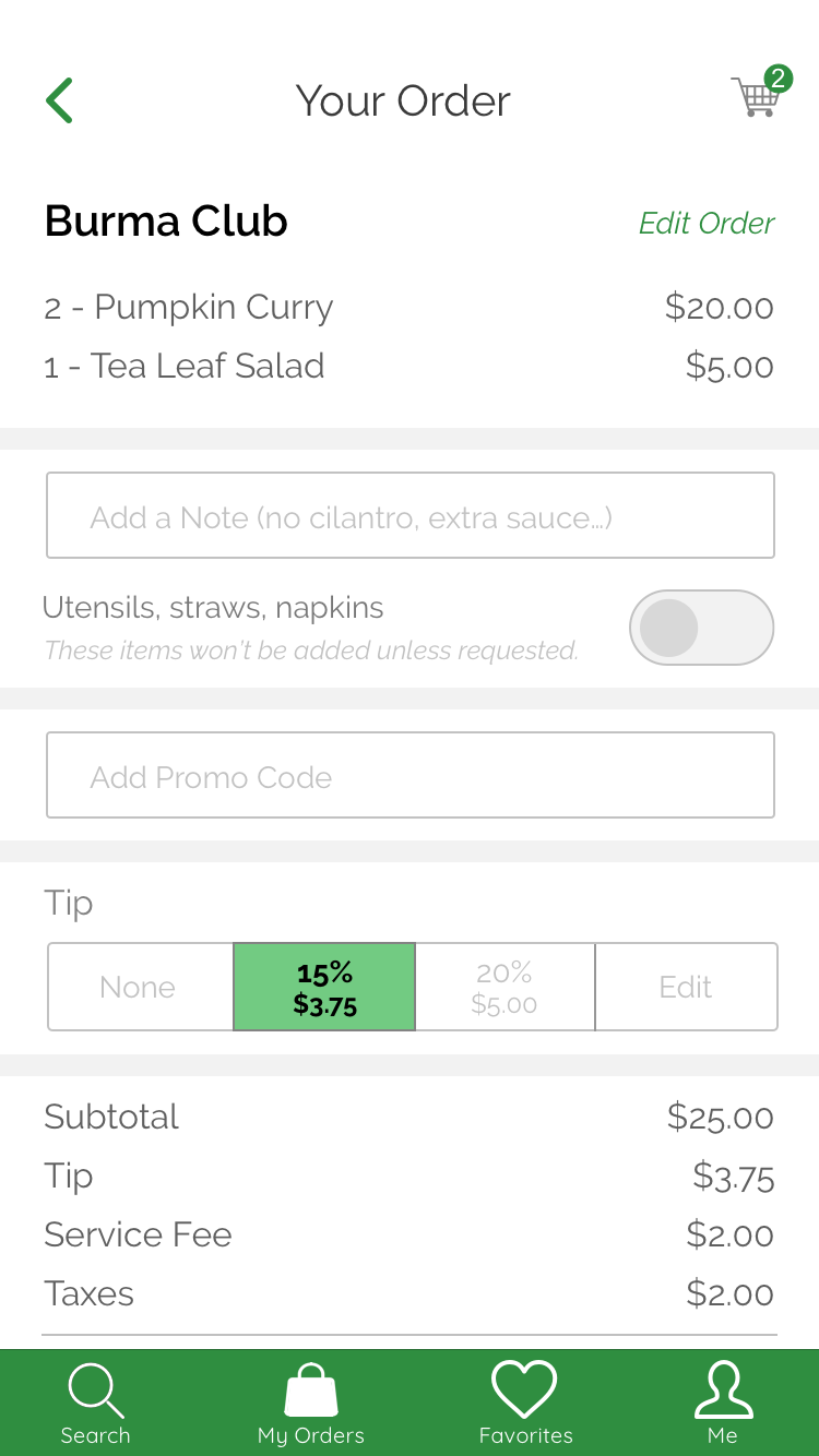
Checking Out: The checkout process is fairly standard. The user reviews their cart, adds a tip and their payment information, and then completes their order for pickup.
If I had more time I would have made more UI iterations, but these were the final high fidelity screens that I was able to design in the Hackathon timeframe.
Next Steps
If we had more time I would have wanted to do the following:
- Iterate on the UI design of the high fidelity screens and design the UI of app pages beyond the main user flows.
- Produce a high fidelity prototype demonstrating the interaction between a restaurant worker and the app.
- Expand the software and develop more aspects to the app.
- Explore a composting aspect of the app, connecting farmers and gardeners to leftover meals that are too old to be sold for human consumption.
- Explore a “waitlist” or reservation component that would allow frequent customers to reserve potential meals in advance. We thought of this feature (and I explored it in storyboarding) but we tabled it for time constraints.
After constructing wireframes for our UI designs we were able to use our UX foundation to explore divergent design direction through moodboards and style tiles, which were then user tested to define the final design direction.
We didn't win the challenge..... but is there a "Best Effort" or "Sportsmanship" prize?
Final Thoughts
Hackathon teams can only do so much in 24 hours and I’m proud of my team for the work that we accomplished! I enjoyed my first Hackathon and I feel like it was a great experience. I collaborated with developers and engineers, I practiced product design (which I love!), I was inspired from seeing the great work of other teams, and overall I learned a lot and had a great time!
Other Design Projects
Albert.ioUX/UI Design
Albert Academy CoursesVisual Design
Dribbble UI WorkUI & Visual Design
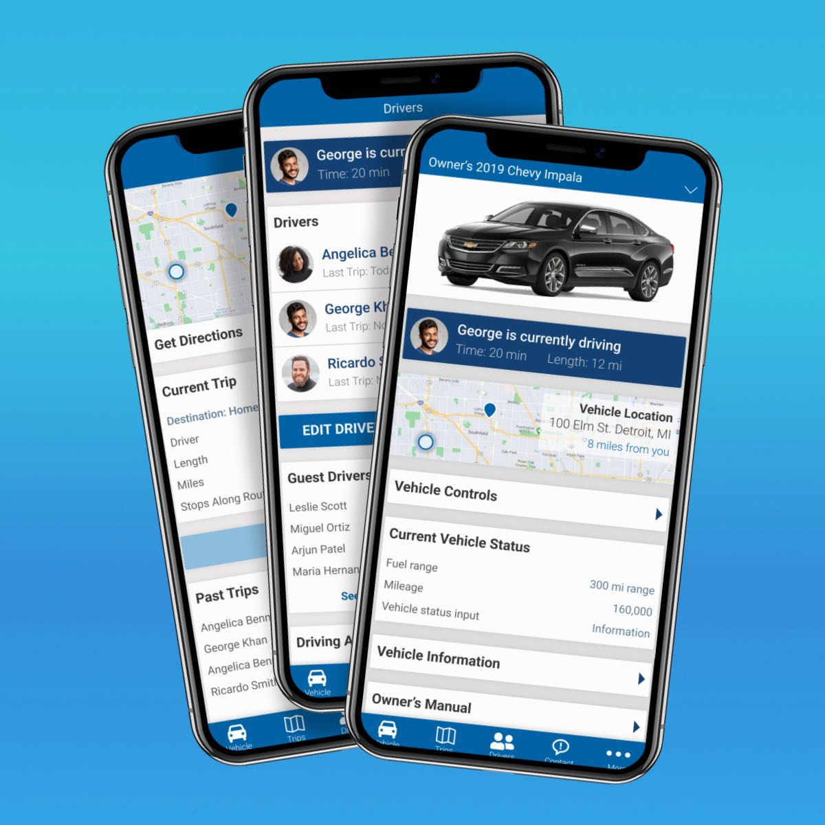
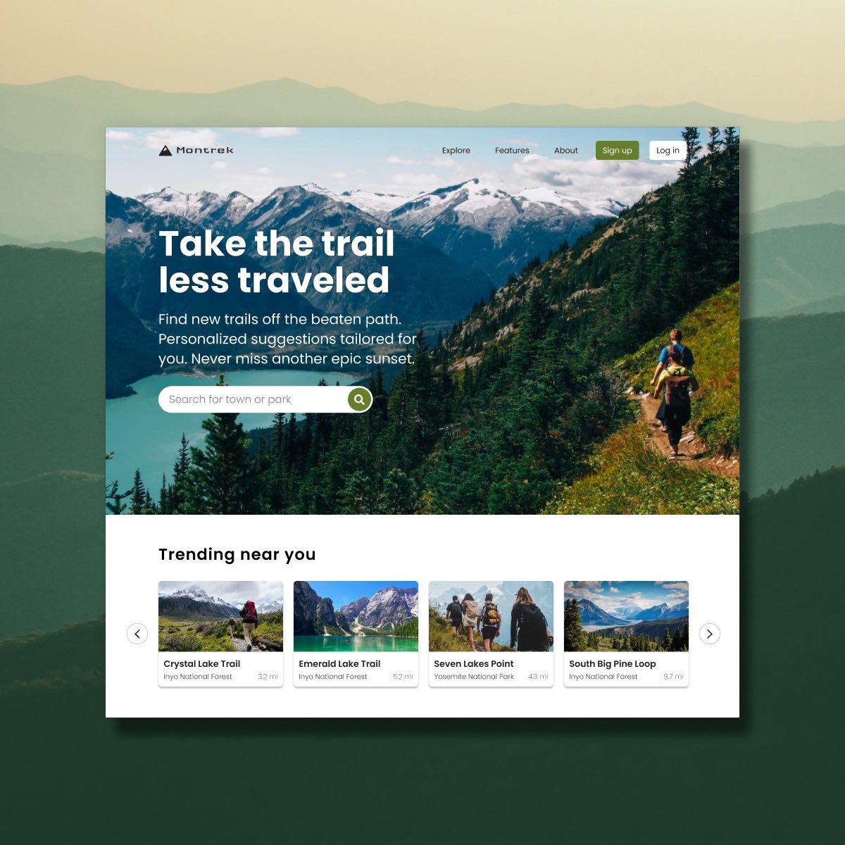
Automotive Design ChallengeUX/UI Design Case Study
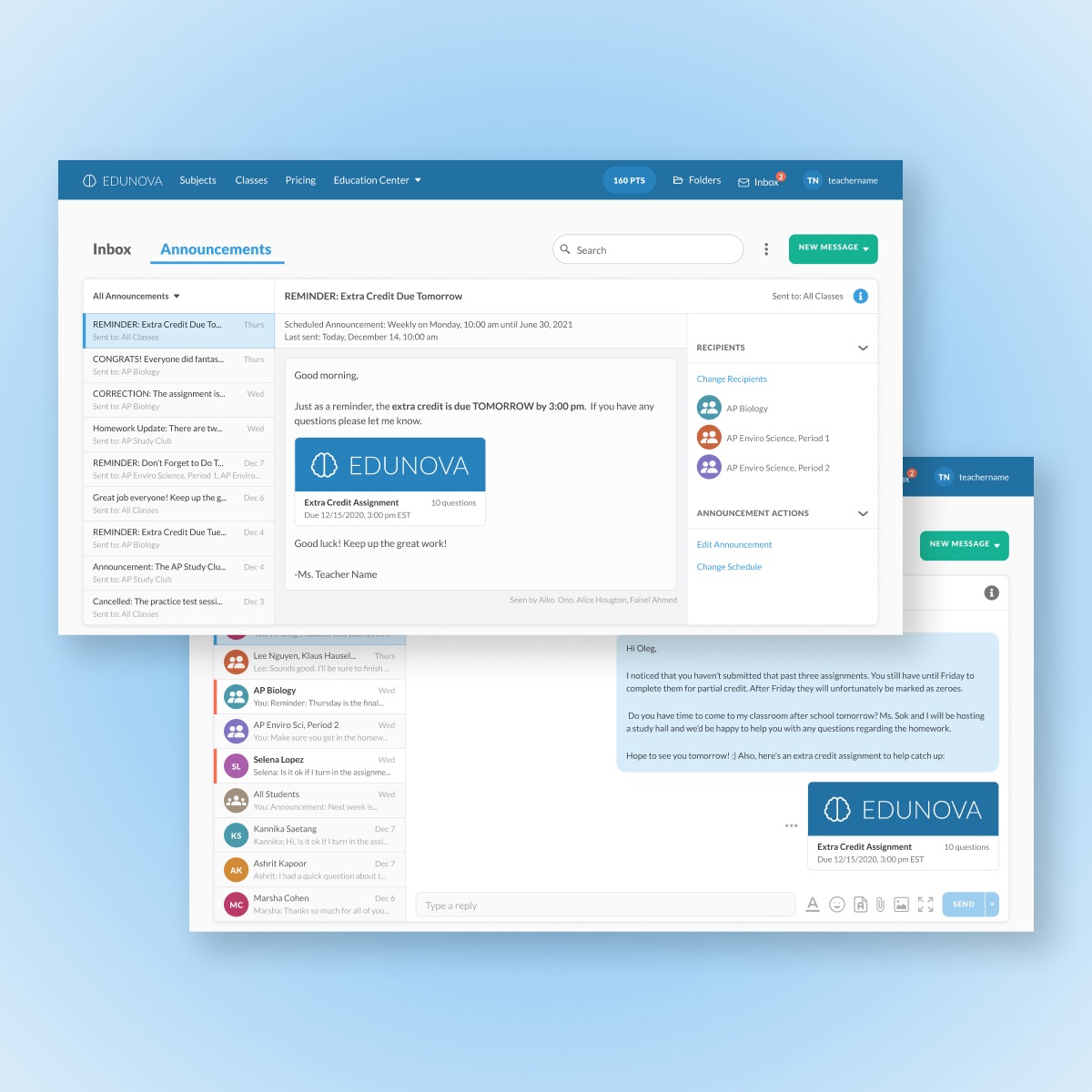
Edtech MessagingUX/UI Design Case Study
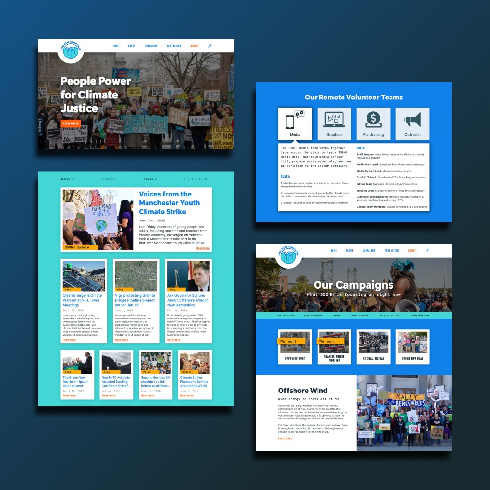
350NHUX/UI Design Case Study
Personal ArtworkArtwork
Amazon Raise-Up BuildathonUX/UI Design Case Study
Project Giving KidsUX/UI Design Case Study
The Cumin ClubUX/UI Design Case Study
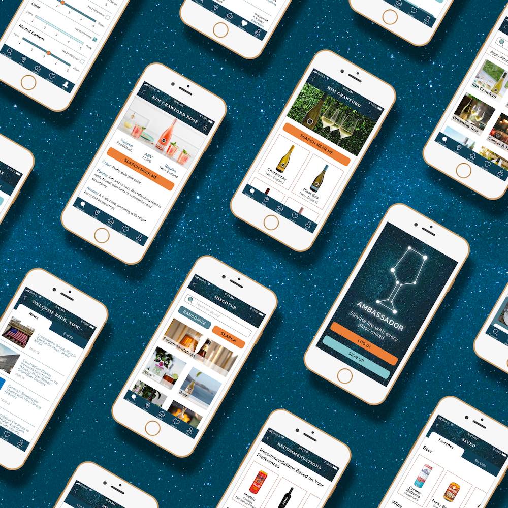
Constellation BrandsBranding & UI Design Case Study