
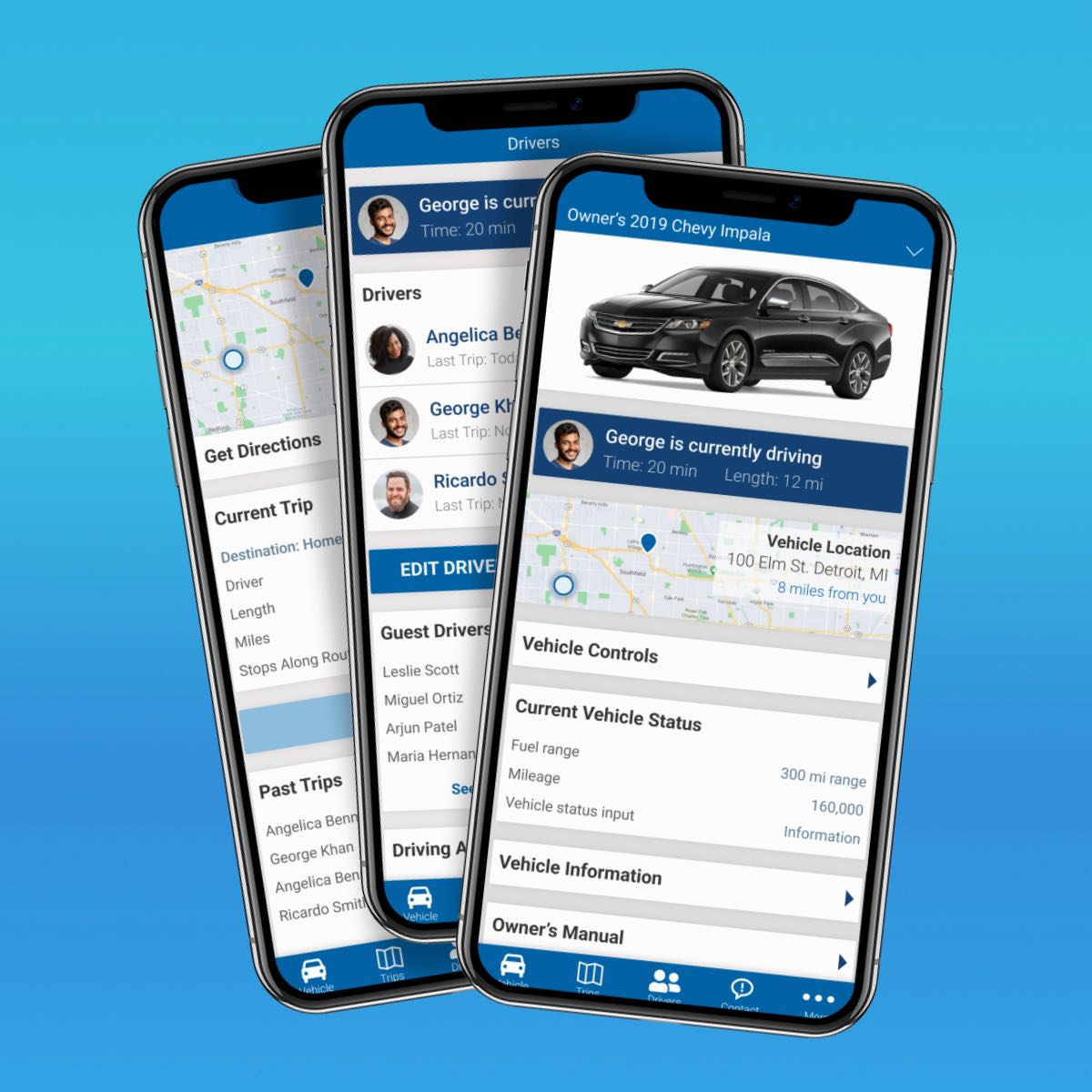
CBI Ambassador App
Client: Constellation Brands (CBI)
Services: UI Design, Desirability & Usability Testing, Branding, Interaction Design
Deliverables: Logo design, microinteractions, high fidelity app mockups, prototypes, UI kit, visual assets, style guide, marketing website UI design, testing data
Team: 3 UI Designers
SUMMARY
The main task for this project was to rebrand and redesign the Ambassador App, an internal employee app of Constellation Brands (CBI), and to create high-quality high fidelity mobile screens while establishing the visual design. To achieve this goal I worked with my team to conduct usability testing to ensure that the visual design was user-focused and aligned with the goals of CBI employees.
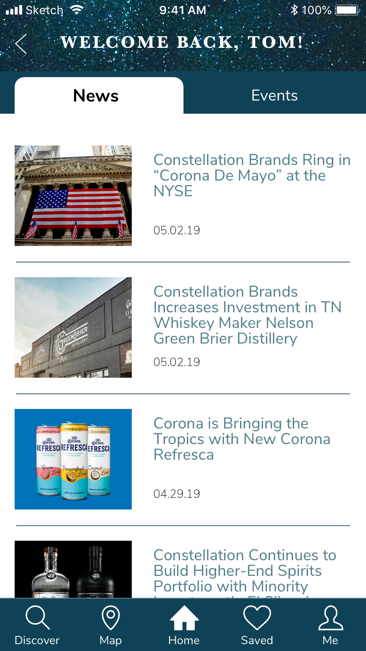
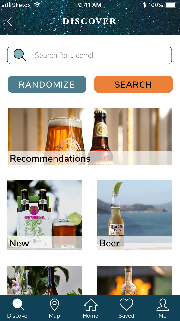
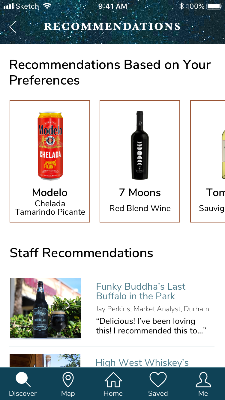
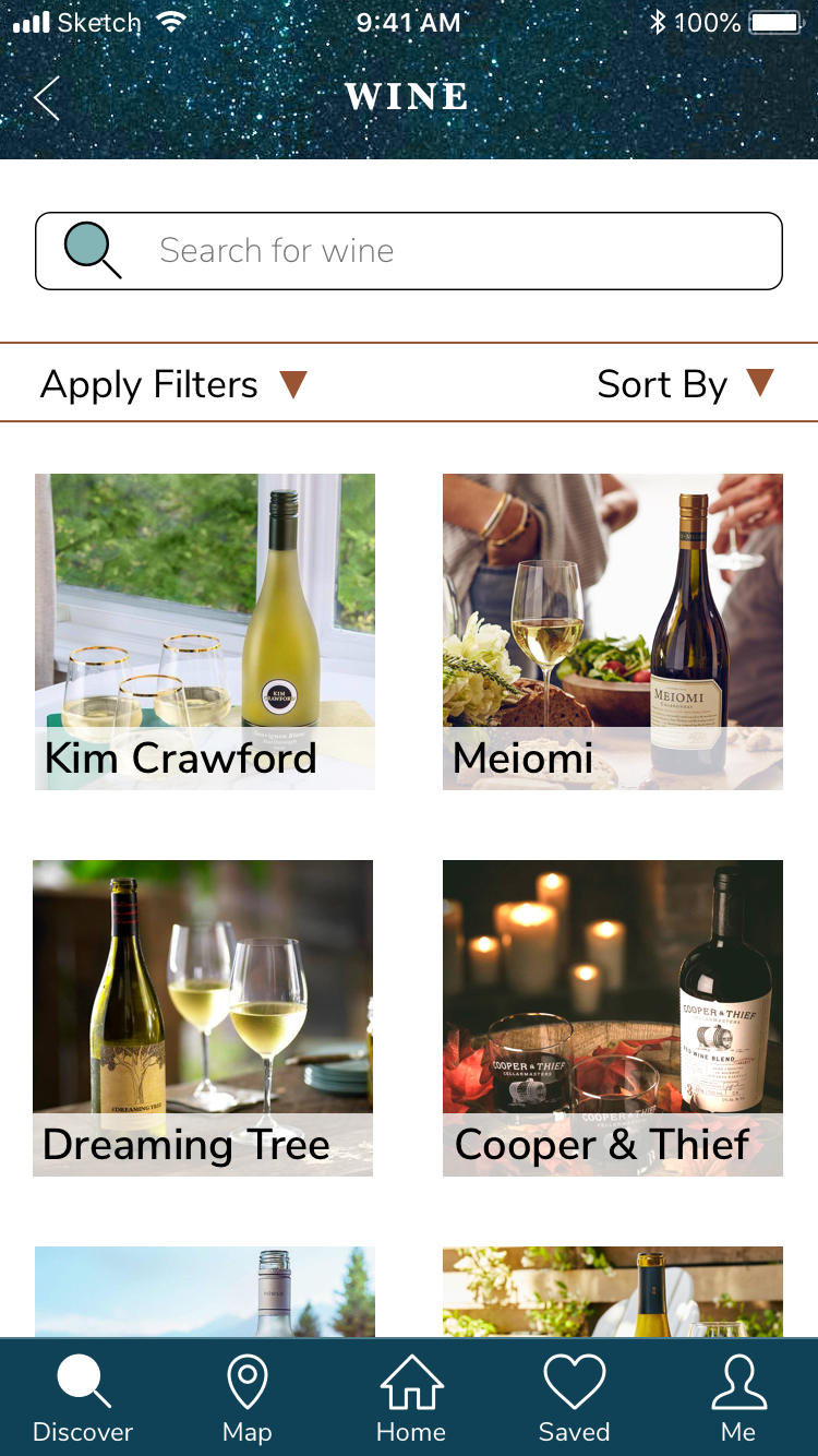
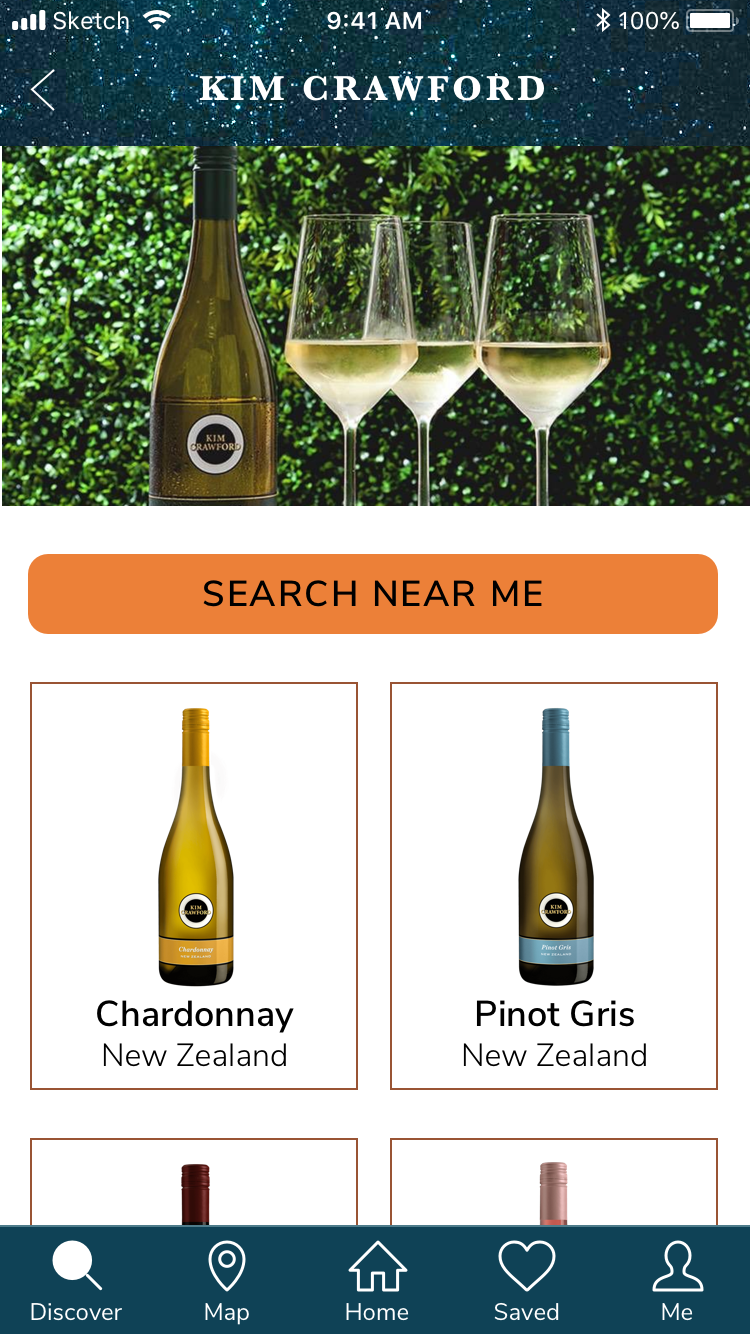
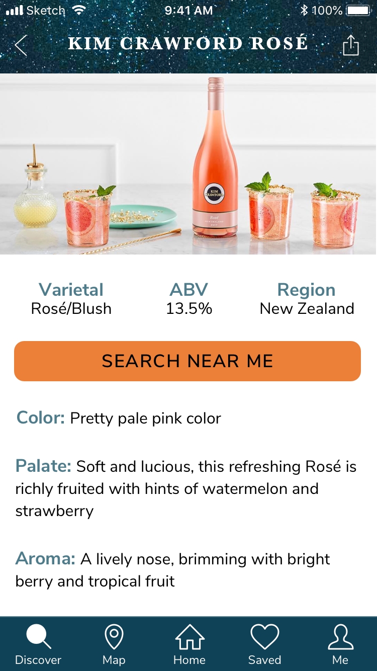
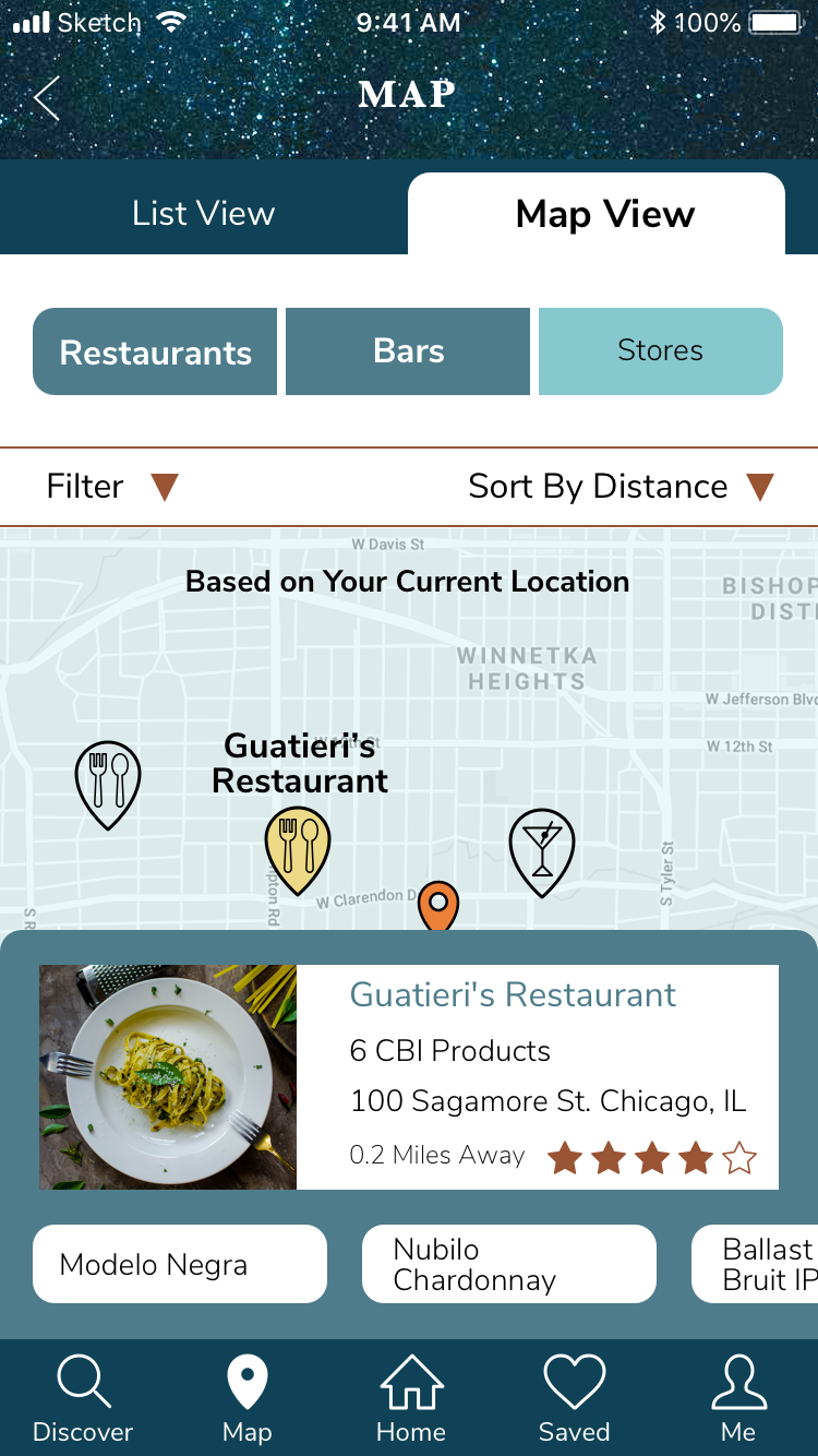
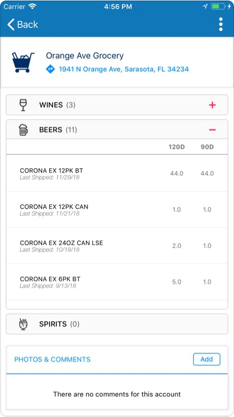
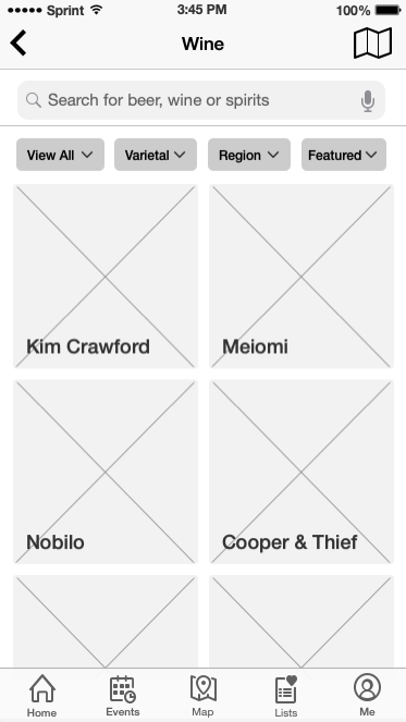
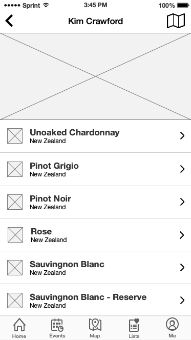
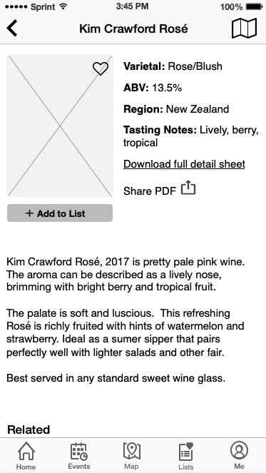
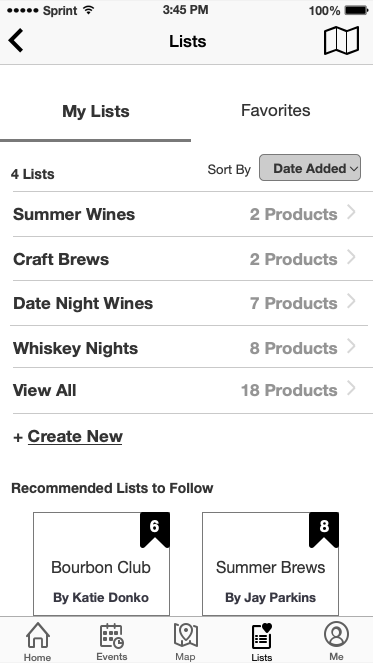
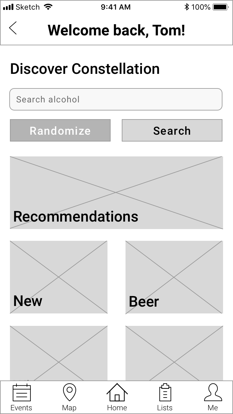
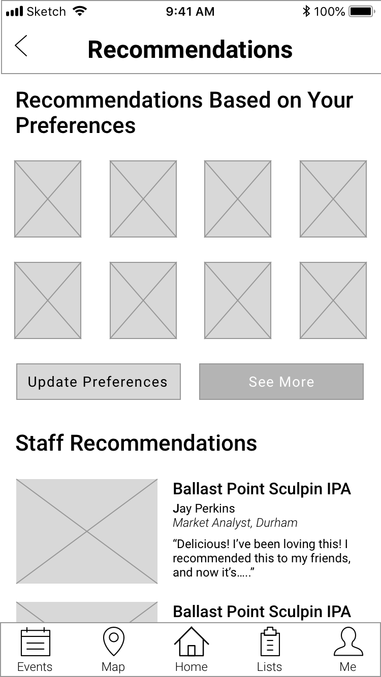
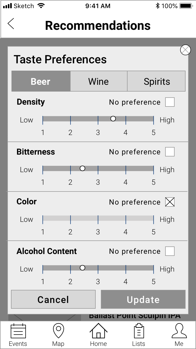
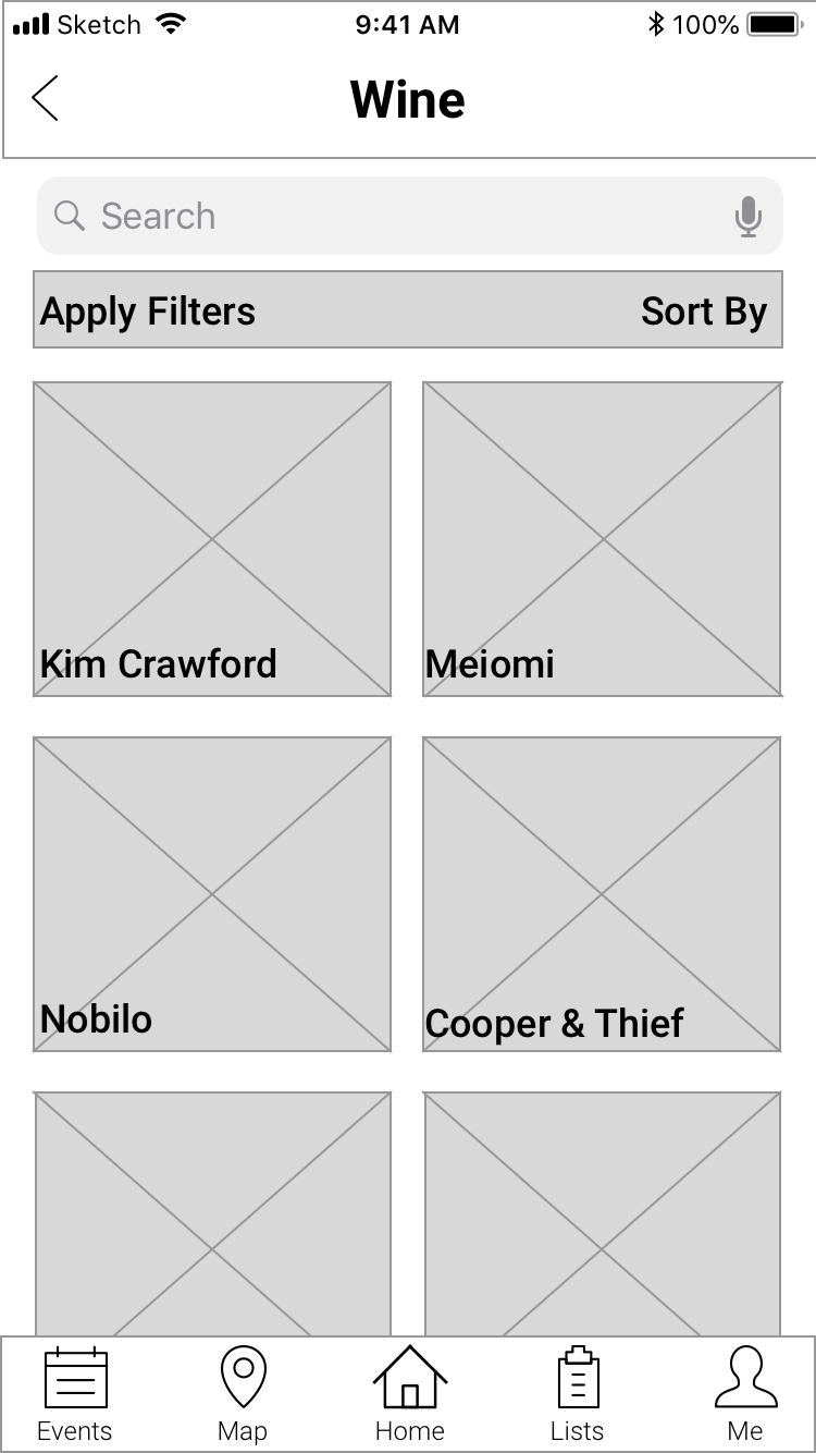
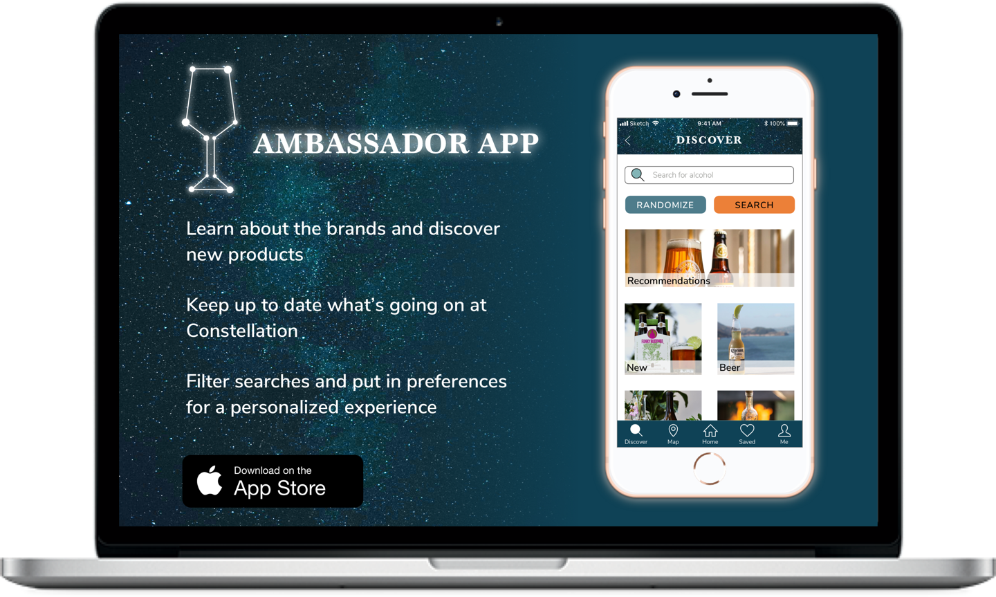
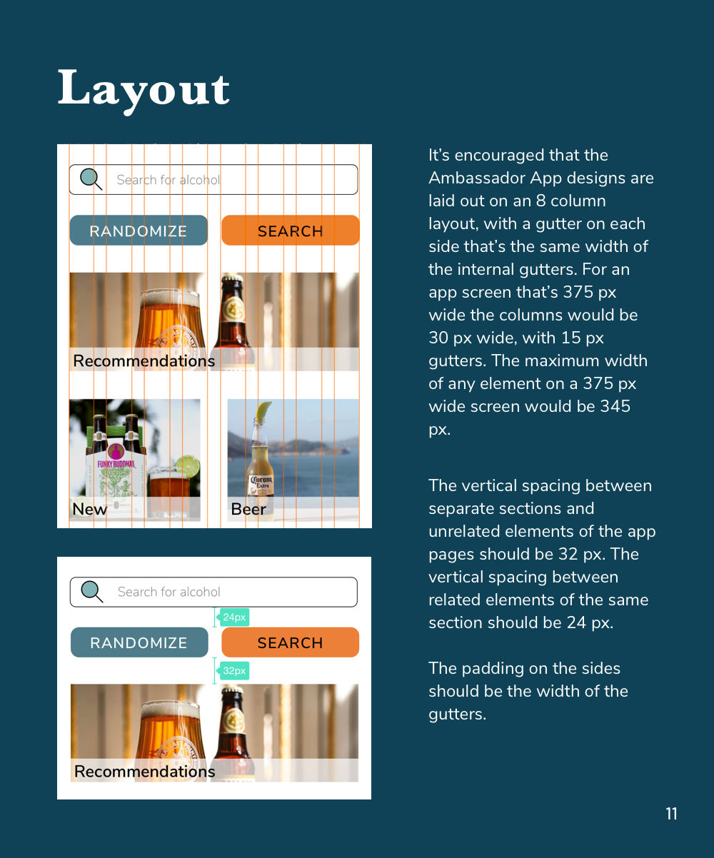
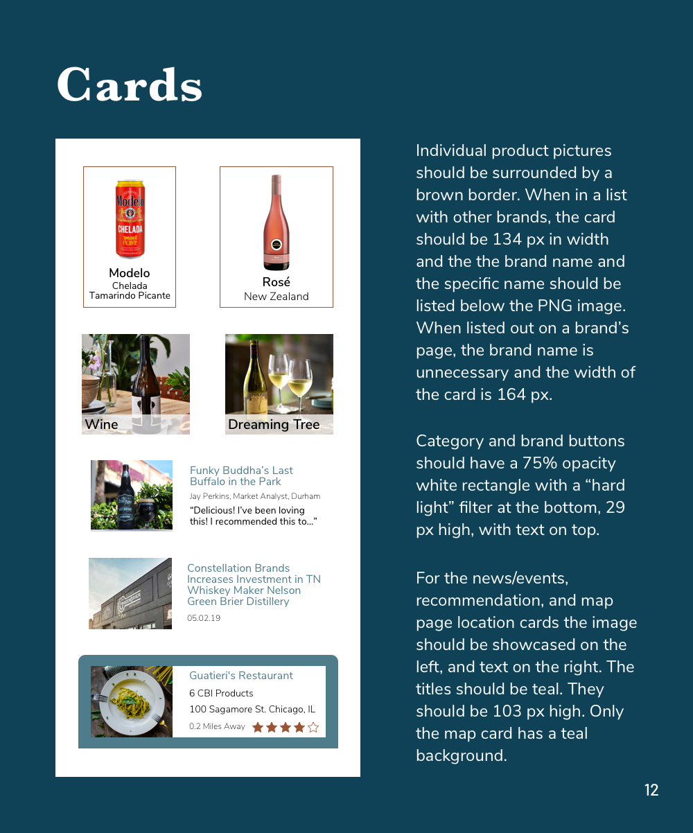
The final high fidelity mobile screens
Background
Constellation Brands is a Fortune 500 alcoholic beverage company that produces and sells over a hundred brands of wine, beer, and liquor. To help their 8,000+ employees enjoy their products and to support them as “brand ambassadors,” CBI created the Ambassador App. Based on a brand, account type, or location, the app allows employees to find nearby CBI products and accounts (stores, bars, and restaurants that sell CBI products). Employees can view the list of specific products sold by each account and they can access directions to the account via an external map app.
The purpose of the Ambassador App is to allow Constellation Brand employees to explore and discover new Constellation beverages in their free time and to learn more about the products of the company that they work for.
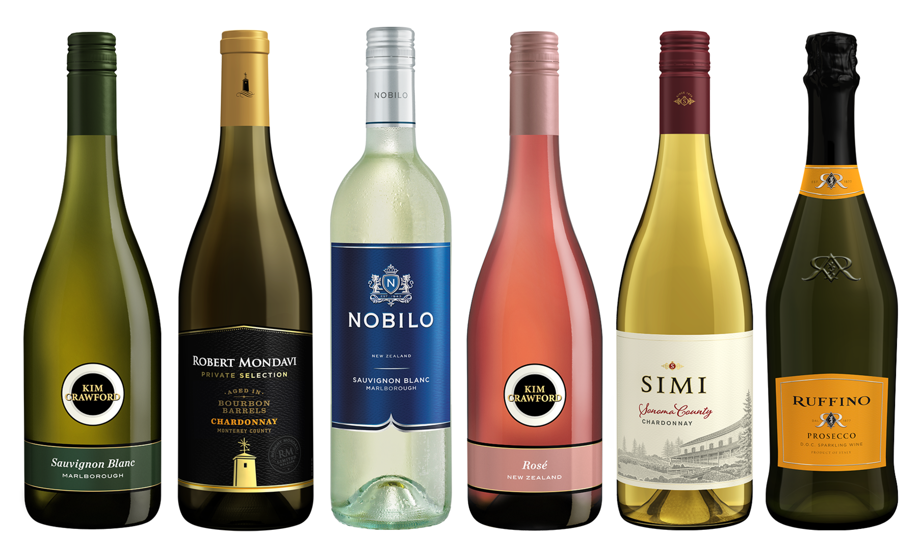
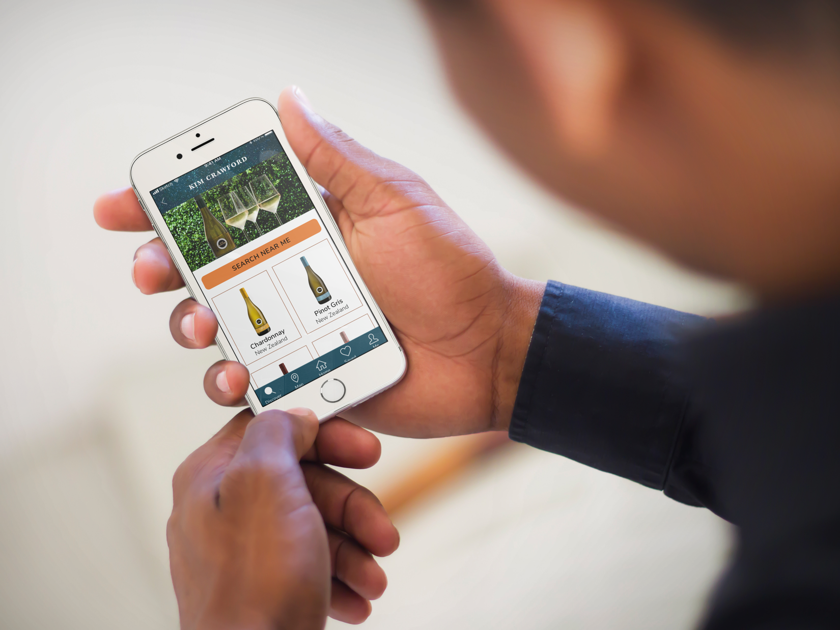
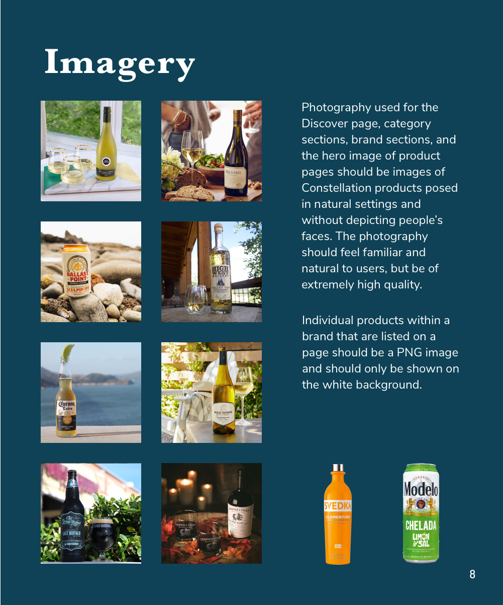
Some of Constellation Brands' products
Client Goals
Although Constellation had an actively used app which allowed employees to find nearby CBI products, Constellation wanted to expand the app with the goals of helping employees connect with each other through product enjoyment, keeping employees updated about company news and events, and guiding them to discover new products, whether it was through tailored suggestions or advanced search capabilities.
In our SME interview, CBI stakeholders explained that their main objective for the app redesign was as follows:
- Discovery: CBI wants to enable employees to discover and try CBI products and find their location and availability near them.
- Suggestions: They want to help employees find out about Constellation products that they wouldn't normally find or try through recommendations.
- Social outings: They want to provide employees an easy way to form group outings with the app

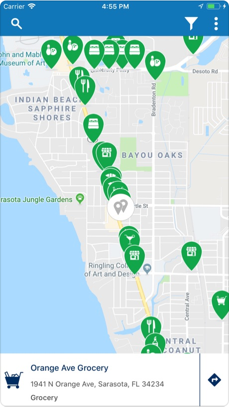
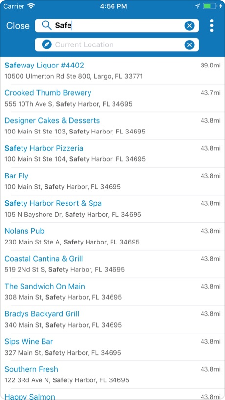
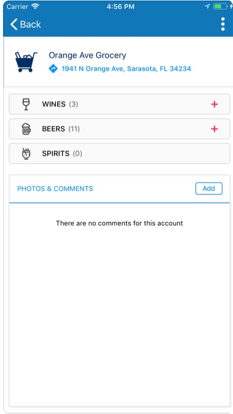

Screens of the original Ambassador App, which primarily showed a map listing nearby accounts
Screens of the original Ambassador App, which primarily showed a map listing nearby accounts
Challenge
When we took on the project, the UX research had already been conducted separately by four individual UX design teams who had delivered four different collections of wireframes. Although the client favored the wireframes of one of the teams, they wanted to pick and choose different elements from the other teams’ wireframes. Since the UX teams were unable to combine their best interaction design and UX design ideas and to solidify one set of wireframes, my team needed to review the four different sets of annotated wireframes and create a new set of wireframes that felt cohesive and best reflected the user research as well as the goals of the user persona and the client.
UX Foundation
The UX teams supplied us with their UX research, user persona, problem statement, and wireframes. The problem statement provided to us, which we tweaked slightly based on client conversations and early testing, was as follows:
"The resourceful brand builder wants a way to cultivate a personal connection through a digital employee network because they want to expand their product and brand knowledge through interpersonal engagement."

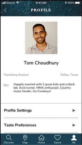
User Persona: “Tom”
"Tom" is a brand advocate of Constellation Brands. He's curious and likes to connect with others, especially coworkers, but finds it hard to build relationships when he travels for work. He likes learning more about CBI, but unfortunately it can be difficult to manage multiple channels of information.
Design Foundation
After the interview we conducted a visual competitive analysis of apps of other beverage companies to establish shared visual patterns and characteristics of direct and indirect competitors. We also took a look at the visual design of a couple apps that the client said that they liked. From this competitive analysis we formed a few ideas and takeaways which would help shape our design principles.
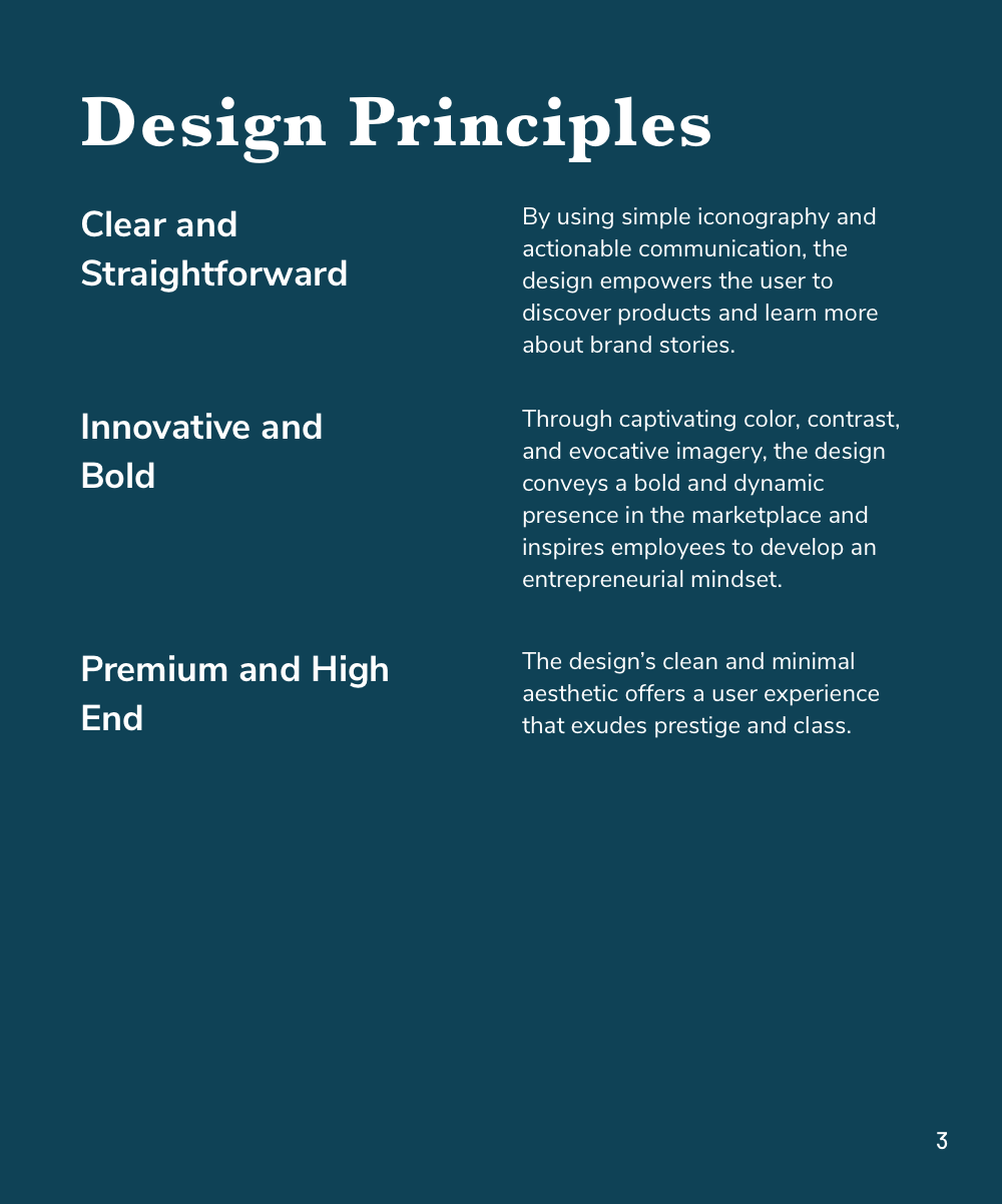
Design Principles
We reflected on Tom (our user), our competitive analysis takeaways, and our client’s goals, and we created design principles to serve as the guiding force in our design decisions:
Considering our competitive analysis takeaways and our client’s goals, we created design principles to serve as the guiding force in our design decisions:
Empowering Discovery
The app empowers the user to take initiative and "think like a CEO," as our client liked to say.
Storytelling
The Cumin Club’s origin story and process is exhibited clearly through the interface, imagery, and icons.
Innovative and Bold
The interface conveys boldness and reflects Constellation's daring and dynamic presence.
Premium
The clean and minimal aesthetic showcases the prestigious and classy CBI brand portfolio.
Logo Design
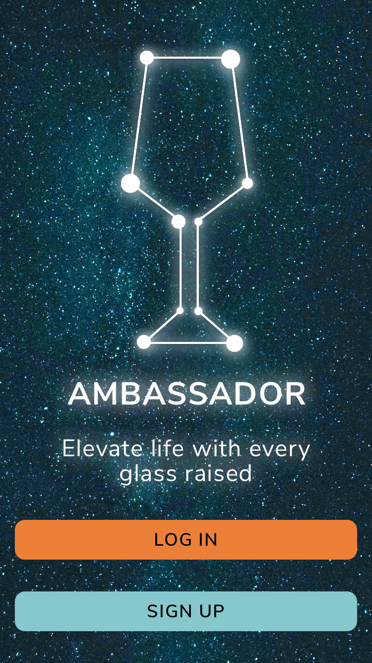
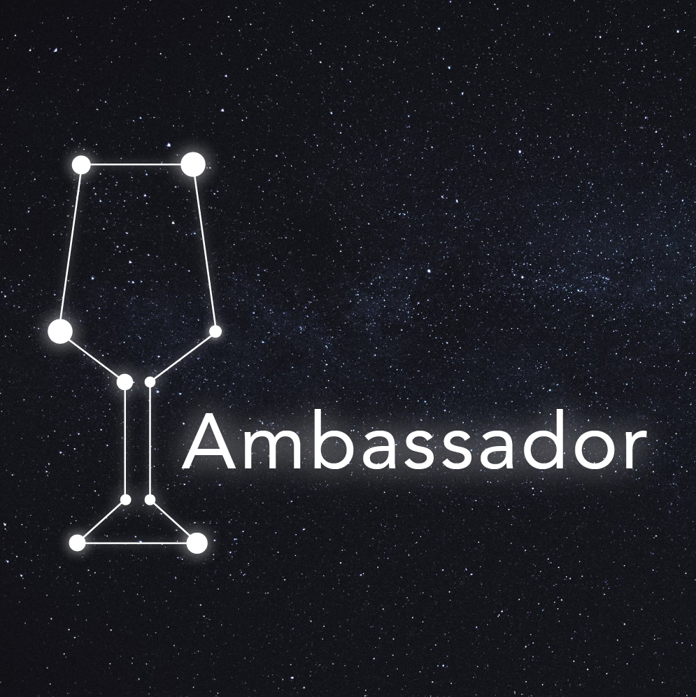
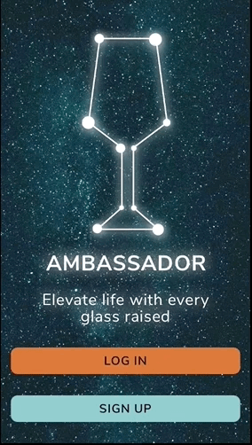
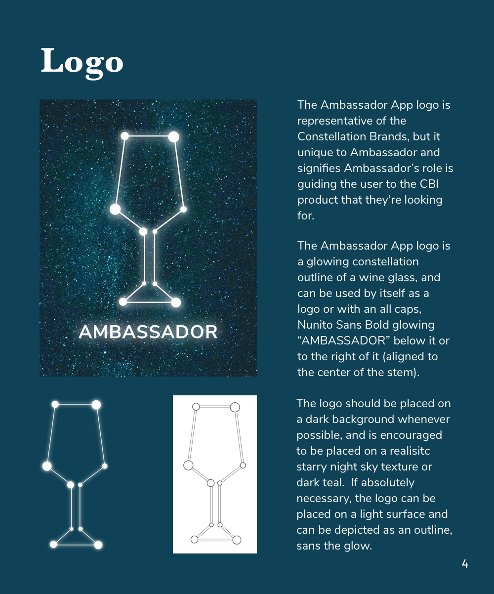
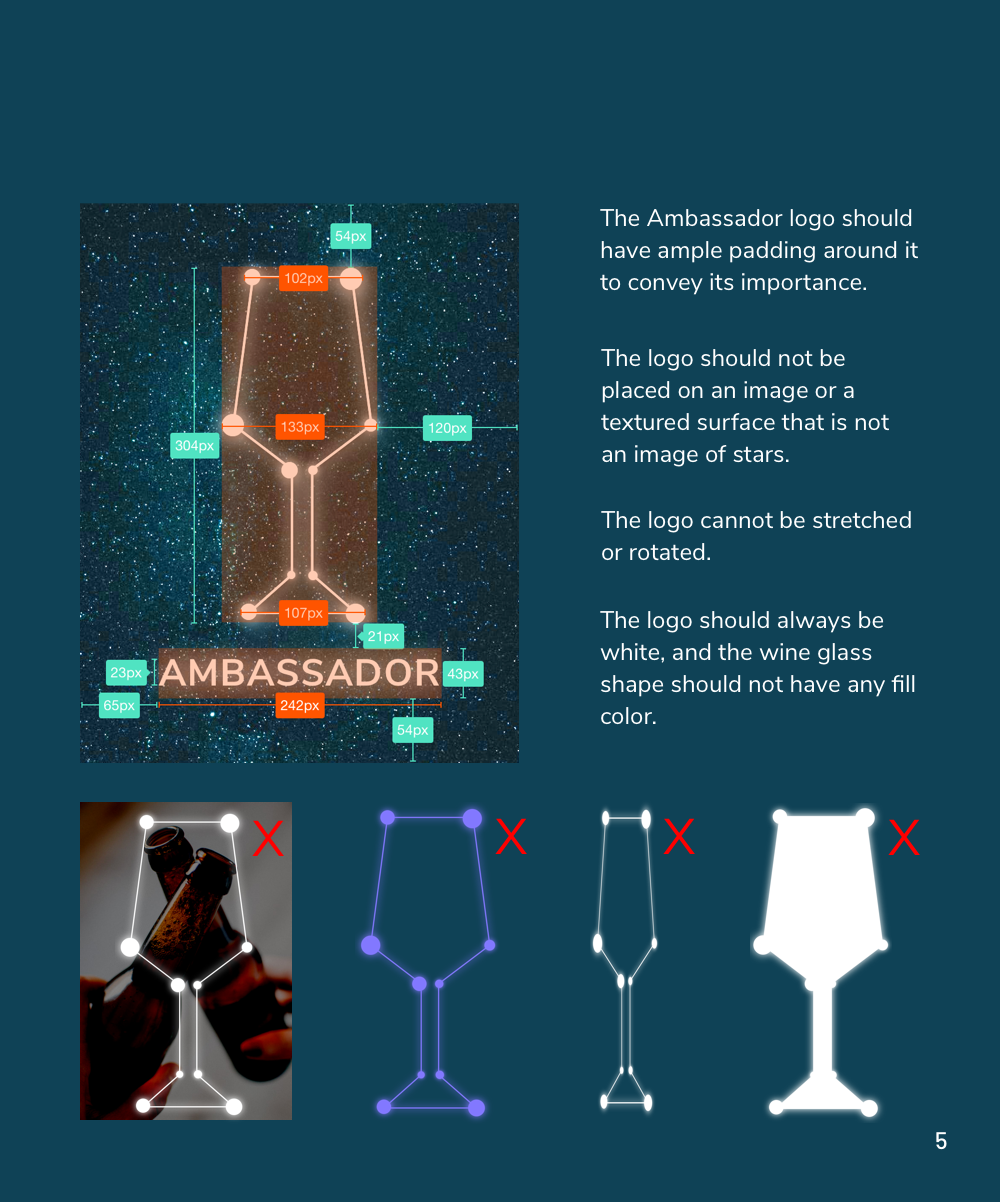
The Ambassador App had a current logo that was a little outdated, and with the UI redesign my team and I wanted to explore different logo options. I finalized and digitized three different logo directions for the new Ambassador App that would reflect the app's purpose, what CBI employees would expect from the app, and Constellation Brands itself. In the end, I decided to go with "Logo 1," the wine glass constellation, which felt lively and celestial, like a CBI drink.
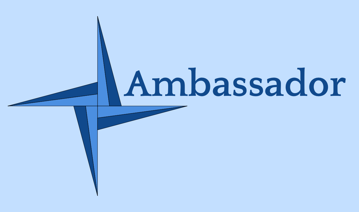
Logo 1: Wine Glass Constellation
Since Ambassador is an employee app of Constellation Brands, which uses a logo of a shooting star, I wanted to pay homage to the company by using a constellation of a wine glass. On a black or dark background I added a glow effect, to make it feel celestial.
Logo 1: Wine Glass Constellation
Since Ambassador is an employee app of Constellation Brands, which uses a logo of a shooting star, I wanted to pay homage to the company by using a constellation of a wine glass. On a black or dark background I added a glow effect, to make it feel celestial.
Logo 2: Simplified Compass
The original Ambassador App logo is a complicated compass with two circles around it and an orange-blue gradient in the background. To modernize it I simplified the compass into four points, with lines bisecting the triangles making up the points.
Logo 2: Simplified Compass
The original Ambassador App logo is a complicated compass with two circles around it and an orange-blue gradient in the background. To modernize it I simplified the compass into four points, with lines bisecting the triangles making up the points.
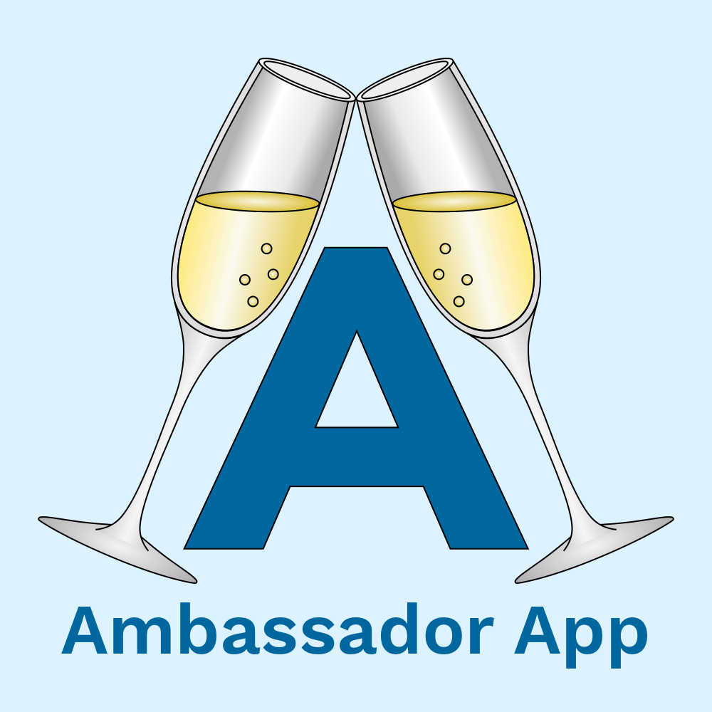
Logo 3: Champagne Glasses
I wanted to try something that went beyond stars and compasses. I played around with the idea of two clinking champagne glasses outlining the letter “A” for Ambassador to give off a feeling of fun and to showcase Ambassador as a social drinking app.


Wireframes
We received wireframes from different teams and had to figure out how to combine them into one set that reflected what the client and the user would want. The client expressed that they liked the wireframes of "Team 4," but that they wanted to incorporate certain elements from the other teams' wireframes, including taste preferences, randomized searches that mimic Google's "I'm feeling lucky," a rewards points incentive program, and a news feed of Constellation Brands news and events.
Wireframes from Team 4
Updated wireframes, which incorporated elements from other UX teams that the client wanted to add. We later tweaked these based on user testing.
Design Directions
Based on our user persona and our client needs, I wanted to test out a few different different concepts through mood boards and style tiles:
- “CEO”: This design direction was inspired by a direct quotation from our SME interview, where the client told us that Constellation wants their employees to be their own CEO and feel like a boss. This design has a dark palette and conveys executive, power, and luxury.
- Elegant and Premium: The client emphasized repeatedly that Constellation Brands are premium. This design direction conveys the premium brands, as well as elegance and luxury. It’s softer, fancier, and lighter than the first design direction.
- Adventurous and Bold: "Bold” and “risk taking” are the spirit of Constellation and the Ambassador user. Constellation wants to be bold and take risks by acquiring new brands and making bold business moves. The design direction conveys a sense of adventure and freedom.
After constructing wireframes for our UI designs we were able to use our UX foundation to explore divergent design direction through moodboards and style tiles, which were then user tested to define the final design direction.
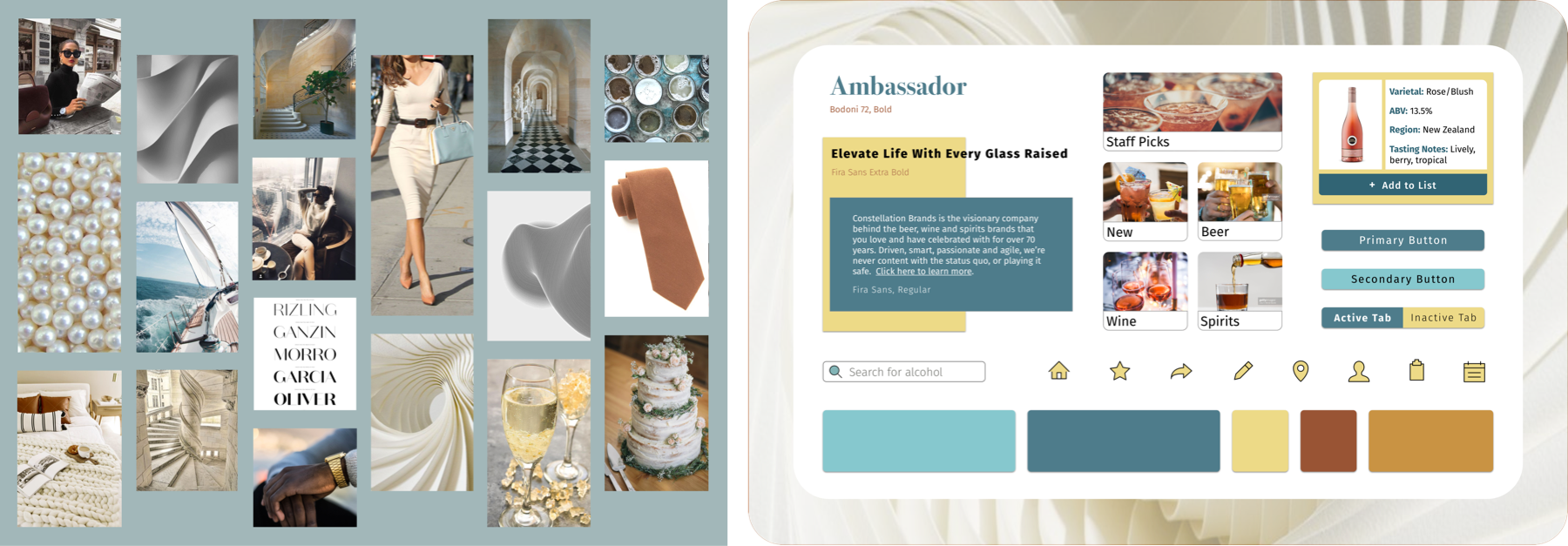
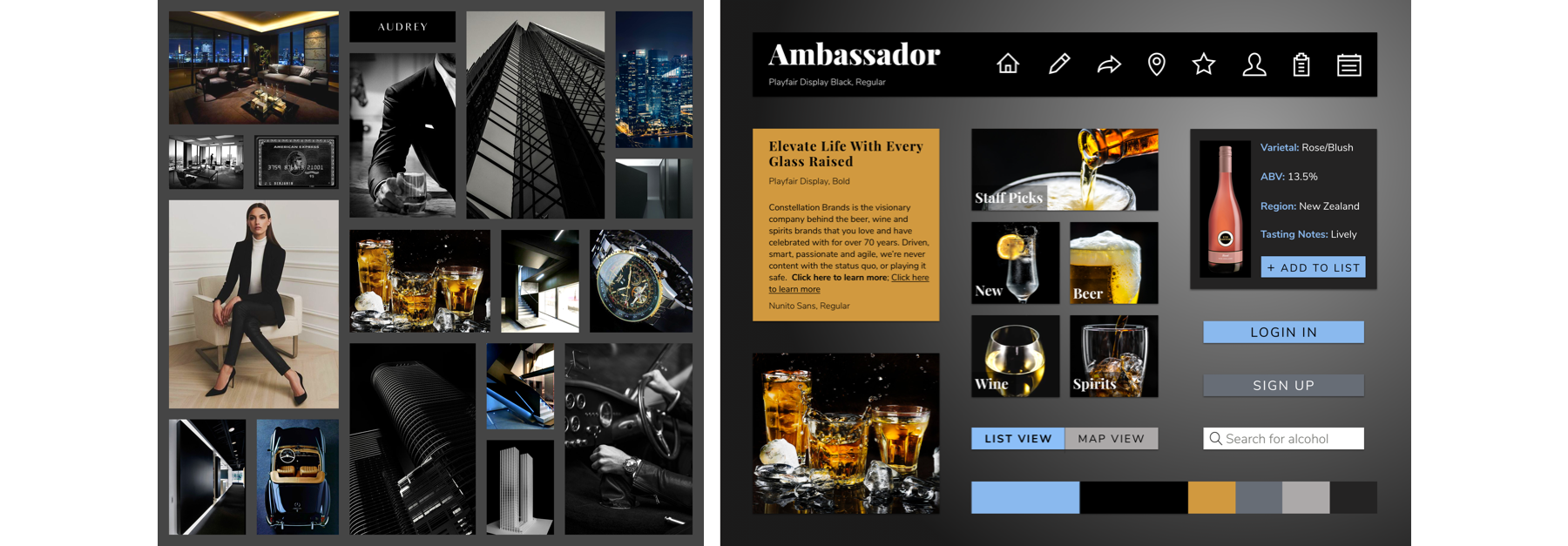
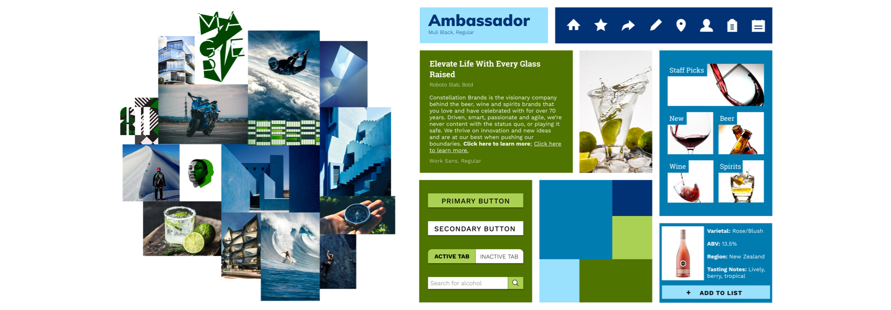
Moodboards and style tiles exploring the different design directions. All of these were tested with users and helped guide the final design direction.
Users responded well to the first two design directions that were tested ("CEO" and premium), but weren't keen on the quirkier design of the "bold and adventurous" aesthetic. They liked a light color palette and a light background, but they also liked a bold contrast in colors and imagery. I decided to combine the aspects that they liked best in the first two design directions for the final UI design.
After constructing wireframes for our UI designs we were able to use our UX foundation to explore divergent design direction through moodboards and style tiles, which were then user tested to define the final design direction.
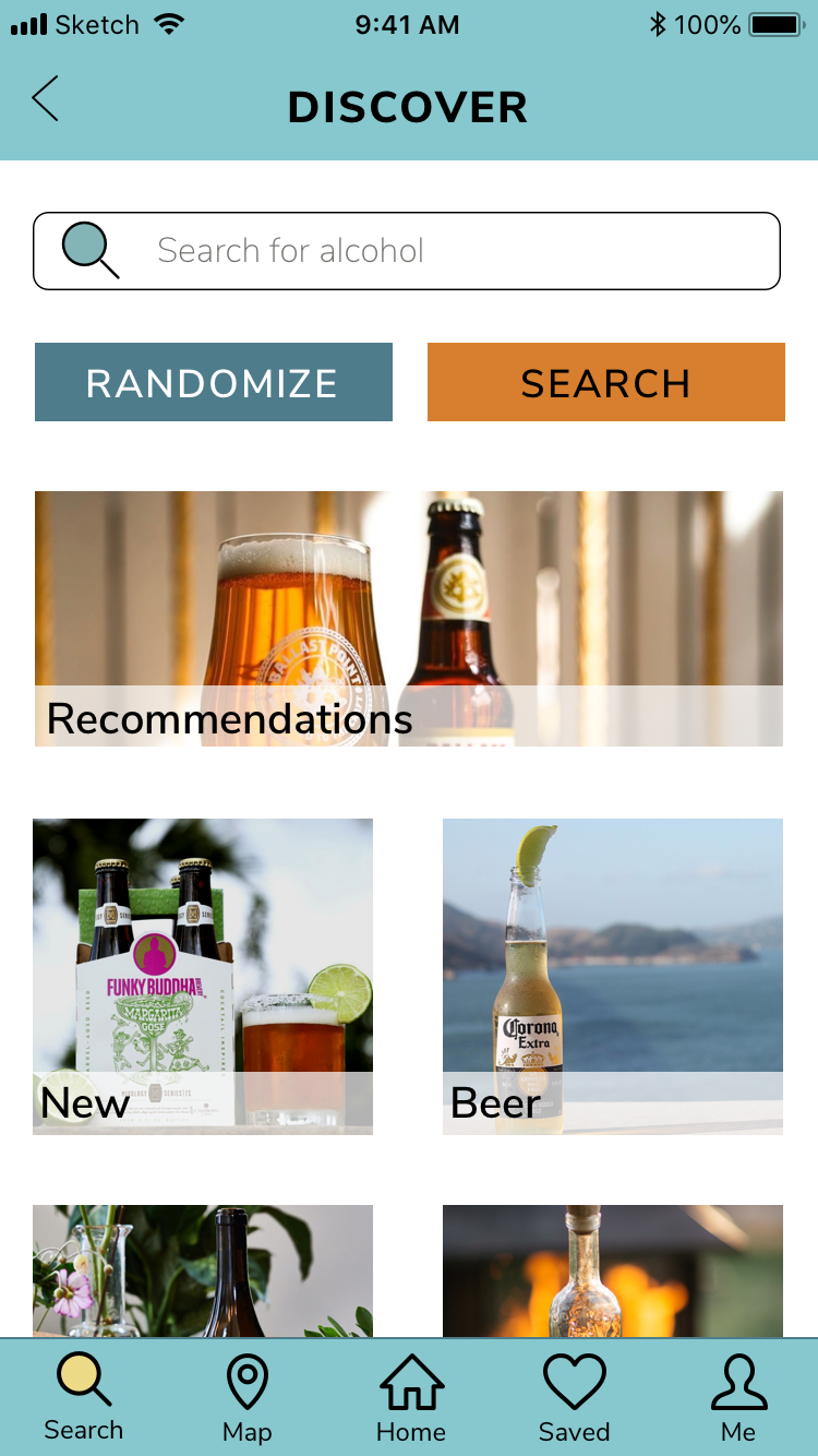
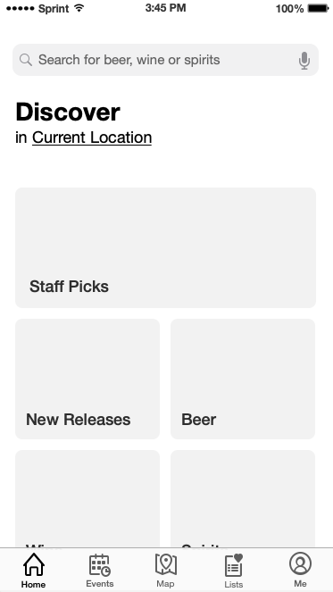
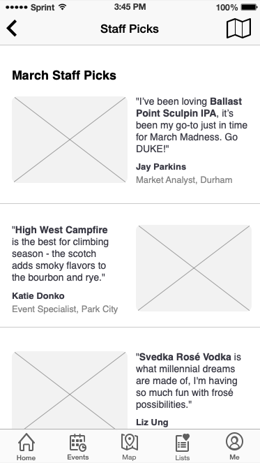
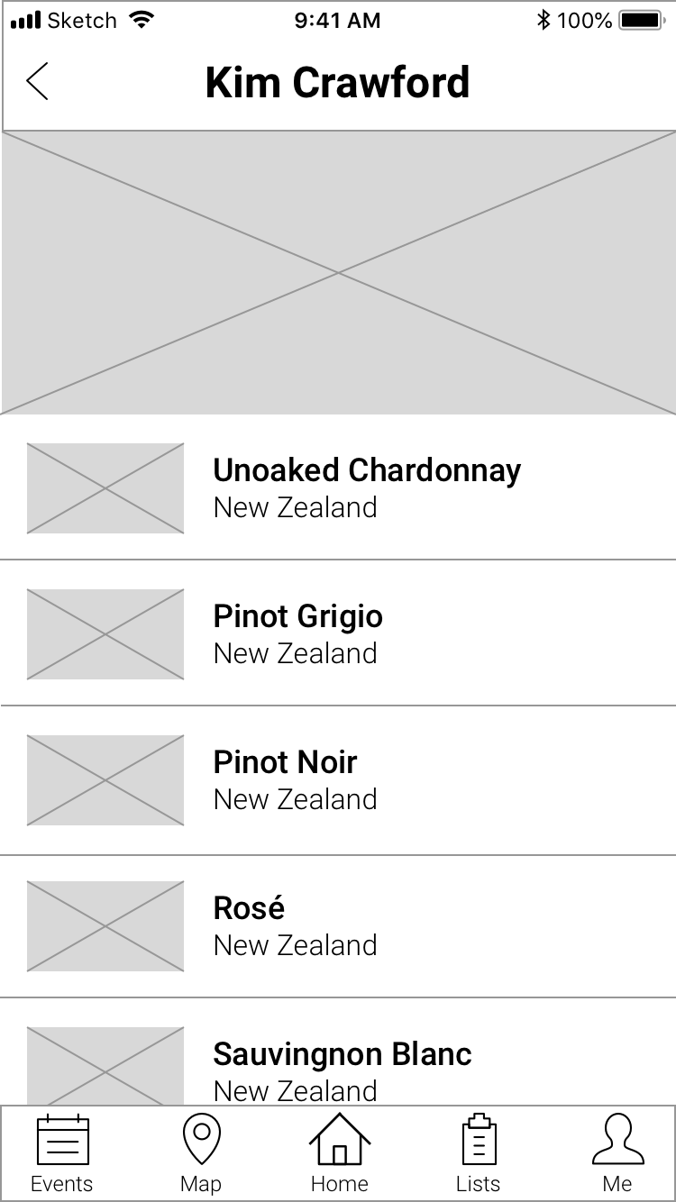
The evolution of the discover page
1. The evolution of the discover page
The evolution of the "saved lists" page
The evolution of the "saved lists" page
2. The evolution of the "saved lists" page
The evolution of the filters dropdown
The evolution of the filters dropdown
3. The evolution of the filters dropdown
Solution
After testing the high fidelity screens and prototype, I made some final changes based on user feedback. The teal and turquoise felt a little too plain to users, so I decided to change the bottom navigation bar to a dark teal bottom with simple white icons, and I changed the top navigation bar to a starry night texture. This was better received in user testing and added some subtle pizzazz.
By defining a design direction that was user-focused and user tested, I was able to create high fidelity screens that met the goals of both the user (Constellation employees) and the client. On top of the UI design, I also created a style guide and UI kit to ensure future visual design cohesion and I designed a marketing website to promote the new app.
Homepage: Instead of opening to a map page, users will now have a homepage that features CBI news and events so that they can stay informed about important company updates.
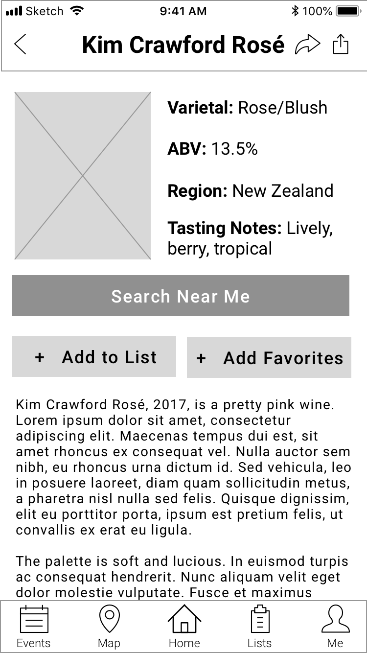
Personalization: The original app wasn't tailored to the individual user. Employees can now personalize their Ambassador App experience by being able to apply their taste and beverage preferences.
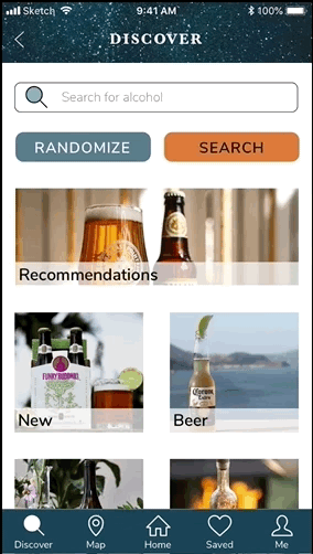
Suggestions: Now users can explore new CBI products through a randomized search button (similar to Google's "I'm feeling lucky") or through a recommendations page that provides personalized suggestions and staff recommendations. This encourages employees to find undiscovered products and learn about new merchandise.
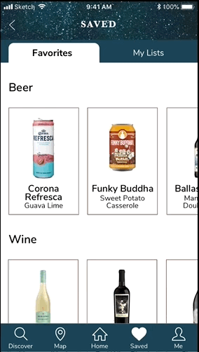
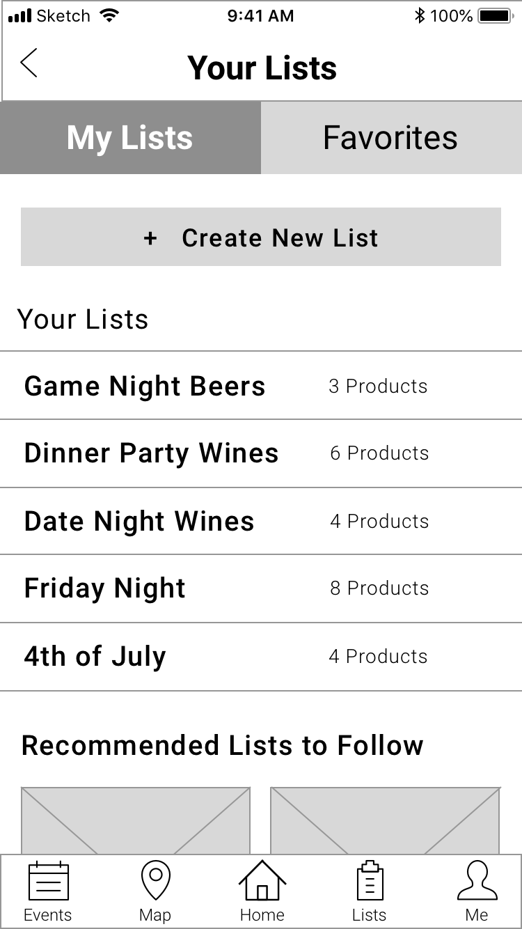
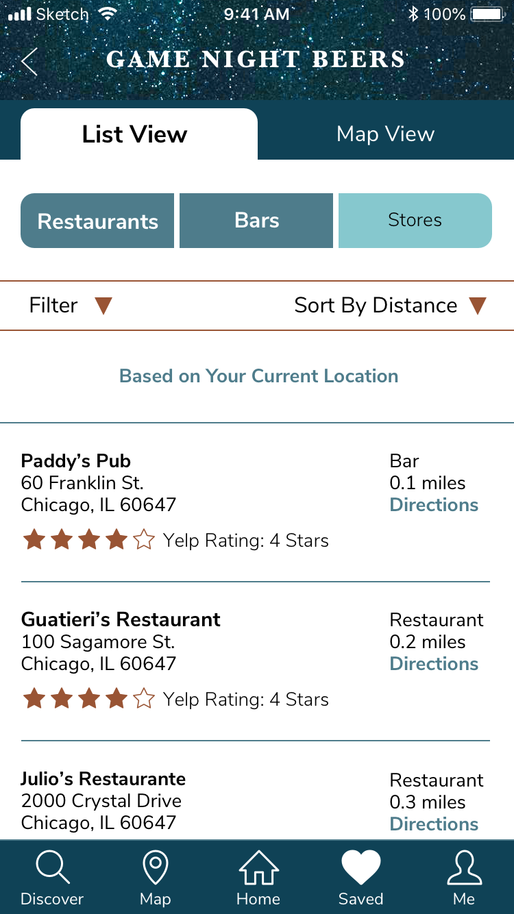
Favorites & Lists: The Saved page is now easier to scan through and is more personalized. The “Favorites” tab displays favorited products with imagery, which makes it easier and more enjoyable for employees to browse through saved products. The “My Lists” tab displays both the beverage lists as well as recommended lists based on preferences, increasing engagement.
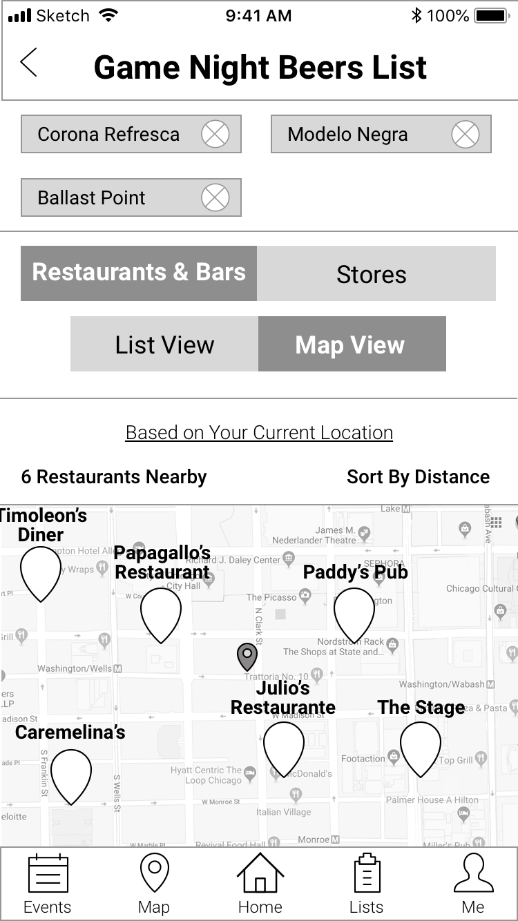
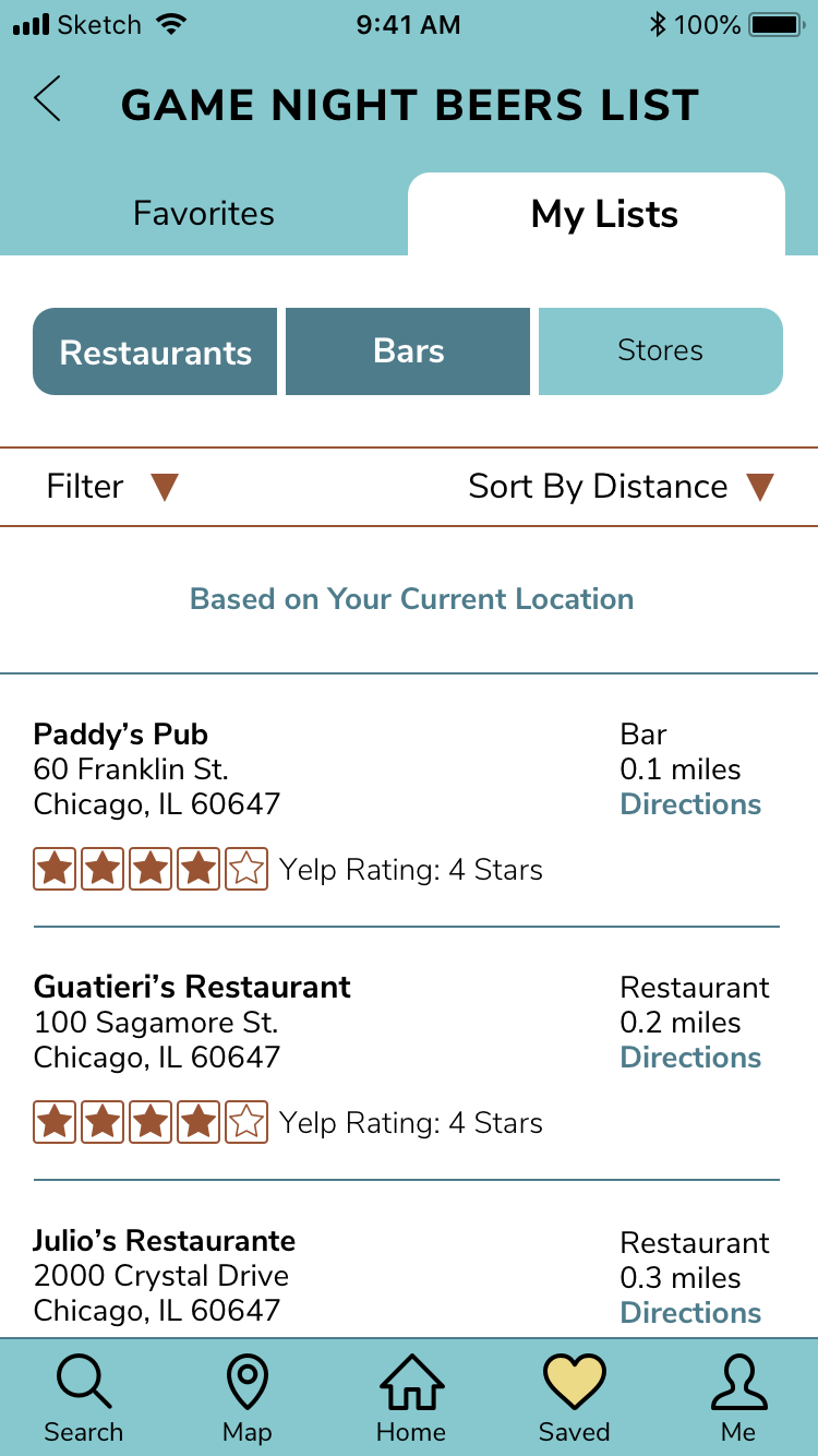
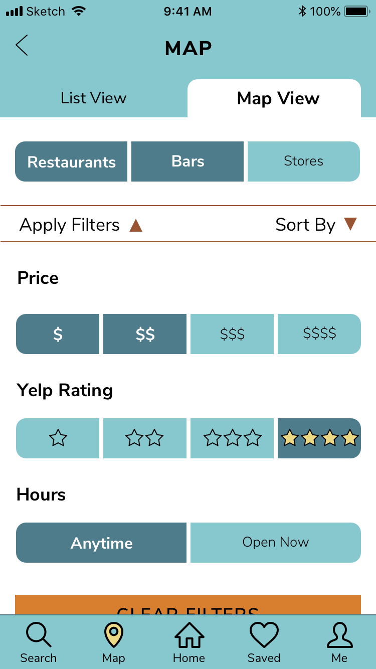
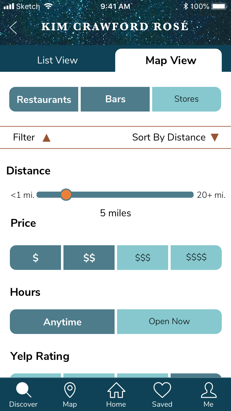
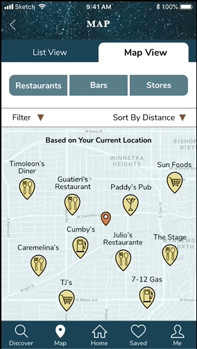
Sorting & Filtering: It was difficult in the original app to look for certain merchandise or to find particular account locations. It’s now easier for employees to browse CBI products and to search locations on the map with the ability to specify location types, apply filters, and to be able to sort listings.
Sorting & Filtering: It was difficult in the original app to look for certain merchandise or to find particular account locations. It’s now easier for employees to browse CBI products and to search locations on the map with the ability to specify location types, apply filters, and to be able to sort listings.
The marketing website of the Ambassador App. You can view the extended webpage example here.
Future Considerations
Considering the time constraints of creating UI design in four weeks, we know that there is further work that can be done to improve the final product and to ensure that the Ambassador App is user-aligned. Some future considerations include:
- Conducting further user testing of the prototype across various sectors of CBI
- Exploring the integration of a rewards program in the future that will incentivize CBI employees to actively use and engage with the app. The rewards program was an idea put forth by one of the UX teams, but was put on hold by the client for the time being.
- Examining the expansion of employee communication through the Ambassador App with an internal system or an external system integration.
Other Design Projects
Albert.ioUX/UI Design
Albert Academy CoursesVisual Design
Dribbble UI WorkUI & Visual Design
Automotive Design ChallengeUX/UI Design Case Study
Edtech MessagingUX/UI Design Case Study
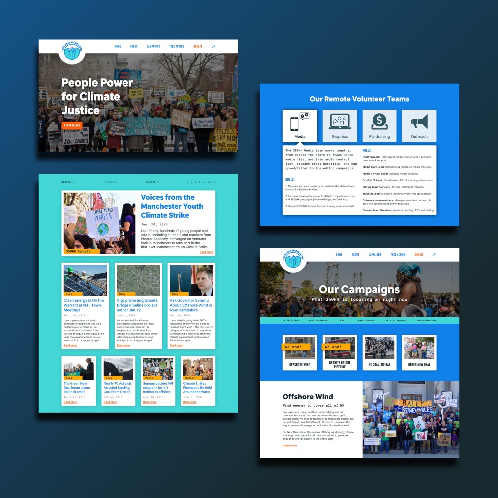
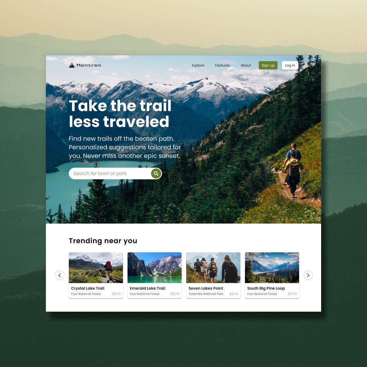
350NHUX/UI Design Case Study
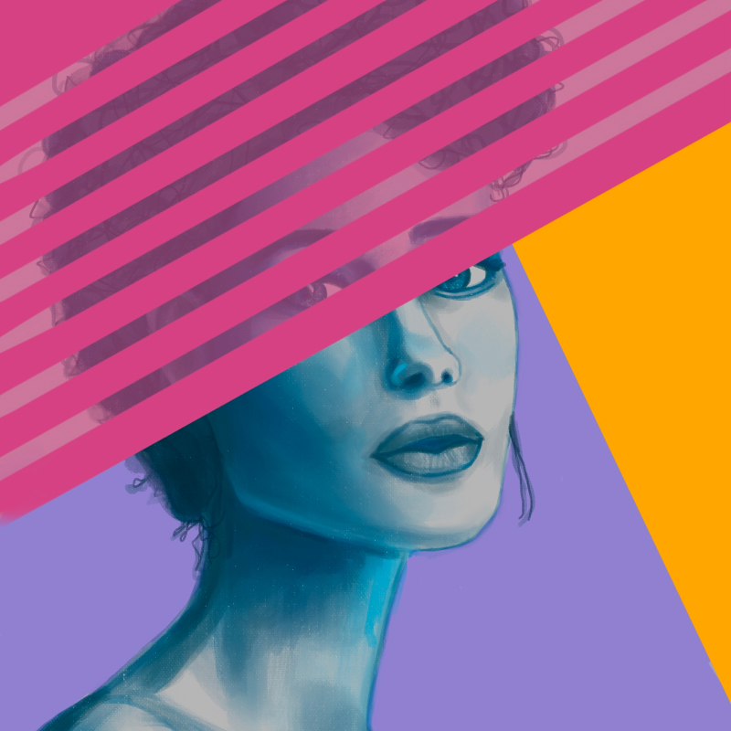
Personal ArtworkArtwork
Amazon Raise-Up BuildathonUX/UI Design Case Study
Project Giving KidsUX/UI Design Case Study
DeveloperWeek 2020 HackathonUX/UI Design Case Study
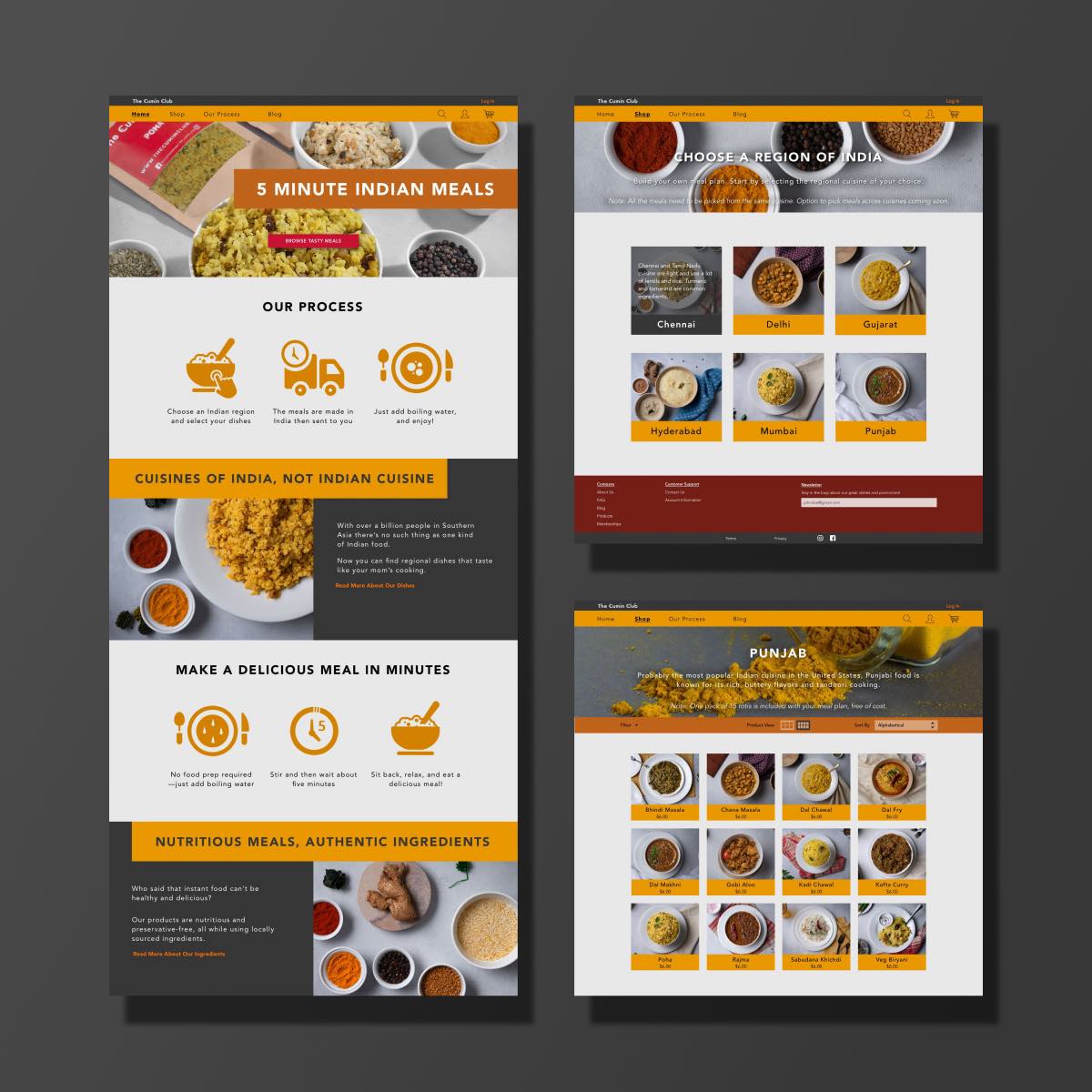
The Cumin ClubUX/UI Design Case Study