350NH
Client: 350NH
Services: UX/UI Design
Deliverables: Usability audit, user research, mockups, prototype
Date: April 2020 - Dec. 2020
SUMMARY
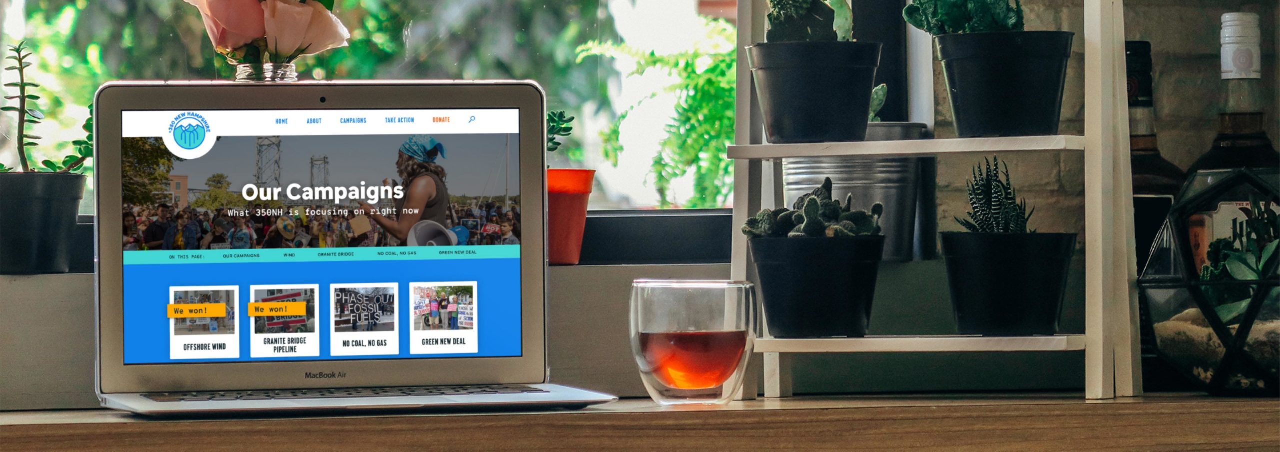
I completely redesigned the website of 350NH, a grassroots environmental nonprofit that is fighting climate change through state initiatives. In the process, I conducted a UX audit, analyzed competitors, administered user tests, and crafted high fidelity mockups and prototypes.
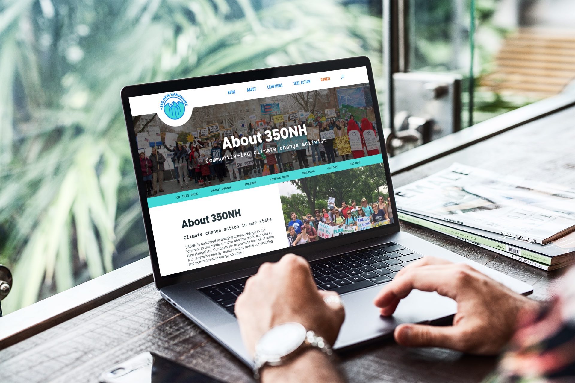
Some of the final high fidelity website screens
Background
Background
350NH is an environmental organization with the mission to “stop the climate crisis by building grassroots support for a just transition to renewable energy and an end to fossil fuel use and expansion.” It works with local communities in New Hampshire to promote state initiatives that fight climate change. It's a local and independent affiliate of 350.org, an international environmental organization that promotes an end to fossil fuel usage and a transition to renewable energy.
I reached out to 350NH via Catchafire, a website that connects volunteers with nonprofits to provide professional services. As an environmentalist from NH, I was eager to apply my UX/UI design skills towards the fight against climate change and help a local organization. 350NH was looking for someone who could help them with their website's visual design and design direction.
Problem
350NH’s original website had two UI issues that the organization wanted to solve through a redesign:
- Visual design: “While we have worked hard on the content of the web pages, they could be significantly more visually appealing.”
- Branding alignment: “Our website has the content it needs for people to learn more about us, but does not clearly follow our branding design.”
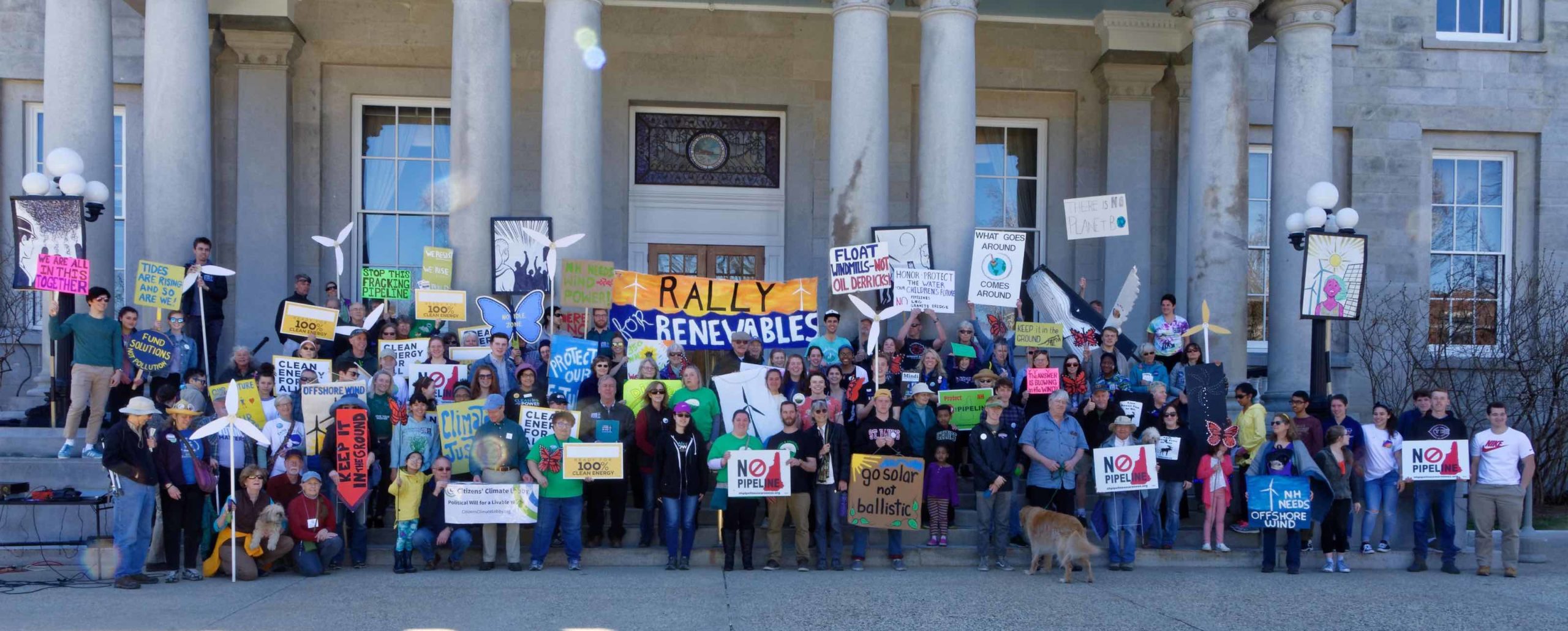
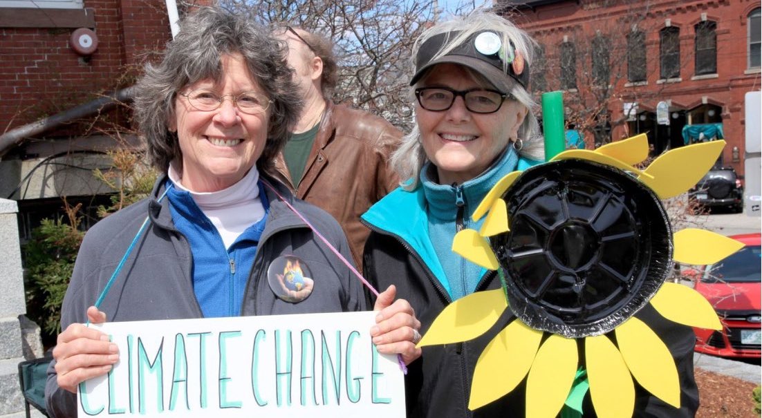
350NH renewable energy activism
Goals
Based on the issues that 350NH wanted to alleviate, the original goals of the project were to improve the visual design of the website and to align it to 350.org’s branding, its parent organization.
Additionally, some of the business goals related to the website were to:
- Increase conversions: petition signing and email newsletter sign ups
- Boost engagement: provide more information about campaigns and programs and get more volunteers involved
- Share updates: share 350NH stories and local environmental news
After conversations with the key stakeholders, I wanted to do some preliminary user research and a UX audit to identify areas of improvement for the UX that could be addressed in the redesign.
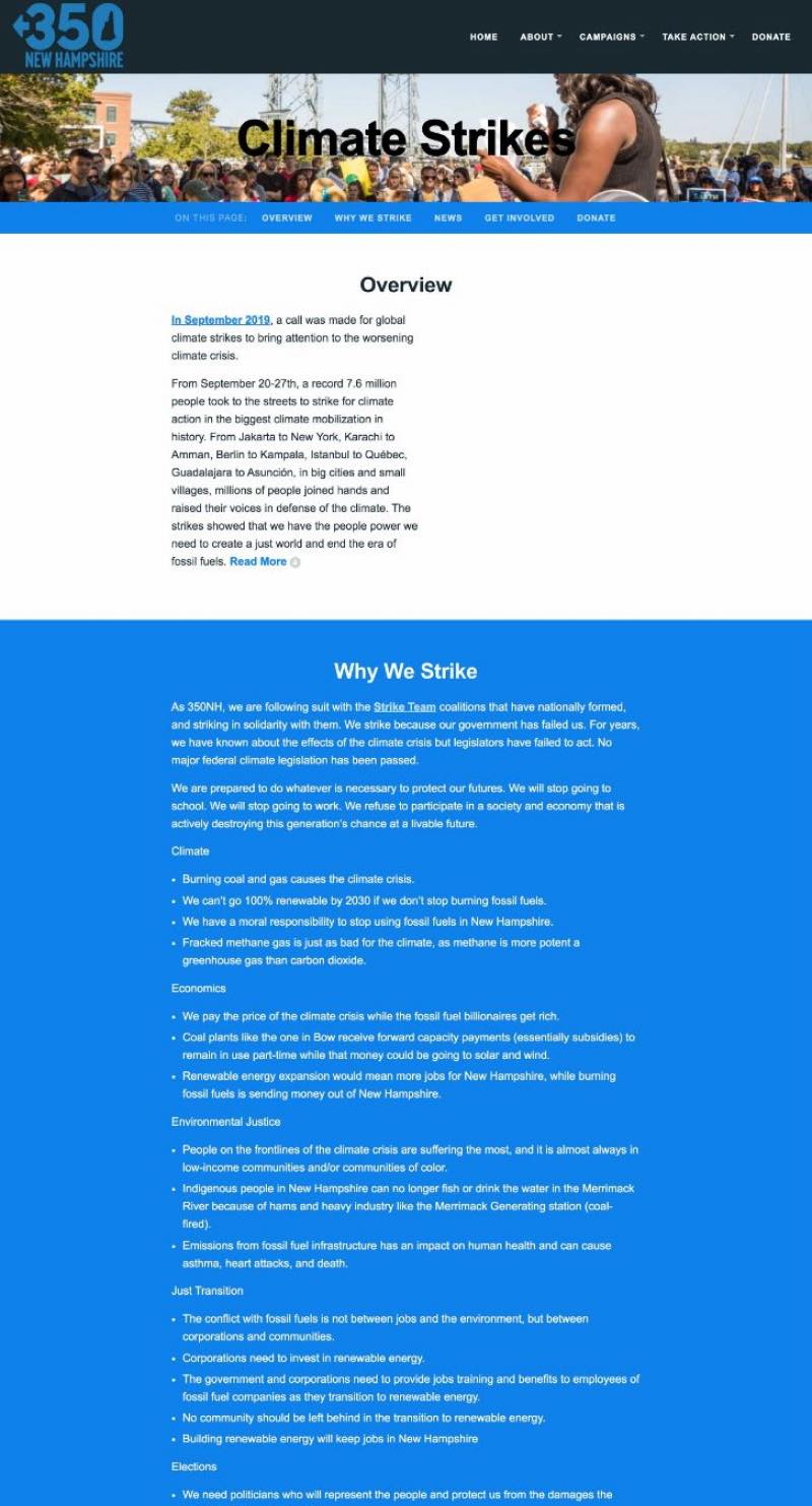
Some of the pages of the original 350NH website (before the redesign)
UX/UI Audit
I began the project by doing an informal UX/UI audit of the website. I didn’t have access to the website analytics, but I focused on evaluating the website by examining these key parts and asking the following questions:
- Homepage: What’s the first impression of the site? Does 350NH’s homepage clearly convey what this nonprofit does and what users can do on this website?
- Main user tasks: Outlining key tasks based on business and assumed user goals, how can these tasks be achieved? What was the user flow to get from the homepage to the end goal?
- Navigation & Information Architecture: What are the primary and secondary pages and how are these organized? Based on the main user flows, how did the navigation support users?
- Main webpages: Do these pages meet the main objects and needs of this page (for example, does the “Who we are” page explain what the nonprofit is)? What are the first impressions?
- Accessibility: Does the website meet basic accessibility guidelines?
- Visual design & layout: What’s a summary on the UI?
This gave me a good starting point on areas that were working well or areas of the website that needed to be improved in the redesign.
Some takeaways from the audit that I wanted to apply to future design decisions included:
- Homepage: Make it more clear what the organization is; add a prominent CTA above the fold.
- Take Action page: Needs information on how to get involved and CTAs.
- Visual design: Consistency and cohesion in visual design; text contrast for accessibility.
- Content overload: Reducing text density and the overload of information.
- Landing pages: Add landing pages to all the primary nav items.
User Research
I gathered user data directly from users themselves. I sent out a survey to better understand who our users were and gather qualitative data about their opinions of the site. I also conducted user interviews and usability tests of the original website to evaluate the usability of the site and identify user pain points.
350NH Users
Based on the surveys sent out, 350NH users were predominantly retired females between 55 and 70 living in southeastern NH. Most users used 350NH primarily for the event calendar, organization updates, and petitions.
The common user pain points expressed in the interviews and testing were that the homepage was disorganized, there was too much text to read, and there was a desire for more imagery.
Competitive Analysis
As with all design projects I work on, I researched direct and indirect “competitors.” I examined the websites of other environmental nonprofits: 350.org, Sunrise Movement, Greenpeace, The Climate Group, Sierra Club, and The Nature Conservancy. I also looked at some other local 350 affiliates, such as 350 Bay Area and 350 PDX, to get a sense of how other local 350 organizations designed their websites. Additionally, I assessed 3 websites that the client expressed they liked: NY Youth Movement, Movimiento Cosecha, and City Year.
Looking at these websites, I analyzed the UI, the UX, and the website’s features and compiled a list of shared design patterns and key takeaways to apply in 350NH’s redesign. I particularly focused on how the websites presented volunteer information, sign up forms, campaigns/petitions, and organization updates/news.
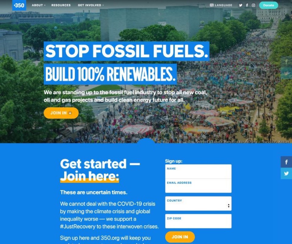
350.org
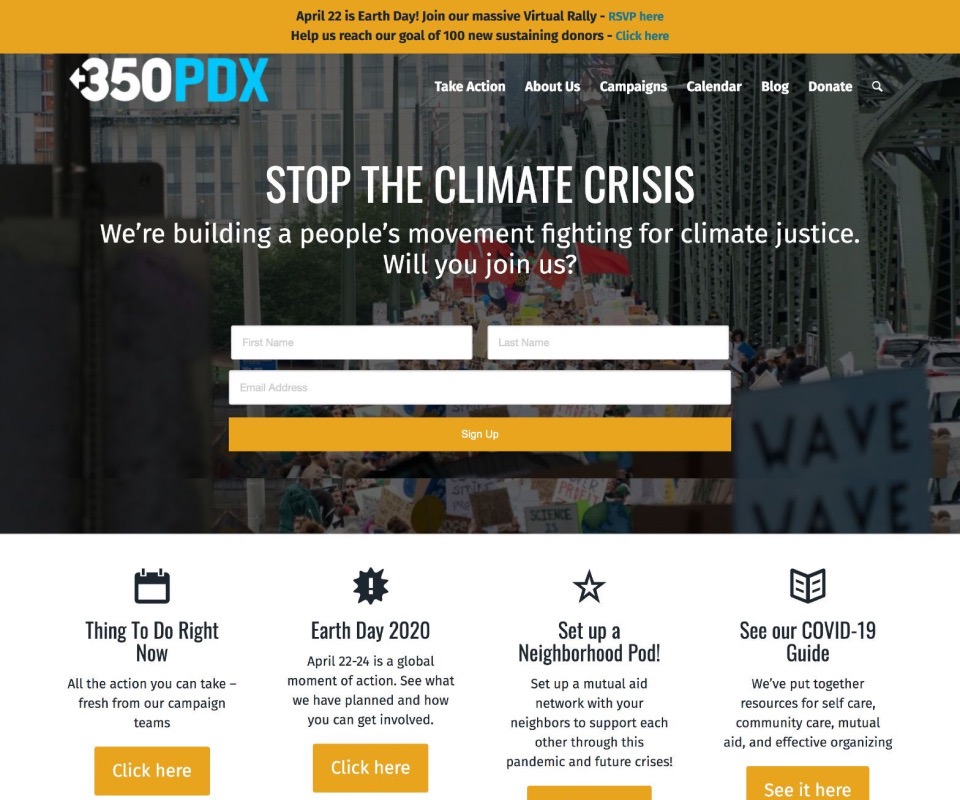
350 PDX
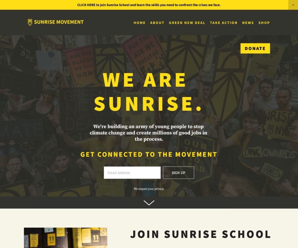
Sunrise Movement
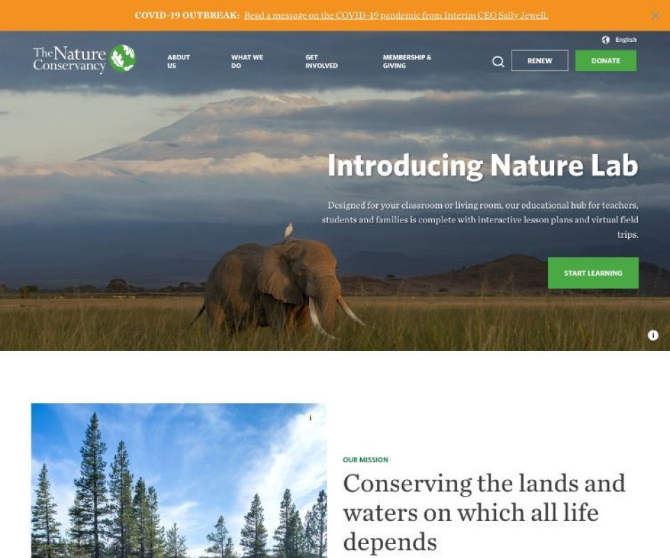
Nature Conservancy
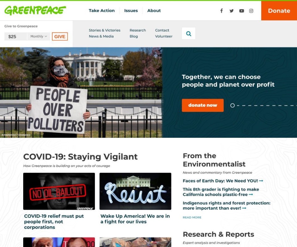
Greenpeace
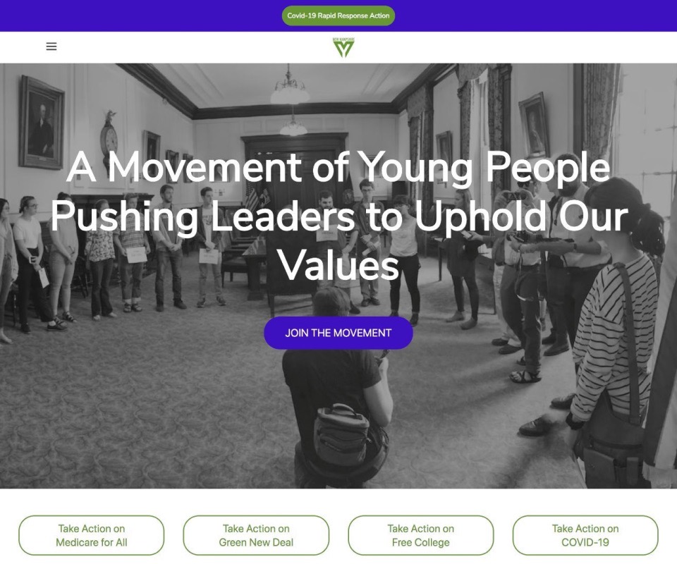
NH Youth Movement
Ideation & Wireframes
Having conducted the preliminary research and gained an understanding of the user, goals, and our competitors, I was able to start ideating the features and UI. Before creating medium-fidelity wireframes in Figma, I always sketch out ideas on paper to explore different ideas, layouts, and interactions.
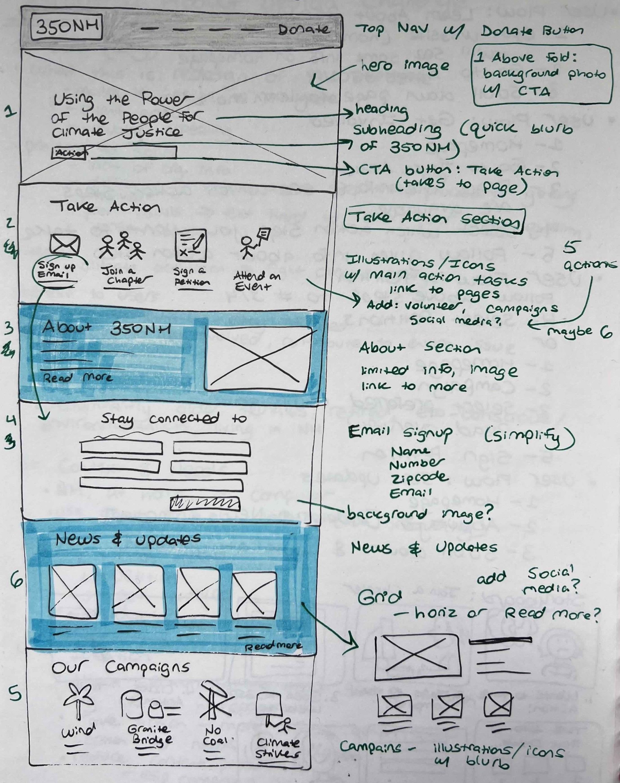
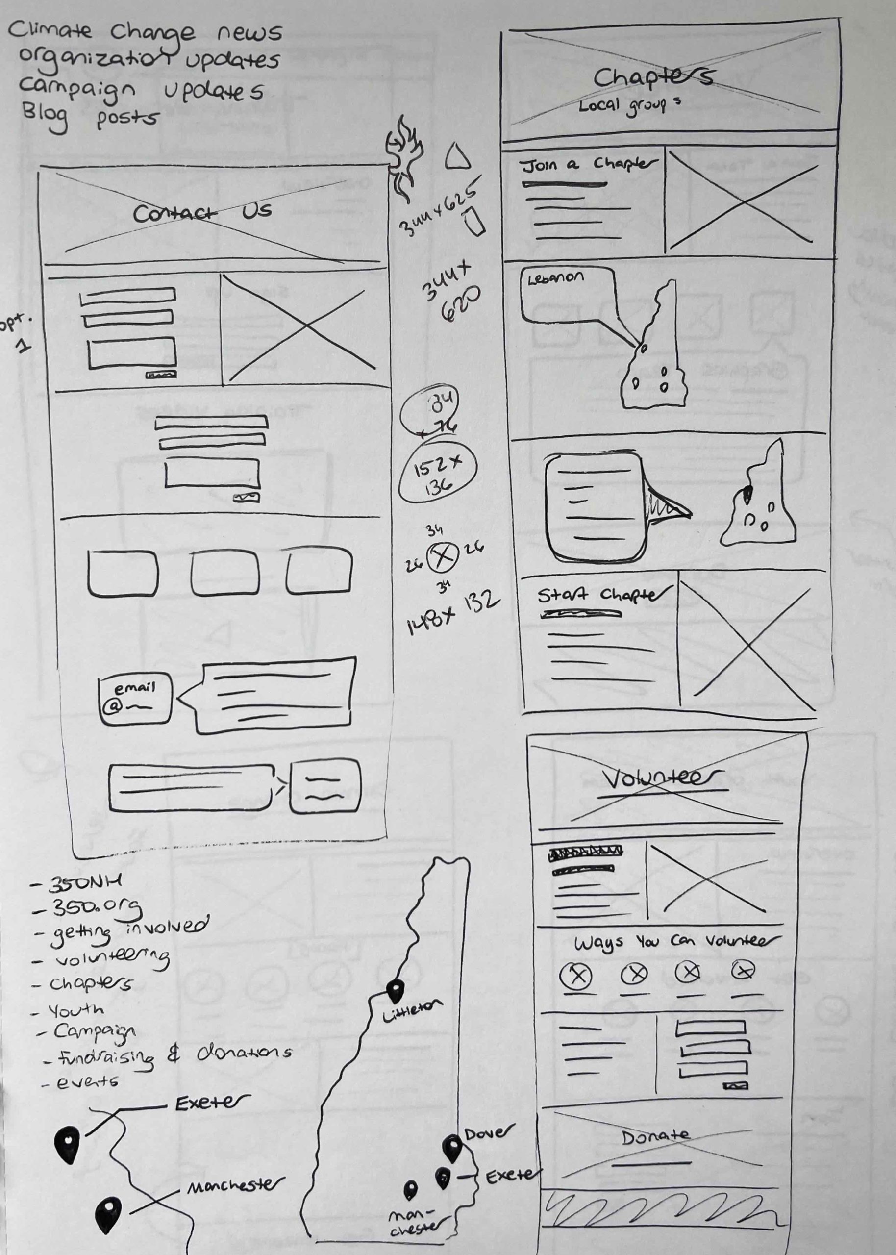
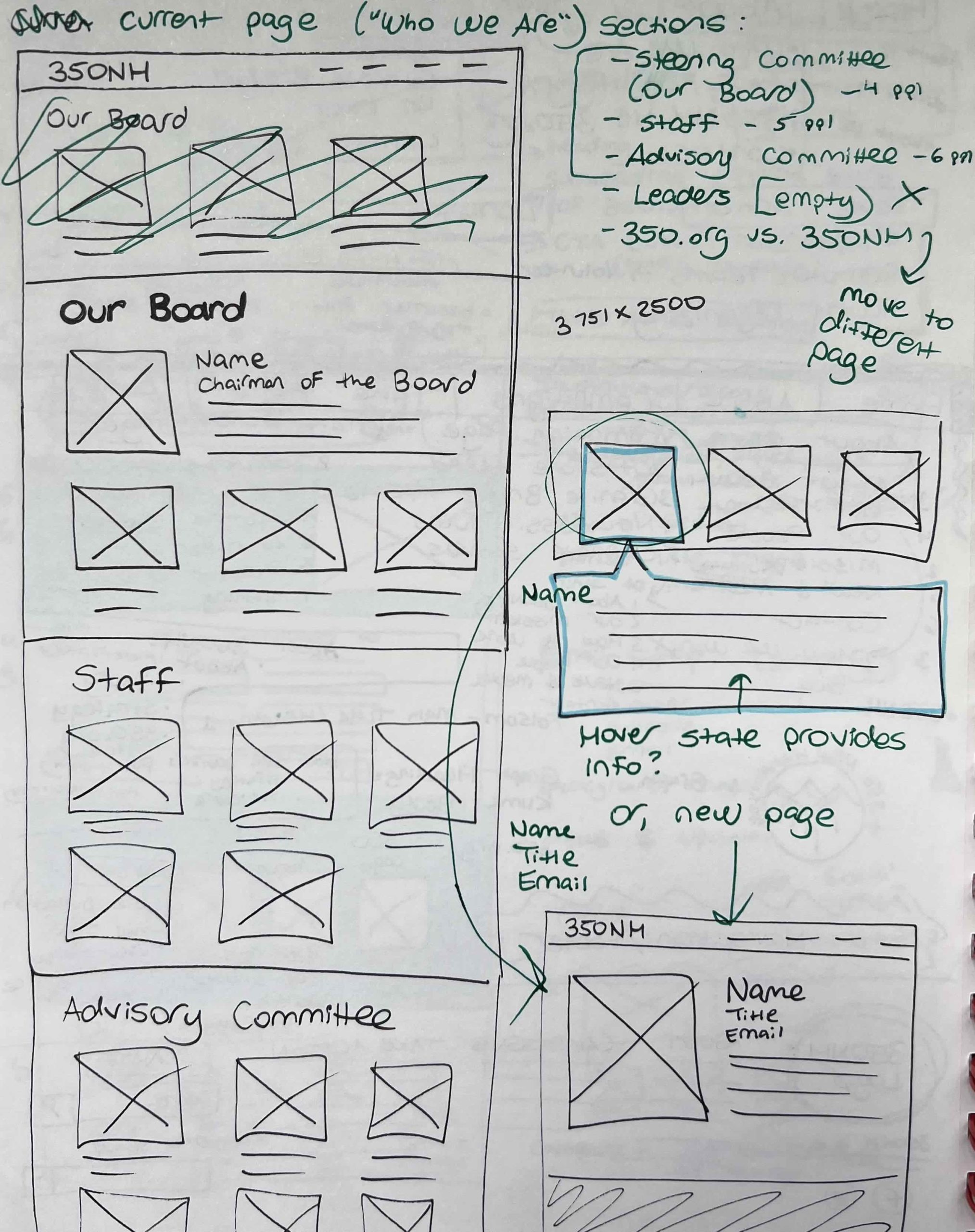
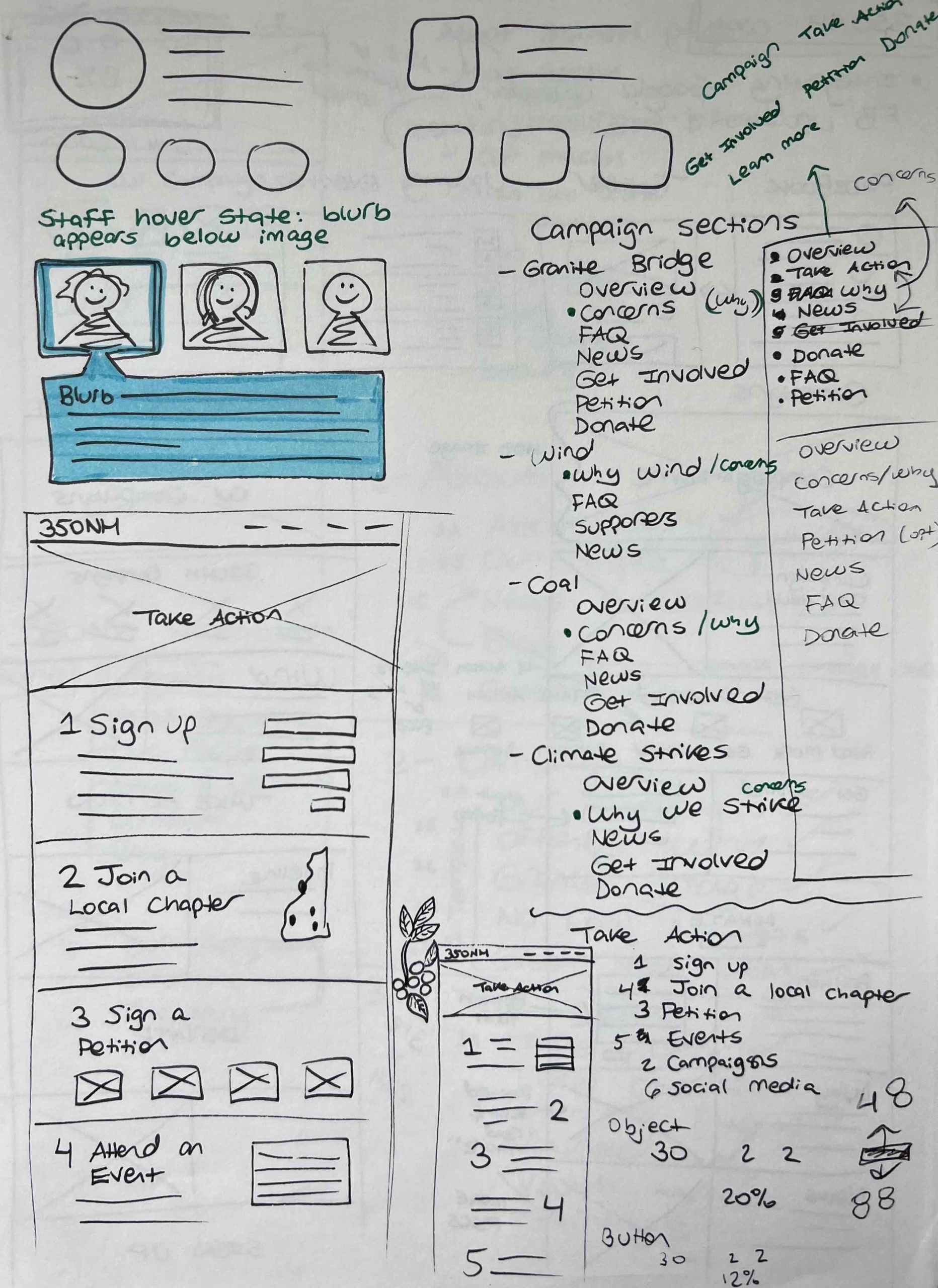
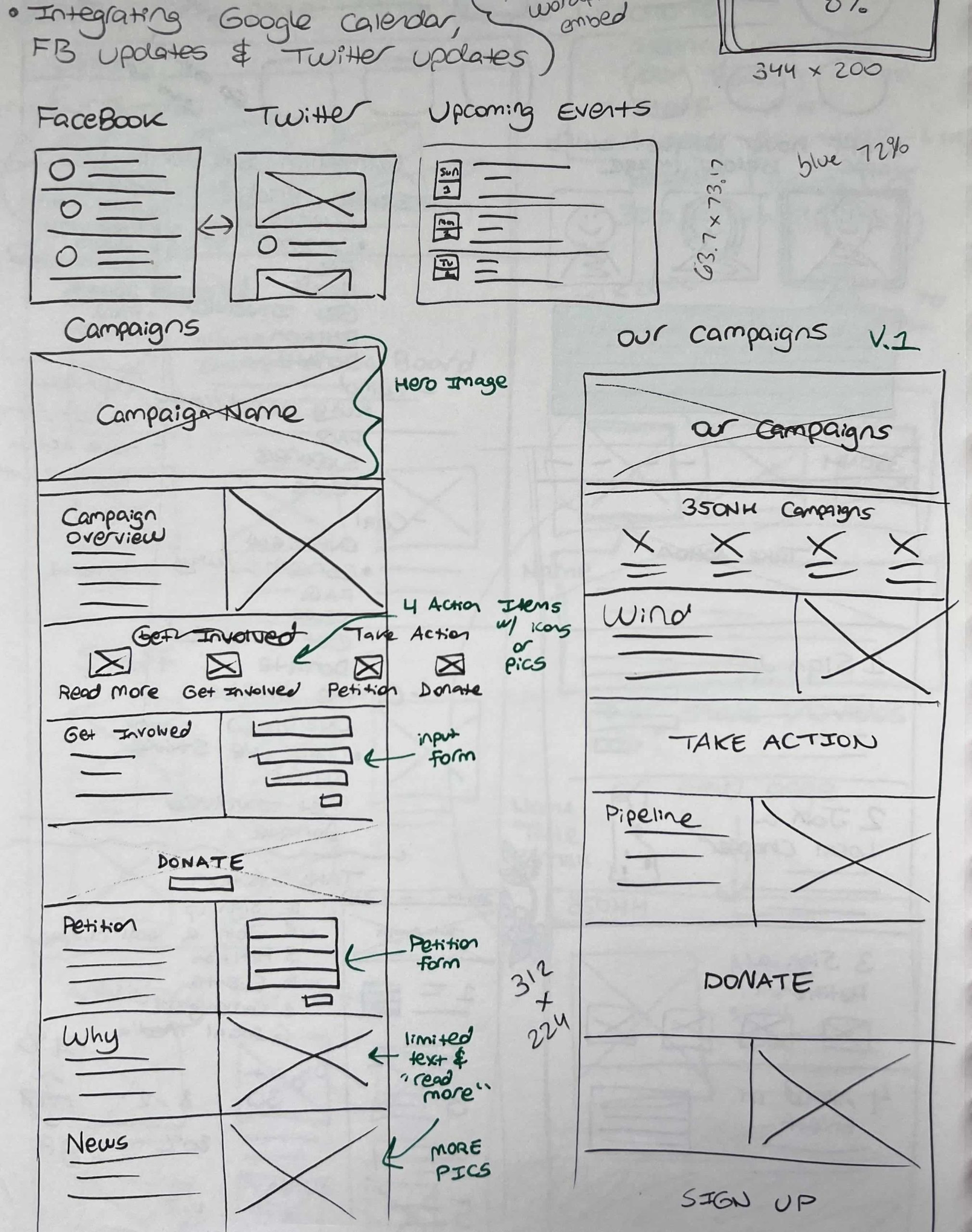
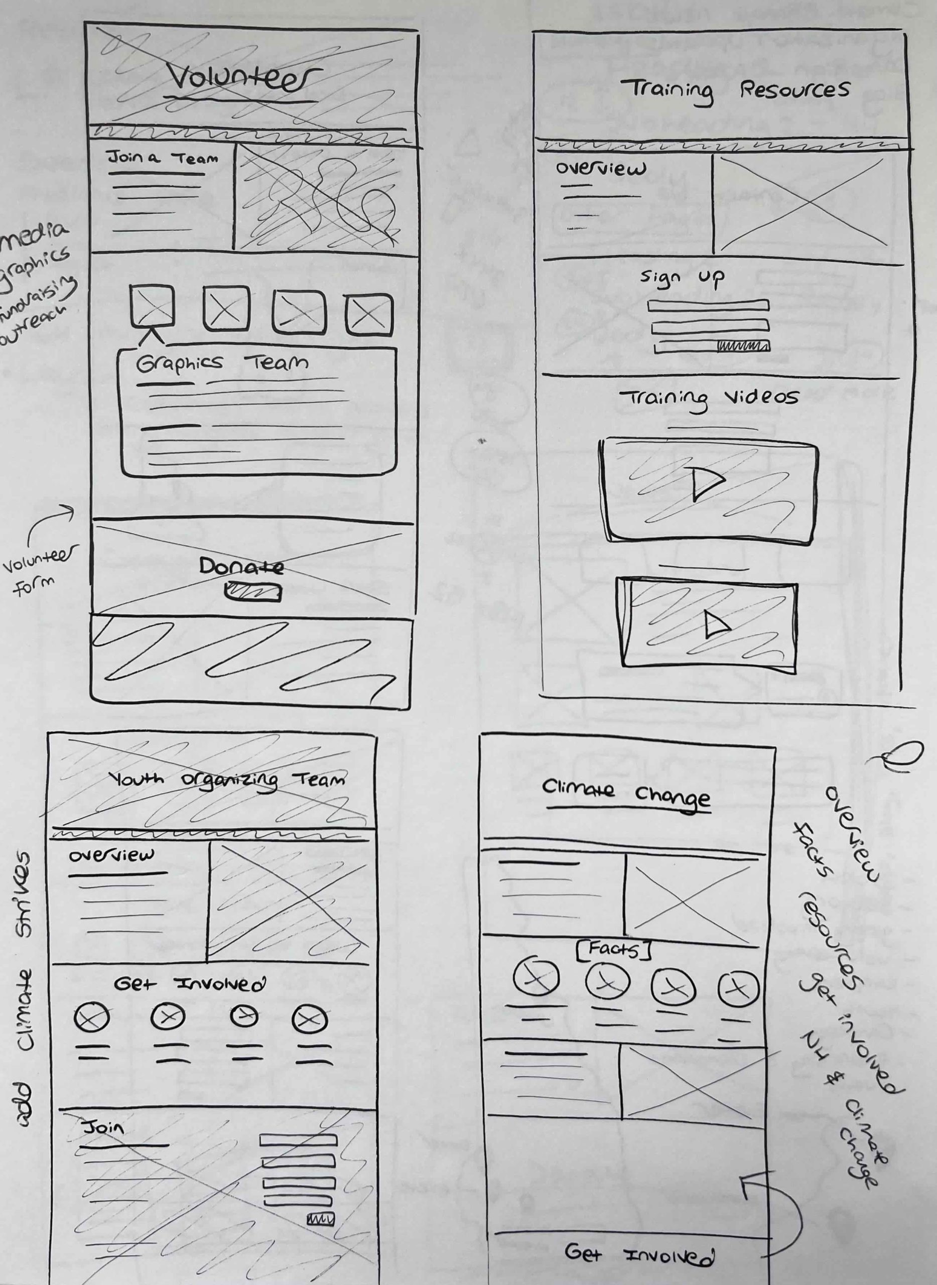
Some of my 350NH sketches and notes
While wireframing, I explored how to reduce the content overload and organize the large amount of website information through chunking, reducing the amount of content being displayed with show/hide elements, segmenting sections and pages, increasing whitespace, and numerical steps for user actions.
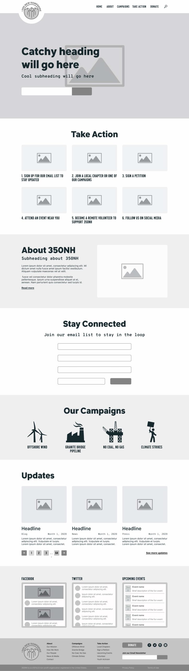
Homepage wireframe
Campaign page wireframe

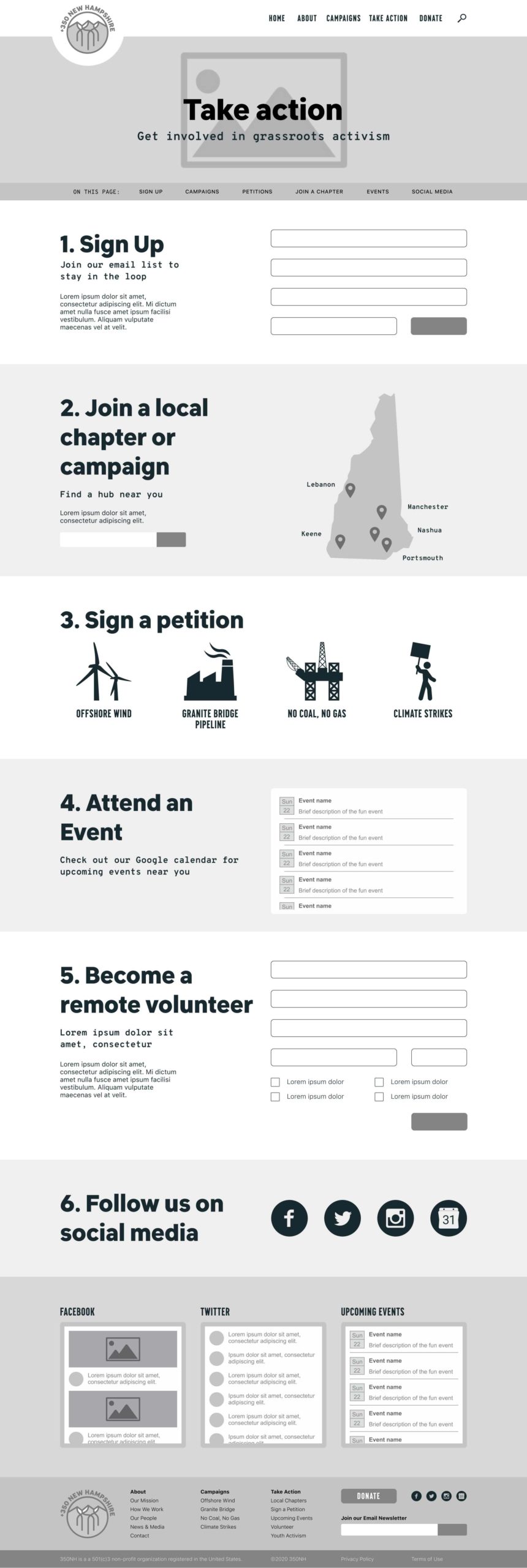
Take Action page wireframe
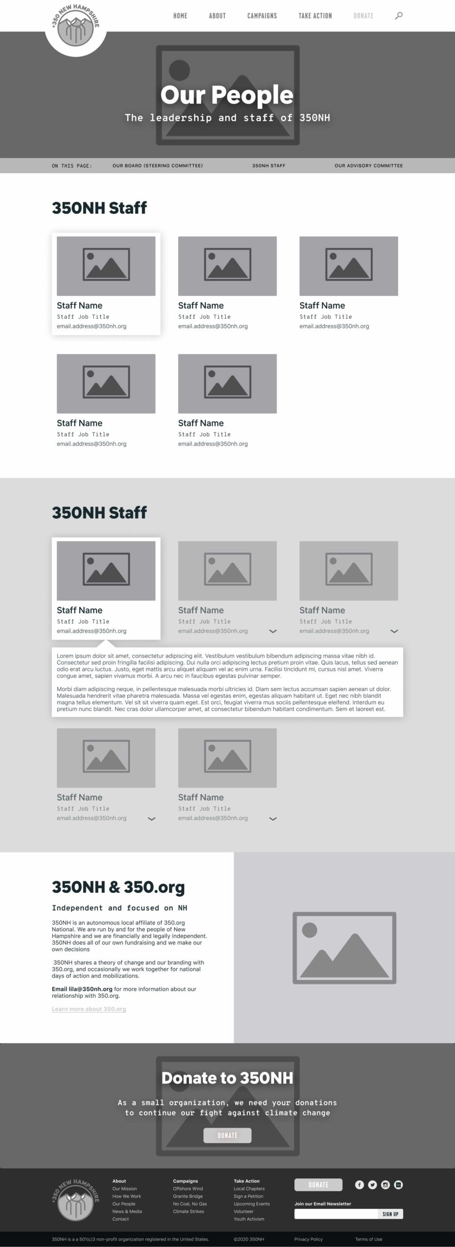
Our People page wireframe
Solution
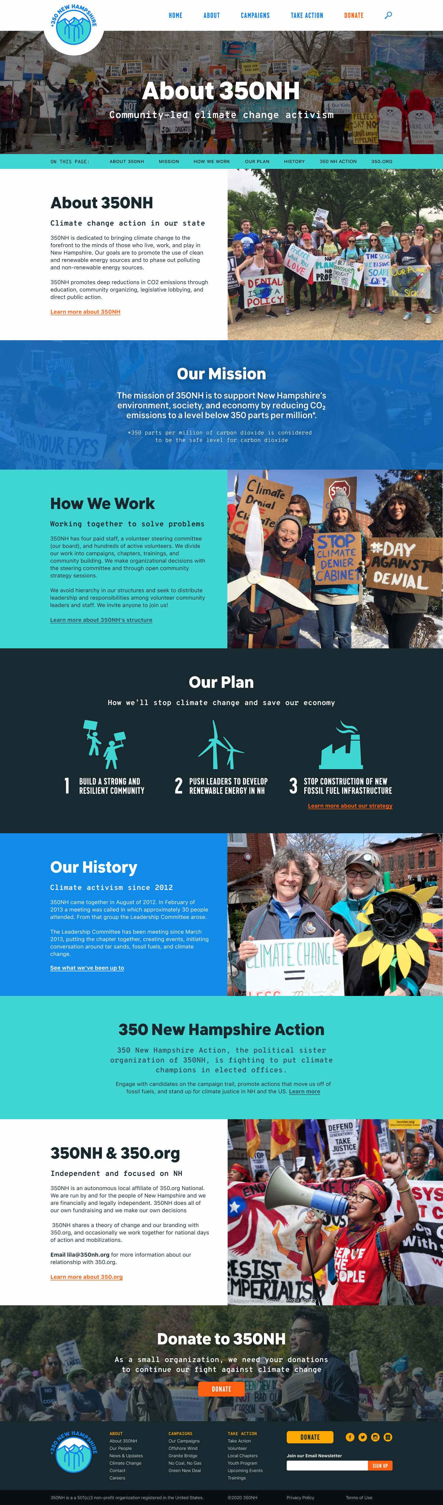
Based on the overarching goals that 350NH wanted to achieve through the redesign, the updated website was aligned to the branding of 350.org and overall had an improved visual design.
Some of the other solutions are discussed below:
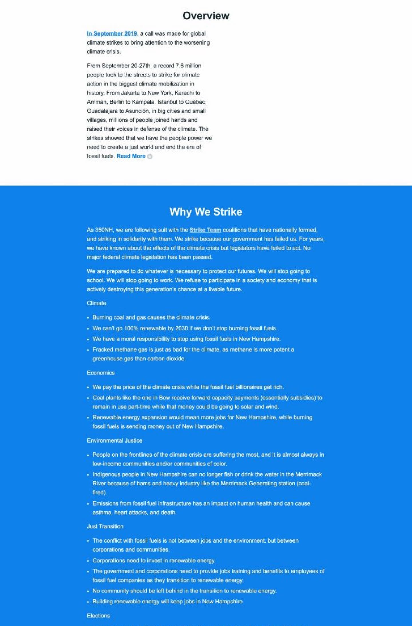
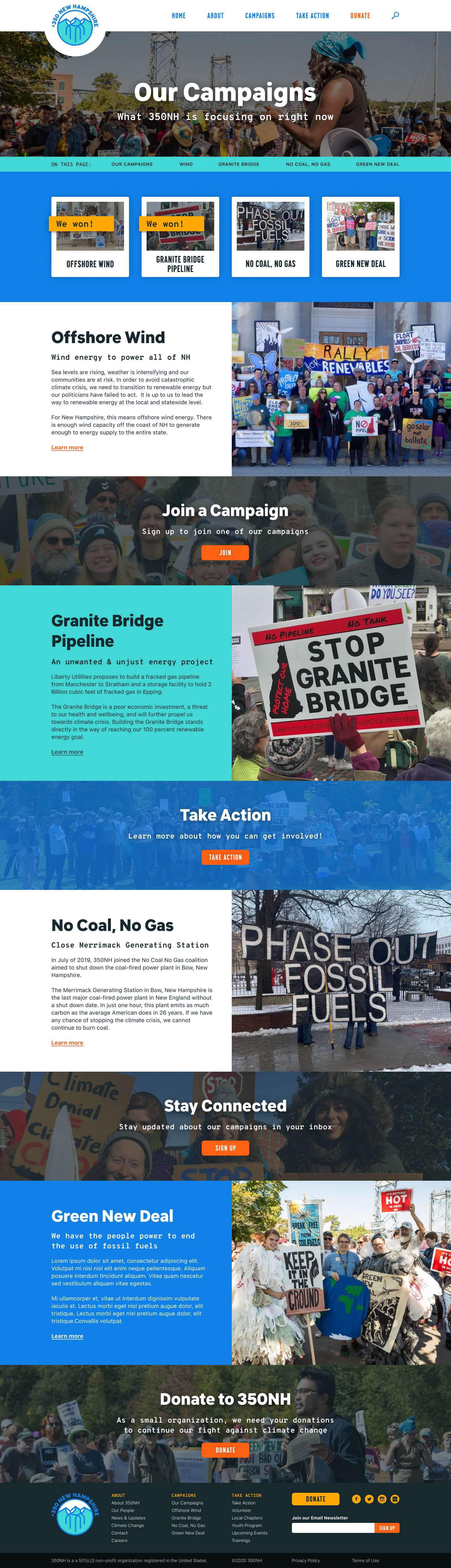
An original campaign page with long blocks of text and limited imagery
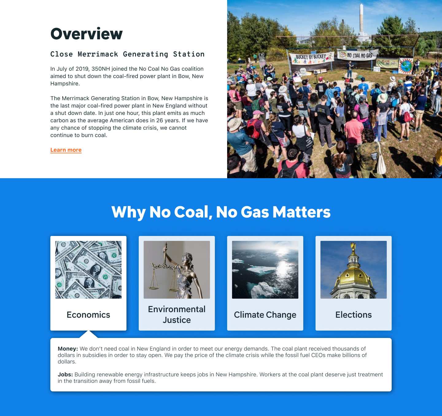
Updated campaign page sections, demonstrating chunking and hidden text
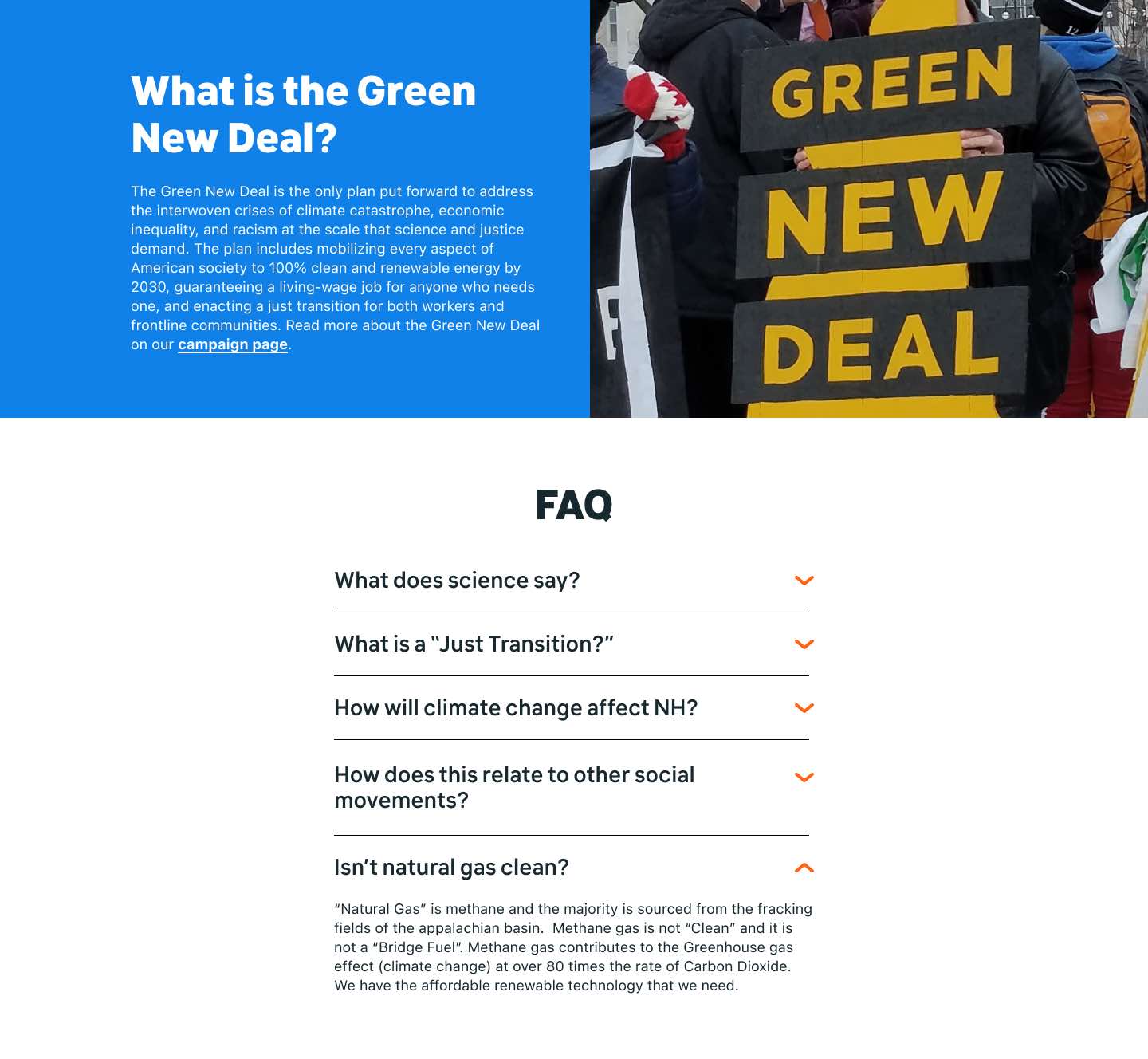
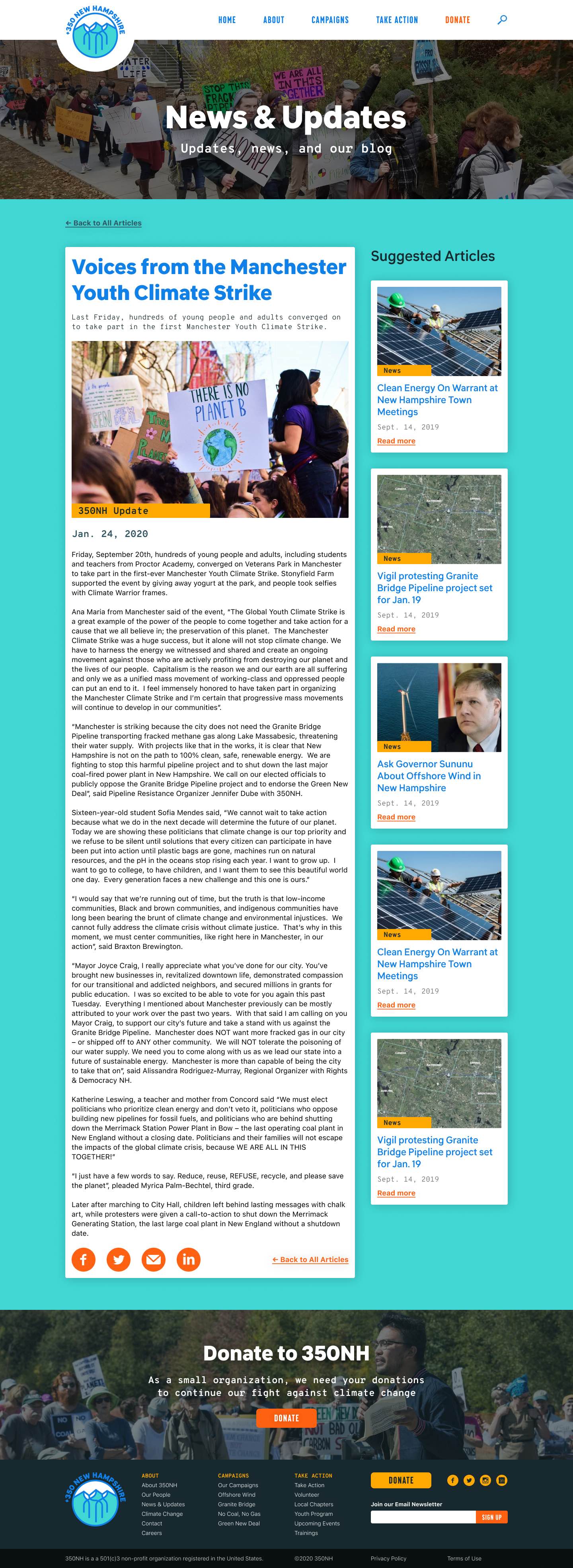
Minimizing Content Overload: Chunking was introduced throughout the website to make it easier to read large amounts of information.
Extra details of large amounts of information were moved into tertiary pages that were accessed from "Learn more" links on the primary and secondary pages.
Less important text was hidden to reduce long pages of text. Users could open them to read them, such as FAQ answer dropdowns.
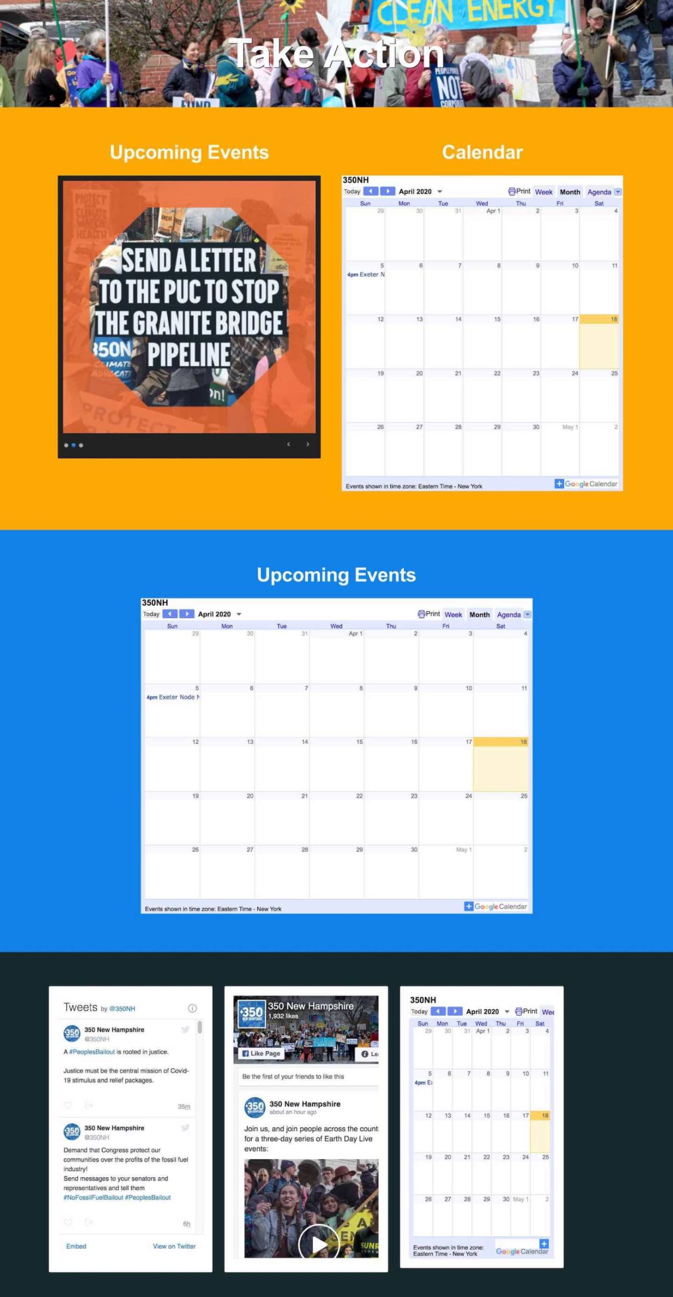
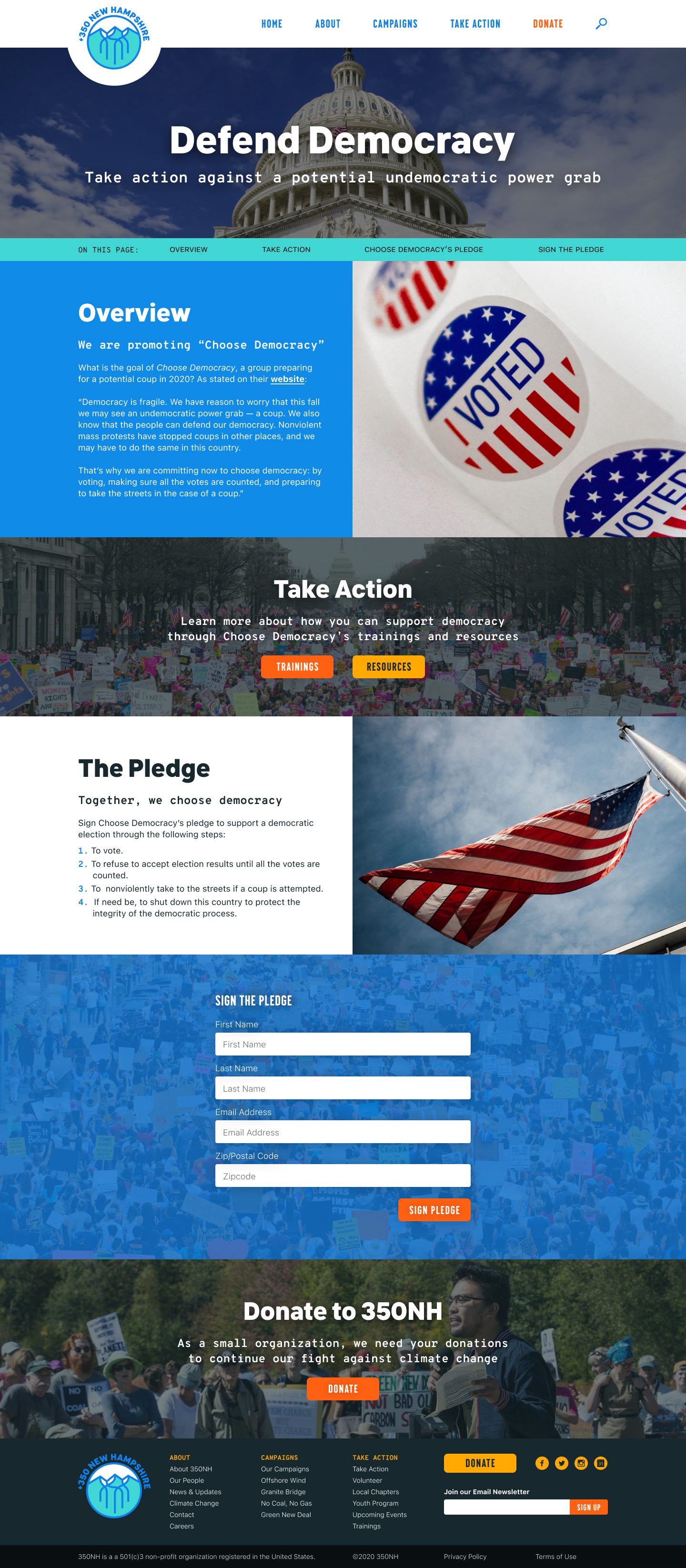
The original "Take Action" page didn't provide information about how users could get involved
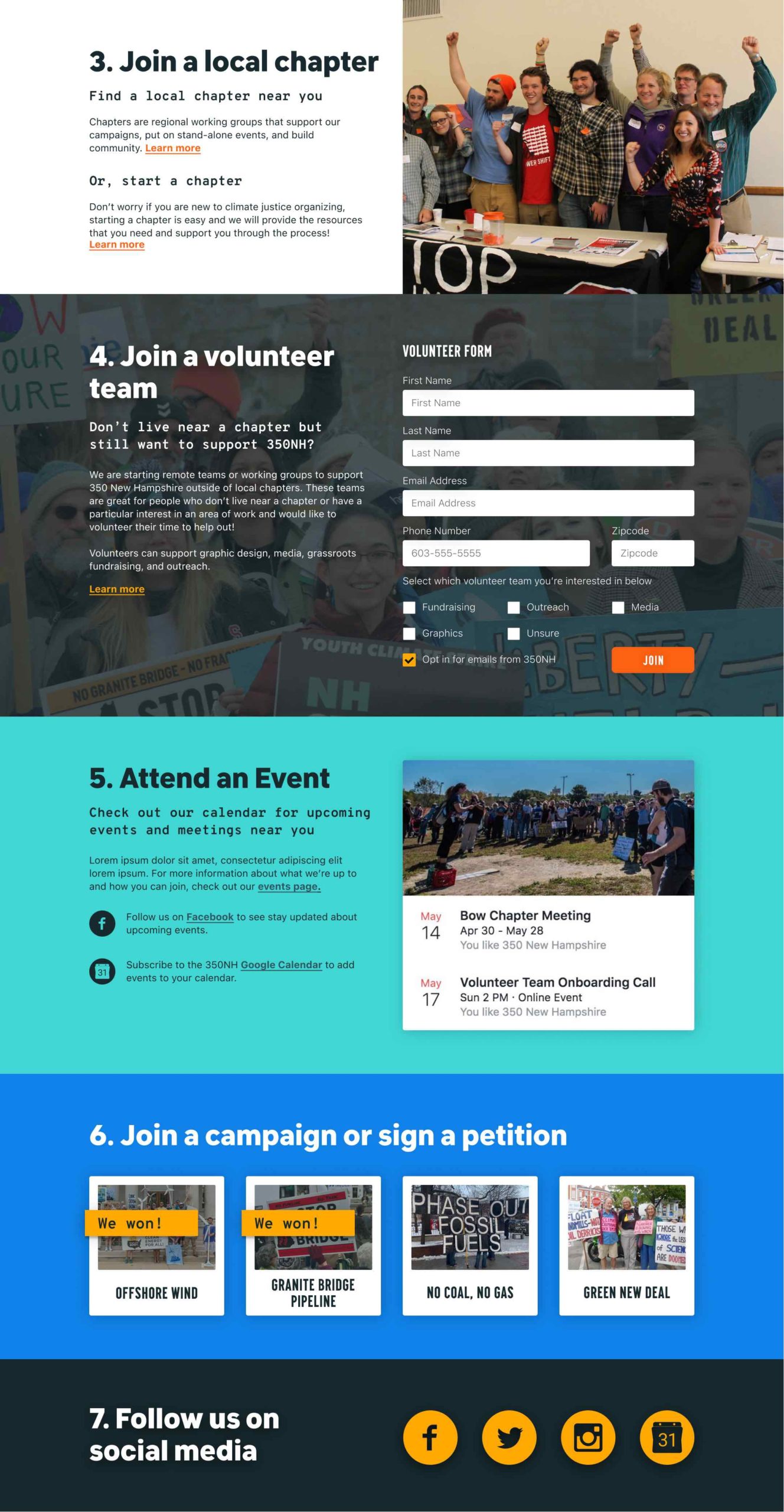
The updated "Take Action" page laid out info and clear steps that users could take to get involved
Supporting Users' Goals: The "Take Action" page was updated to provide clear steps that users could take to engage with 350NH, with corresponding CTAs that brought them to forms or secondary pages with additional information.
The secondary "Take Action" pages were expanded and separated so that it was easier for users to accomplish their main goal of finding information about how they could get involved.
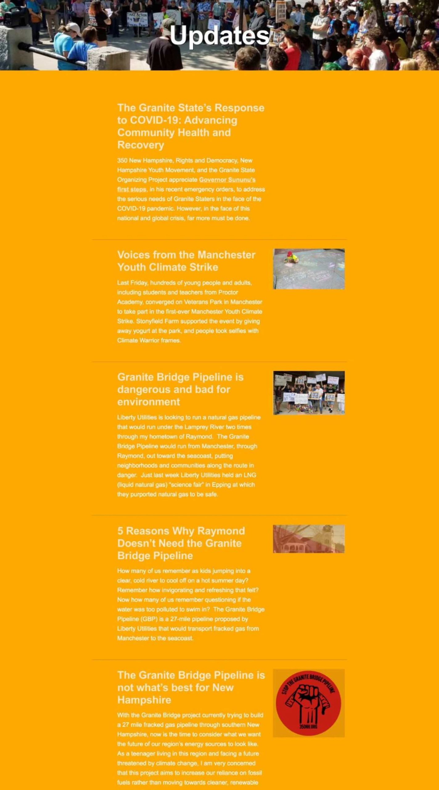
The original website wasn't accessible, such as limited text contrast on this Updates section
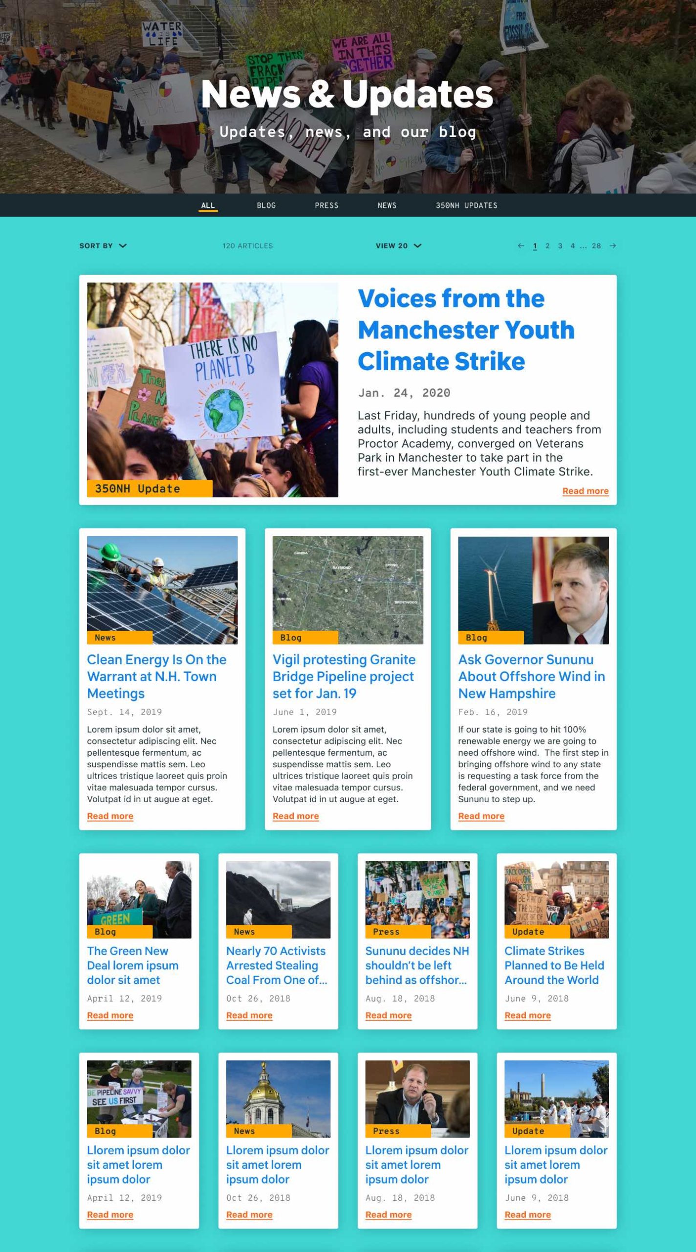
The updated website was more accessible and featured text contrast
Improved Accessibility: The usage of colors was adjusted so that there was more contrast for text. The yellow-orange color was removed as a background color and white text was only used on dark gray and blue backgrounds.

The original top navigation bar's "Donate" CTA had the same white text color as the other links

The updated top navigation bar's "Donate" CTA used a different color from the other links
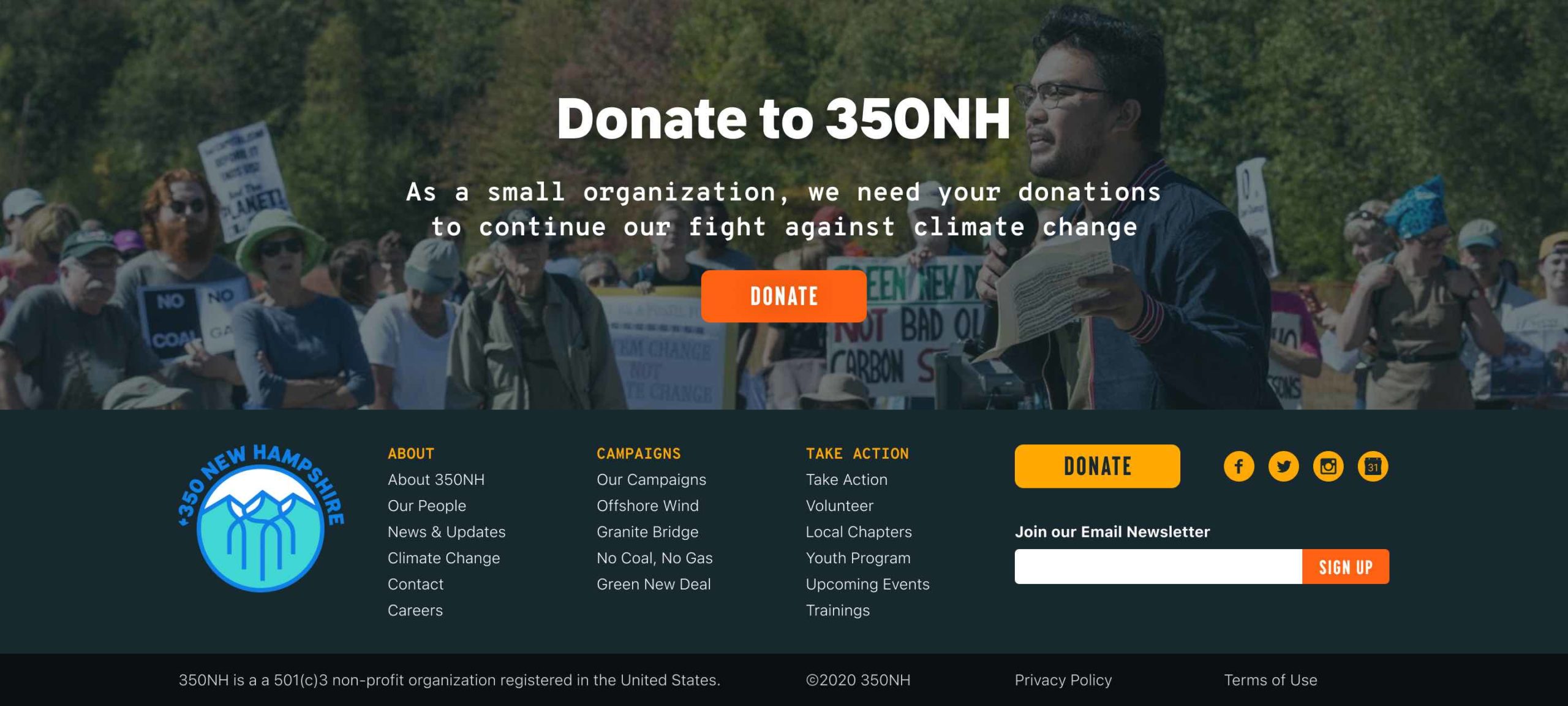
Donate CTAs were now featured on the bottom of the webpage, as shown above
Increasing Donation Conversion: The original navigation bar had a "Donate" CTA that blended in with the other primary links and didn't stick out. The updated "Donate" button was made more prominent on the updated navigation bar.
Additionally, a "Donate to 350NH" prefooter section and CTA was added at the bottom of all 350NH pages, above the footer, to encourage people to donate after they read the webpage. The footer itself has a "Donate" CTA that was given greater visual emphasis than the other footer links.

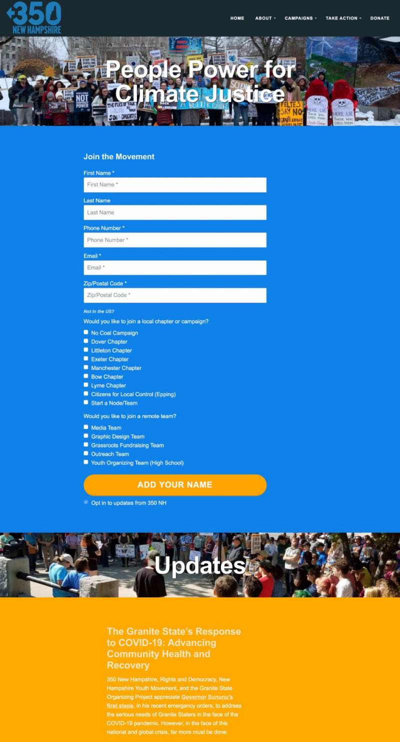
The original homepage didn't clearly explain what 350NH is and lacked a CTA above the fold
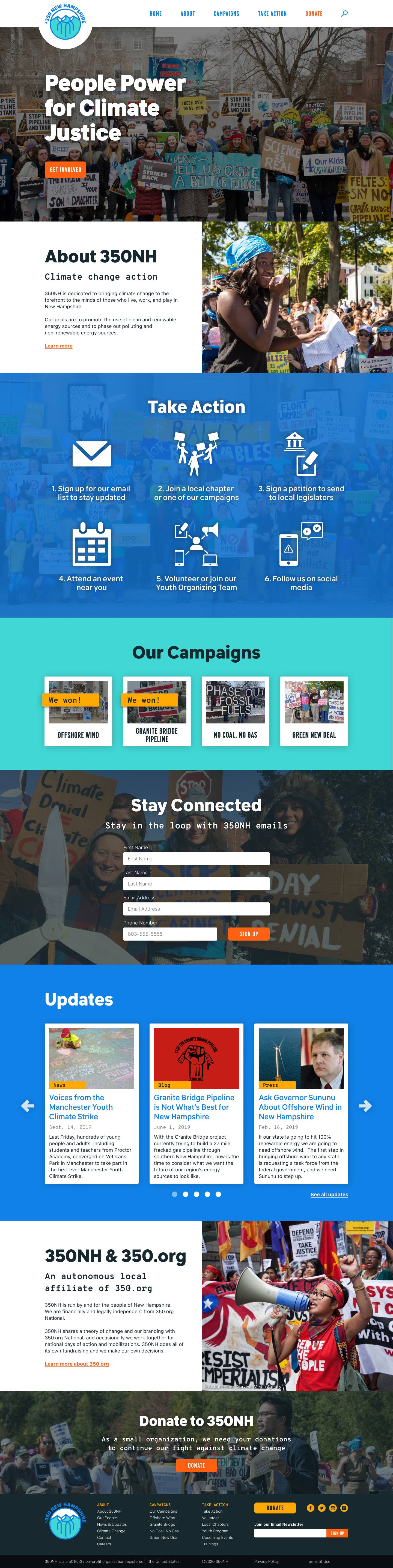
The updated homepage provided more information while being more organized
Making the Homepage More Effective: The homepage was modified in an effort to better inform new visitors about what 350NH is and provide ways for users to take action.
Changes included:
- Adding a CTA above the fold so users have the ability to immediately get involved
- Providing an overview of the nonprofit immediately below the fold so that users understand what the organization is on the homepage itself
- Condensing the lengthy sections so it's easier to take in information and scroll down
- Displaying key information on the homepage so users don't have to look for it
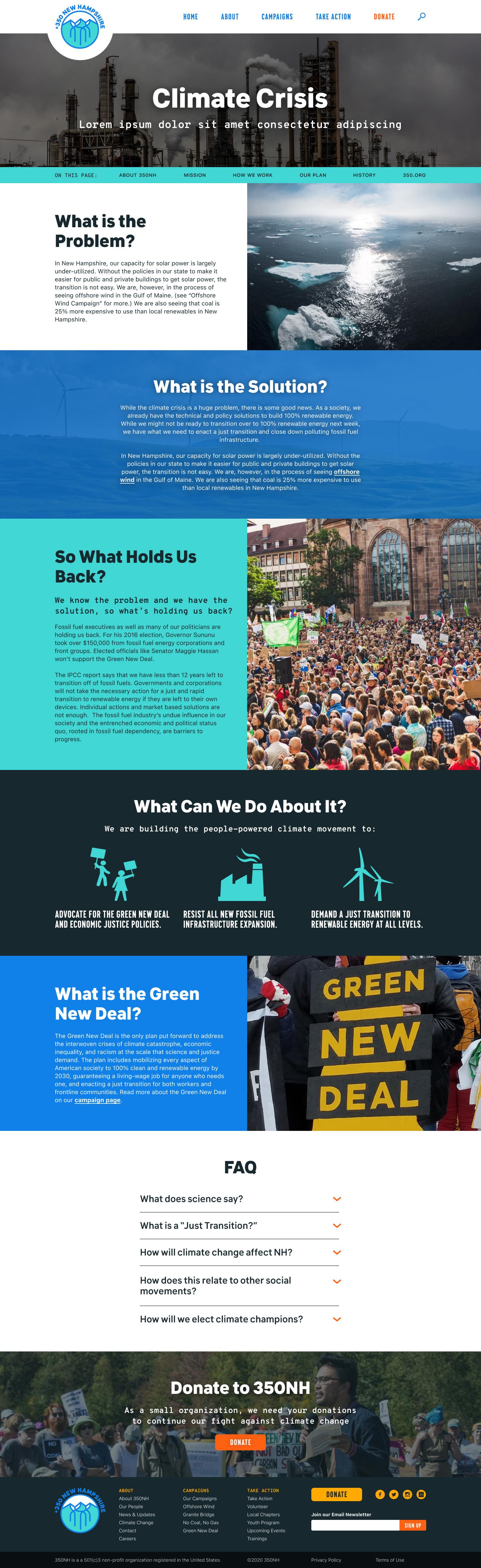
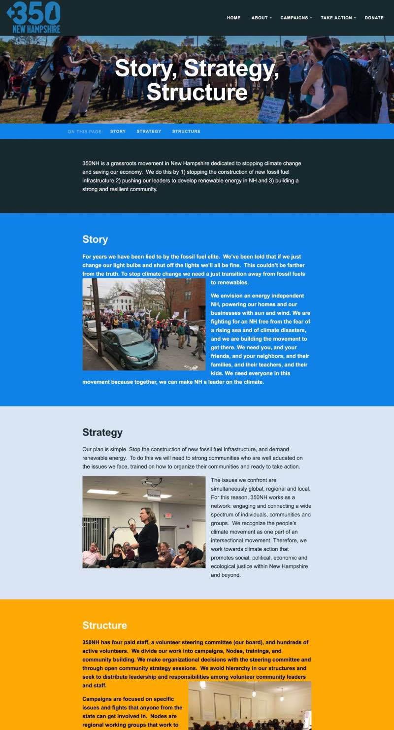
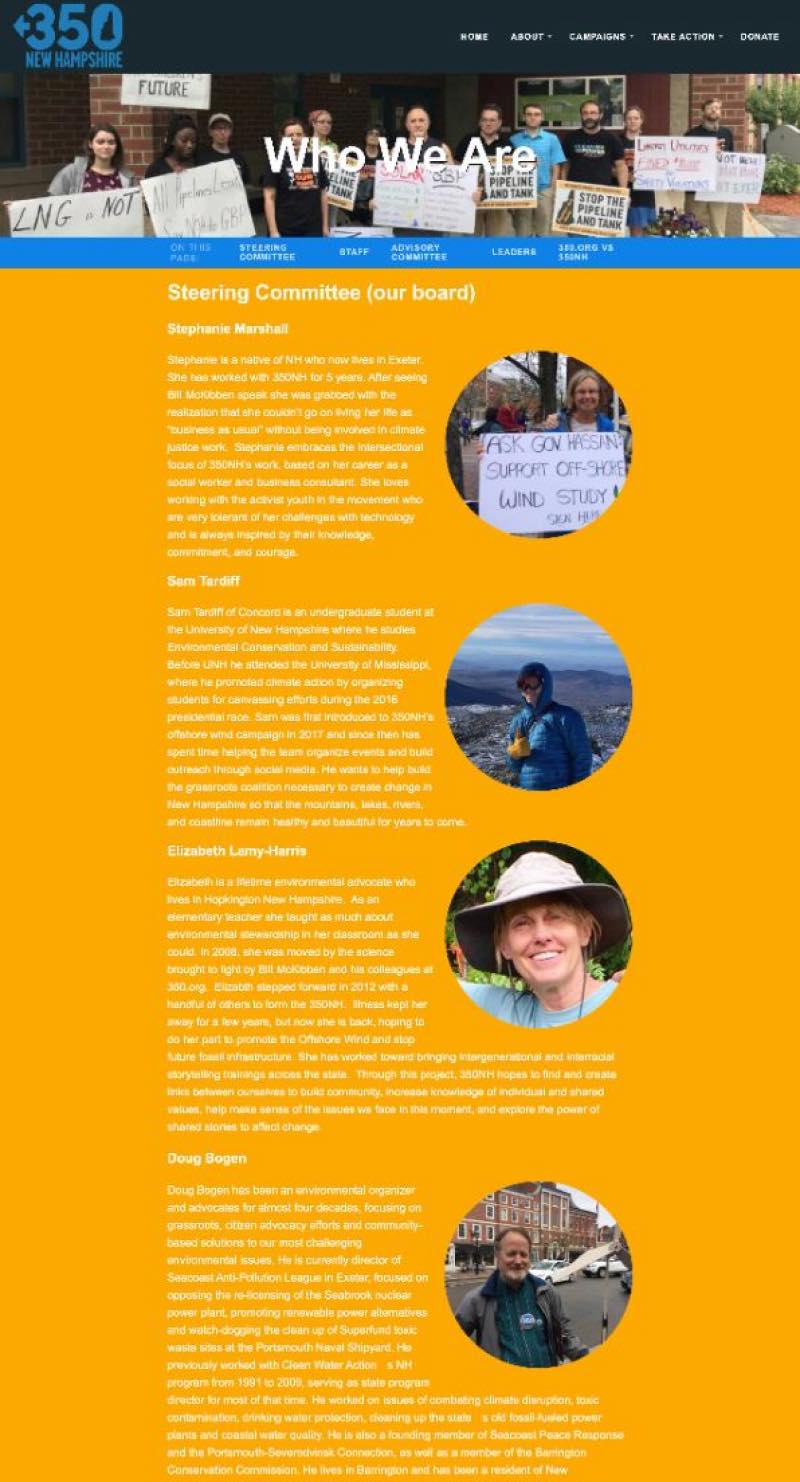
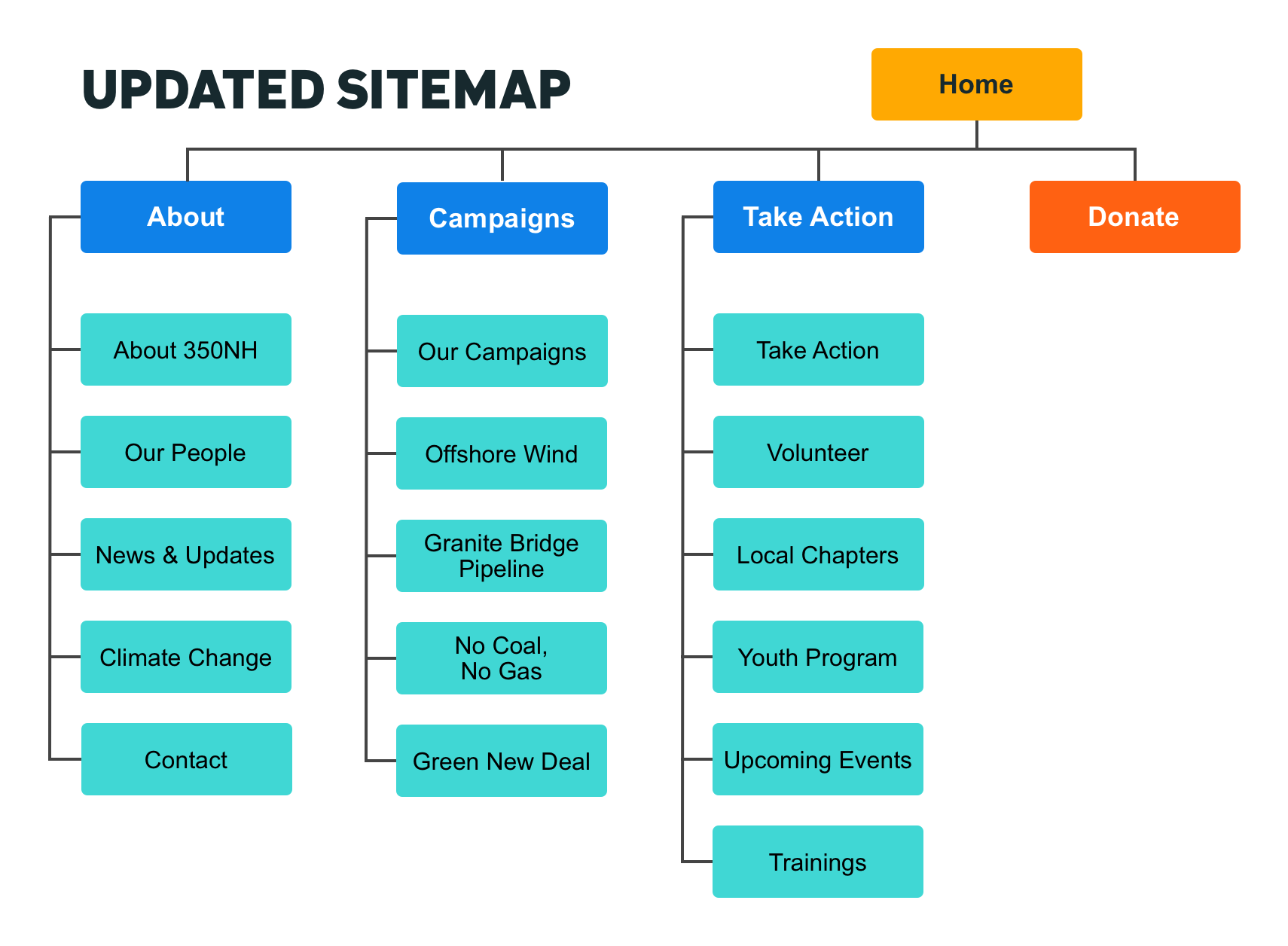
Updated Sitemap: The sitemap was updated to organize the content, add new pages, and clarify page content through updated page titles. “Story, Strategy, Structure” and “350NH and 350.org” were merged into “About 350NH” to make it more clear that this was a page where users could access information about the nonprofit. “Who We Are” became “Our People” to make it clear to users that this page was about the team, not the organization itself. When conducting the competitive analysis, I examined all of the sitemaps and primary nav link titles to see how other environmental websites organized their main pages; this provided a lot of inspiration on how to organize 350NH's sitemap.
Addition of Footer: The original 350NH website didn't have a footer. A footer was added to ensure that users could effectively and easily navigate to other parts of the website after they scrolled down a page.
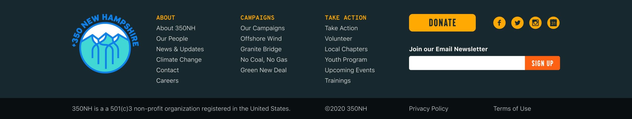
Updated Navigation Bar: While the primary navigation stayed the same, the visual design of the nav bar was updated to incorporate a new logo and to emphasize the Donate CTA. A user sees a microinteraction when they scroll down the page; the logo decreases in size when they scroll below the fold.
Above: the original navigation bar with the old 350NH logo

Above and below: the updated navigation bar; the bottom one depicts how the nav bar appears when a user scrolls down

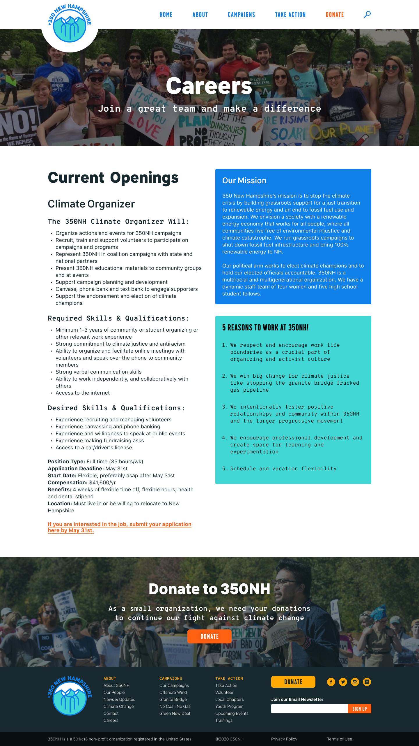
More high fidelity mockups of the updated 350NH website
Next Steps
Next steps for the 350NH redesign include measuring the success of the website through surveys that gather qualitative data and usability tests that measure the speed and ease of accomplishing user tasks.
Although 350NH users predominantly user computers or tablets for accessing the website, mobile responsiveness needs to be further explored in further iterations.
Other Design Projects
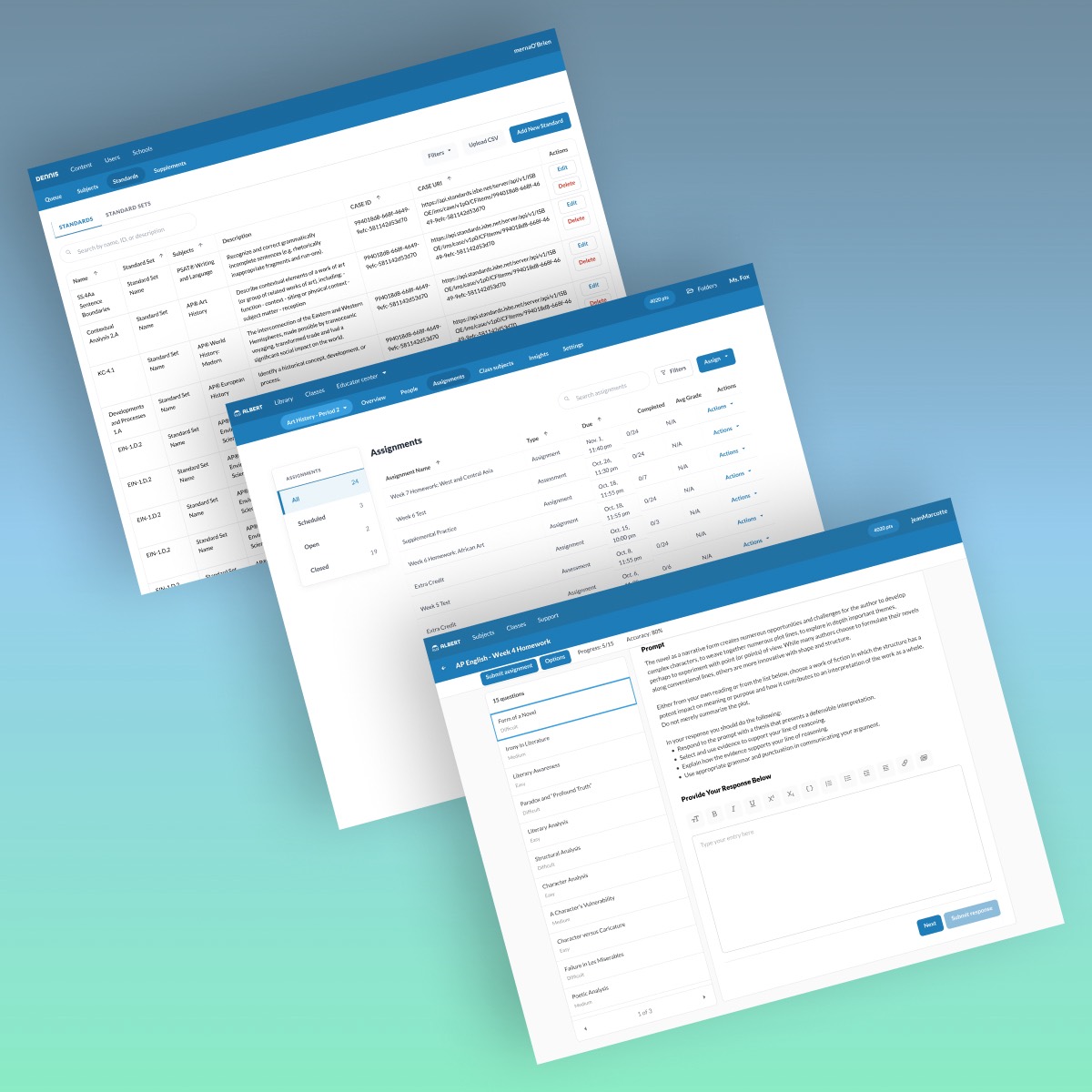
Albert.ioUX/UI Design
Albert Academy CoursesVisual Design
Dribbble UI WorkUI & Visual Design
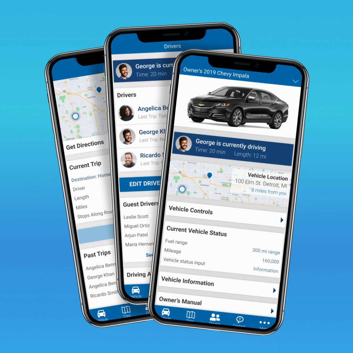
Automotive Design ChallengeUX/UI Design Case Study
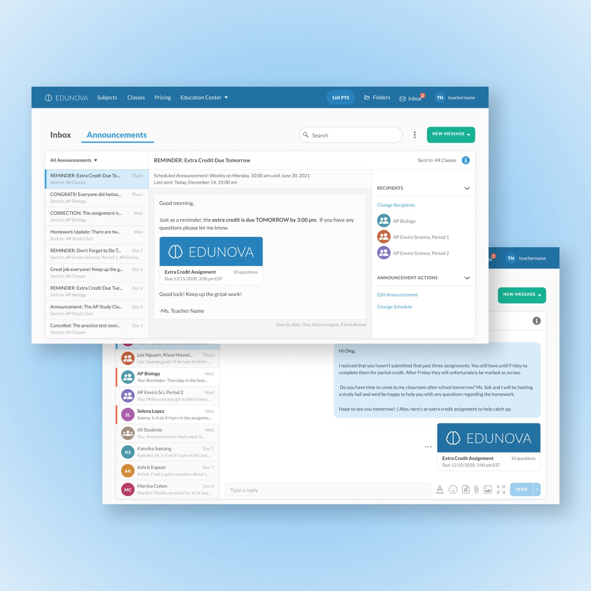
Edtech MessagingUX/UI Design Case Study

Personal ArtworkArtwork
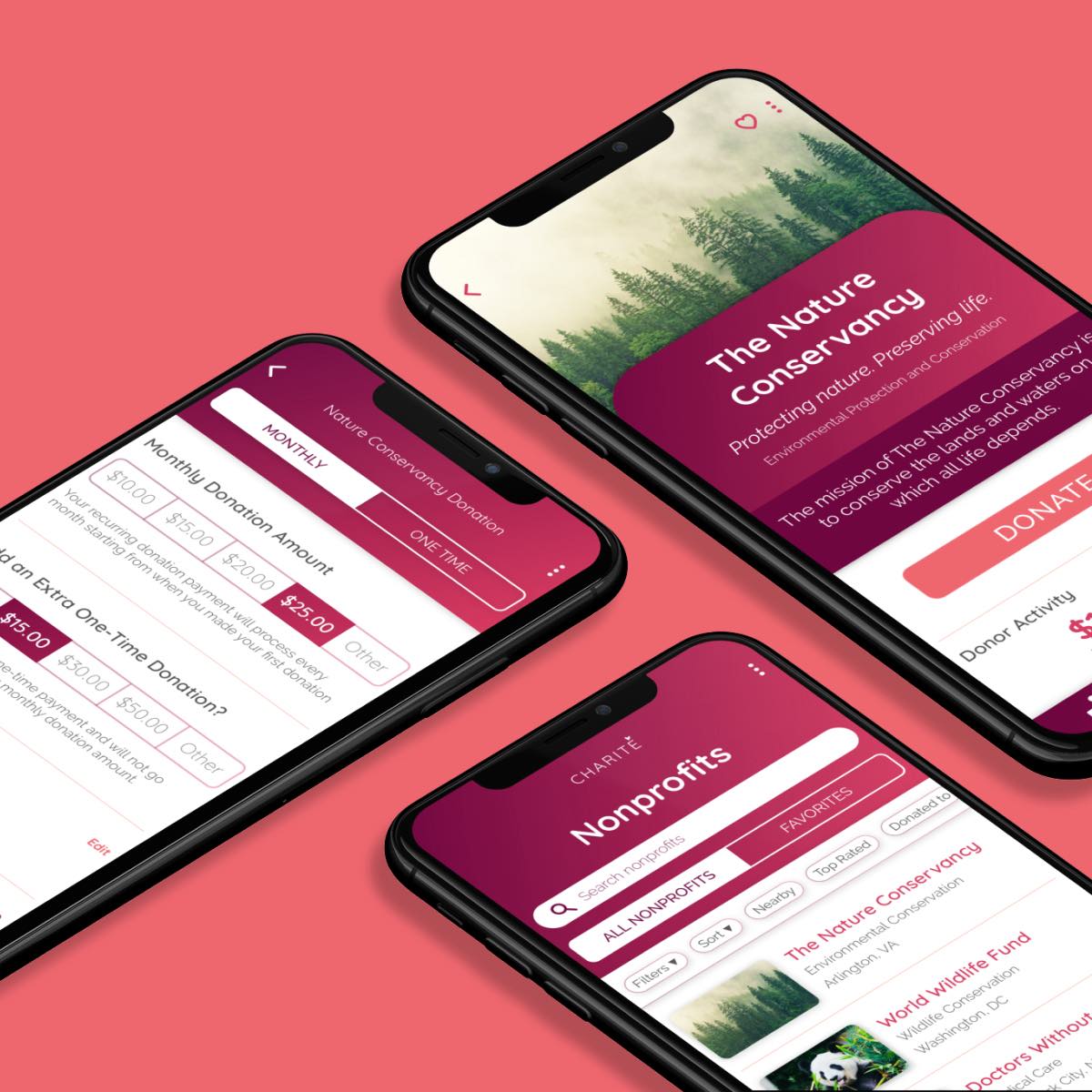
Amazon Raise-Up BuildathonUX/UI Design Case Study
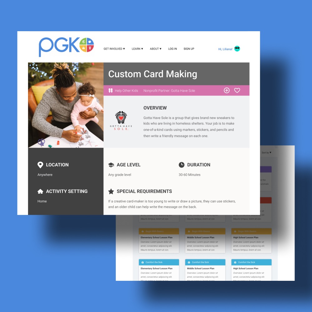
Project Giving KidsUX/UI Design Case Study
DeveloperWeek 2020 HackathonUX/UI Design Case Study
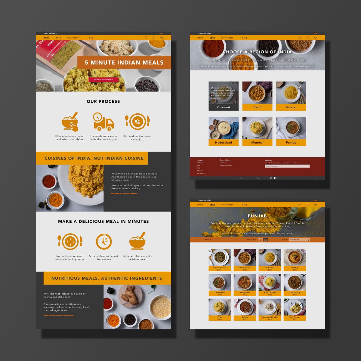
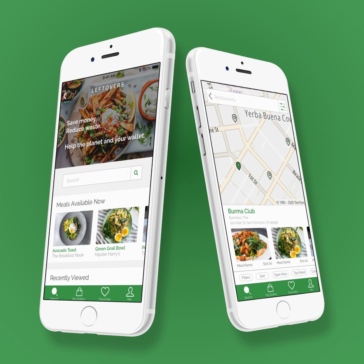
The Cumin ClubUX/UI Design Case Study
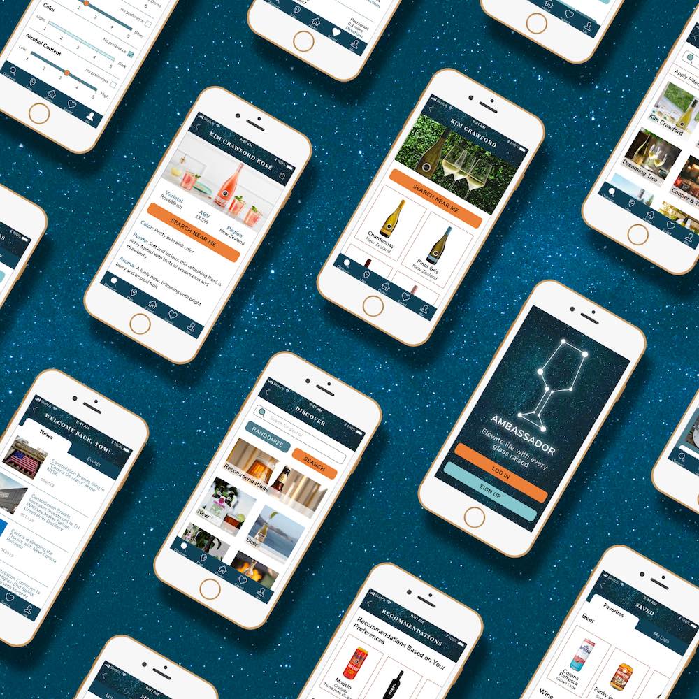
Constellation BrandsBranding & UI Design Case Study