
The Cumin Club
Client: The Cumin Club
Services: UX Research, Usability Testing, UI Design, Interaction Design
Deliverables: Wireframes, moodboards, style tiles, high fidelity website mockups, prototypes, UI kit, visual assets, style guide
Team: 4 UX/UI Designers
SUMMARY
The main goal for this project was to create a high-quality user interface design for the website of an Indian packaged food company called The Cumin Club. To achieve this goal I explored various design directions and worked with my team to conduct UX and UI research and usability testing to align our design decisions with the users’ objectives.
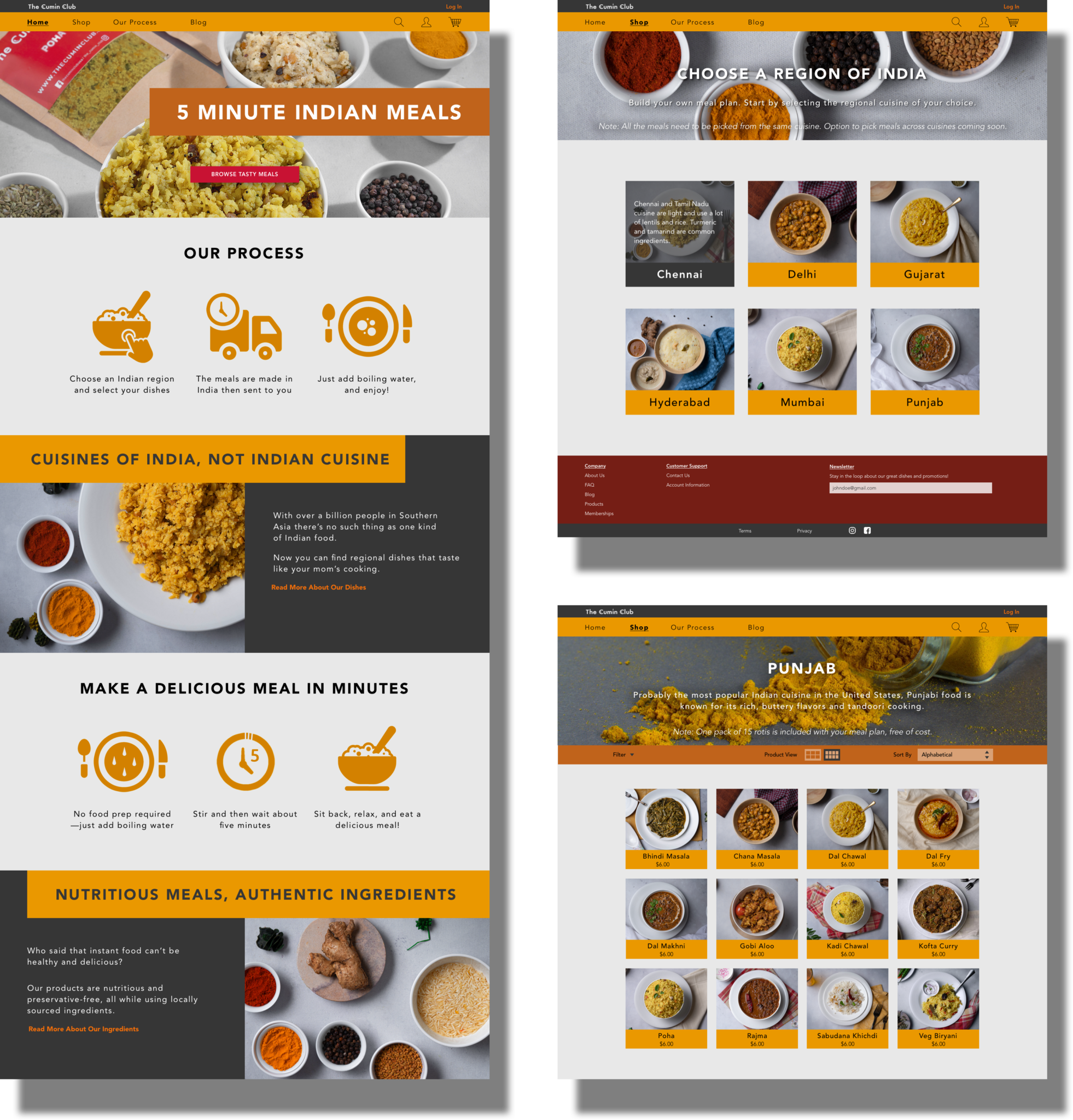
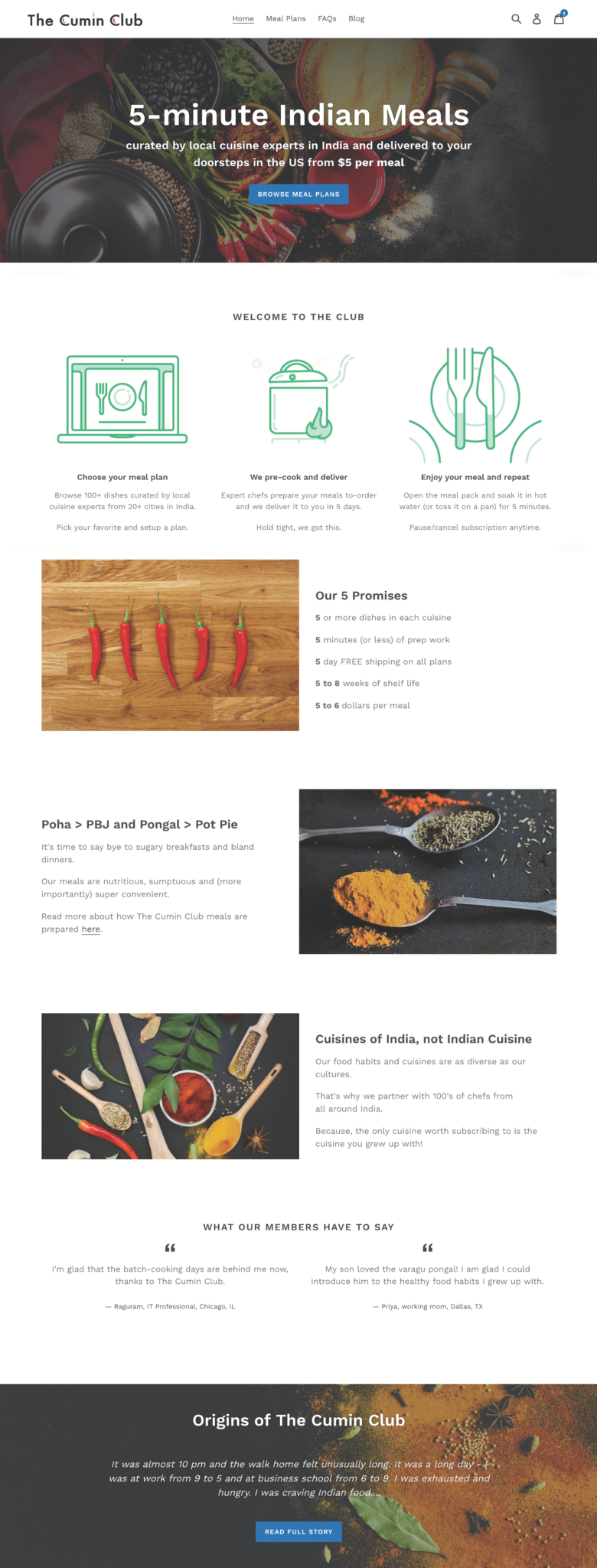
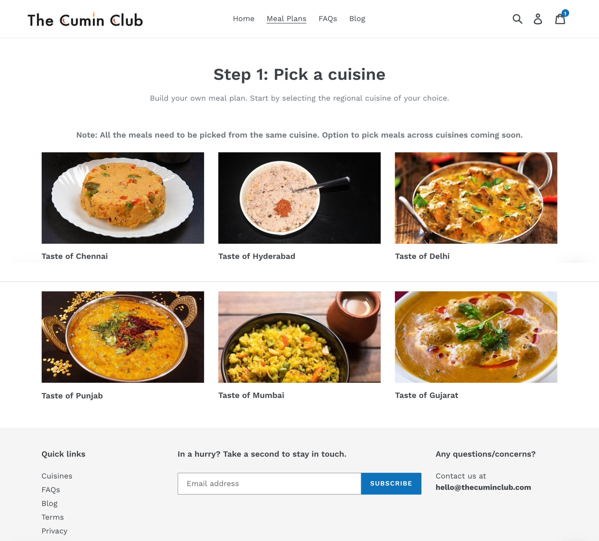
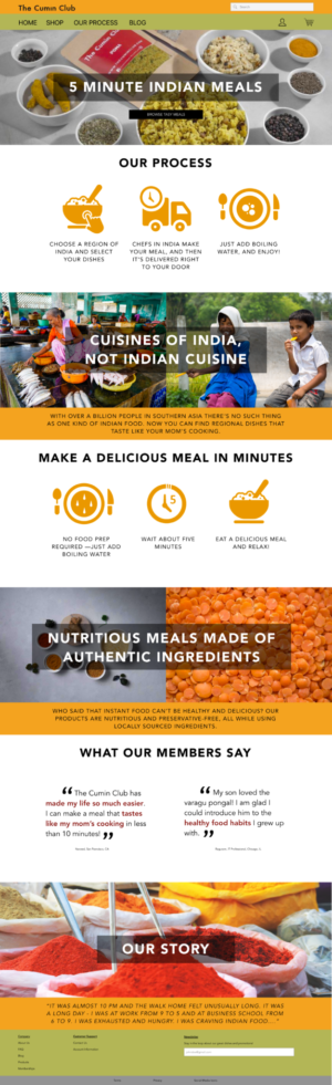
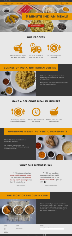
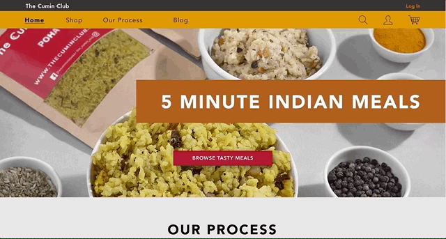
The final high fidelity website screens
Background
Background
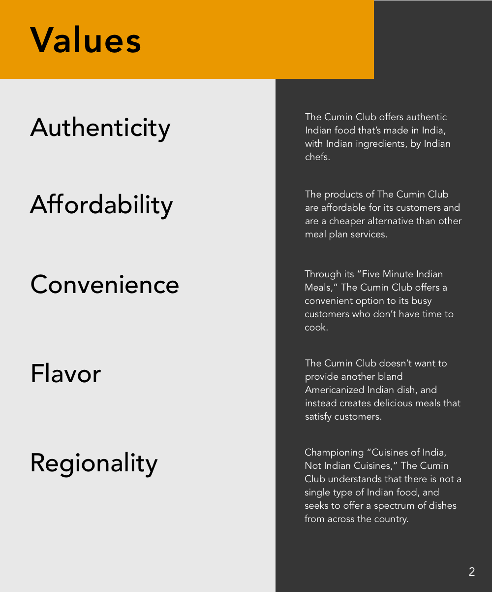
The Cumin Club is an instant packaged Indian food company that provides a quick meal opportunity to customers. By adding hot water to a packet, customers just need to stir and wait a short period of time before they can eat something that tastes authentically Indian, and is regionally specific. As their website states, they provide “cuisines of India, not Indian cuisine.” By focusing on regionality, authenticity, and convenience, The Cumin Club strives to cater itself to busy working professionals of South Asian heritage who want a taste of home but don’t have time in their lives to prepare such dinners.
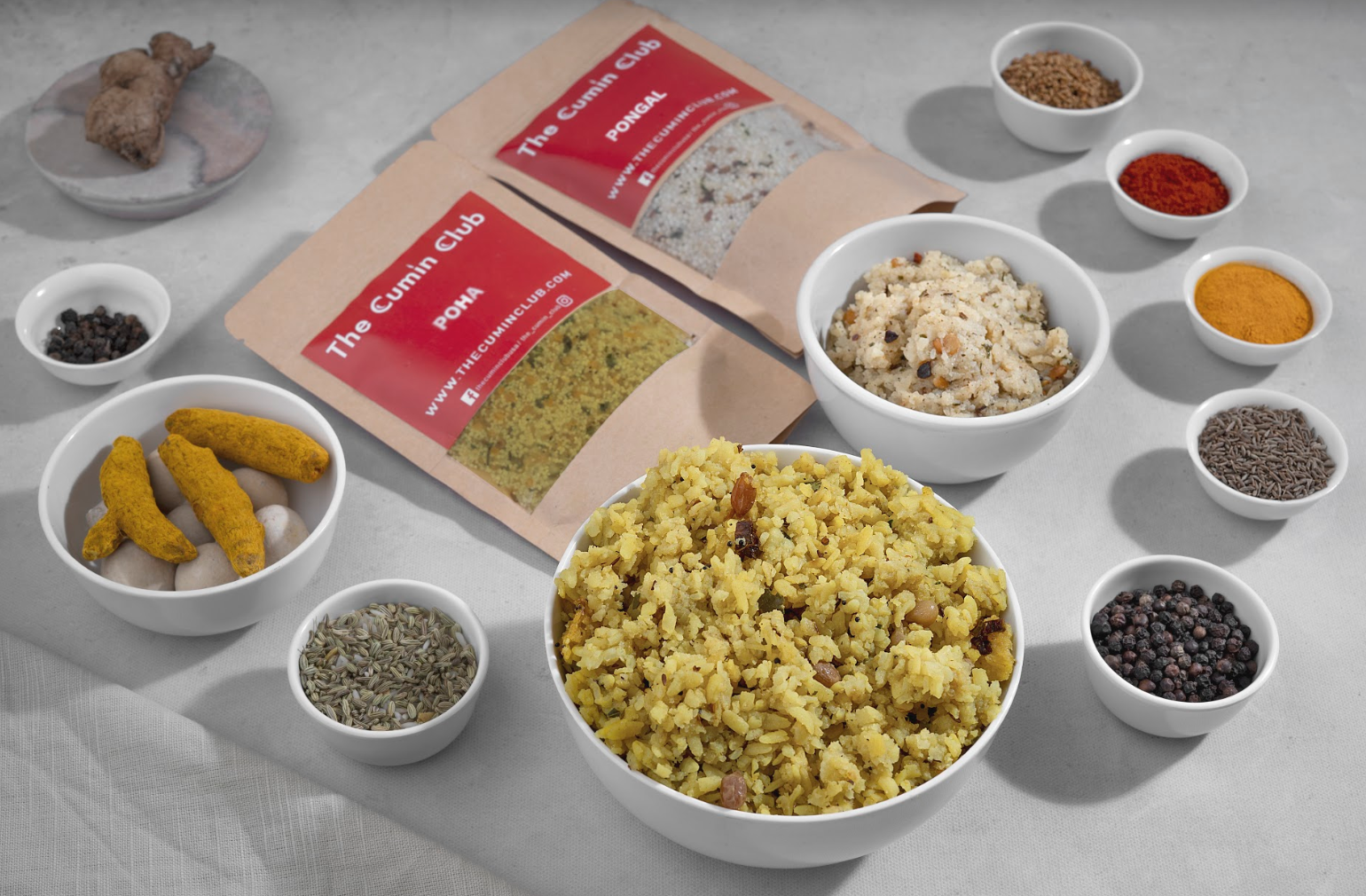
Some products of The Cumin Club
Challenge
The Cumin Club was a small startup that was only one month old when we started working with the client. Due to size and capacity limitations, the client had been unable to do much UX research on their own, besides doing limited user interviews with their friends. They didn’t have any wireframes and they instead were using what they considered a “placeholder” website as their company website.
As a young company with a goal of increasing the customer base despite certain startup limitations, we knew that we needed to do some UX research and usability testing on the current website for the following reasons:
- To make sure we could provide them a user-centric visual design direction.
- To understand how we could improve the language and content presentation of the homepage to draw in new customers and to instill a sense of trust.
- To design high fidelity screens based on user-tested wireframes of the main shopping pages that would allow for an easy shopping experience, which would increase sales.
Webpages of The Cumin Club's original "placeholder" website
Research
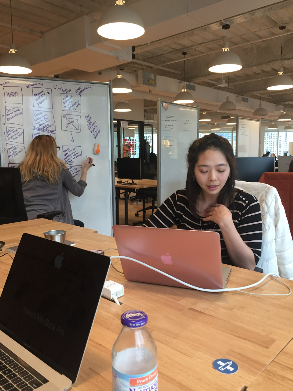
We did user interviews with a group of potential Cumin Club customers to define our user persona and problem statement, influence the construction of our wireframes, and to inspire our design principles and design directions. Although the client had carried out some rudimentary interviews and surveys with friends and family, we wanted to go beyond their basic foundation and conduct unbiased research to understand The Cumin Club customer and define who we would be designing for.
We conducted 8 user interviews in conjunction with our usability testing and had a mix of in-person and remote tests. We began the test session with an interview and asked them questions about their lifestyles, their schedules, their eating habits, and their experiences with meal plan services. Based on the user interview feedback and answers we created two user personas: Vishal and Nayeema.
From our user personas we crafted a problem statement:
“The busy student or working professional needs a convenient way to access high quality, regional Indian dishes because they lack the time to prepare such dishes themselves.”
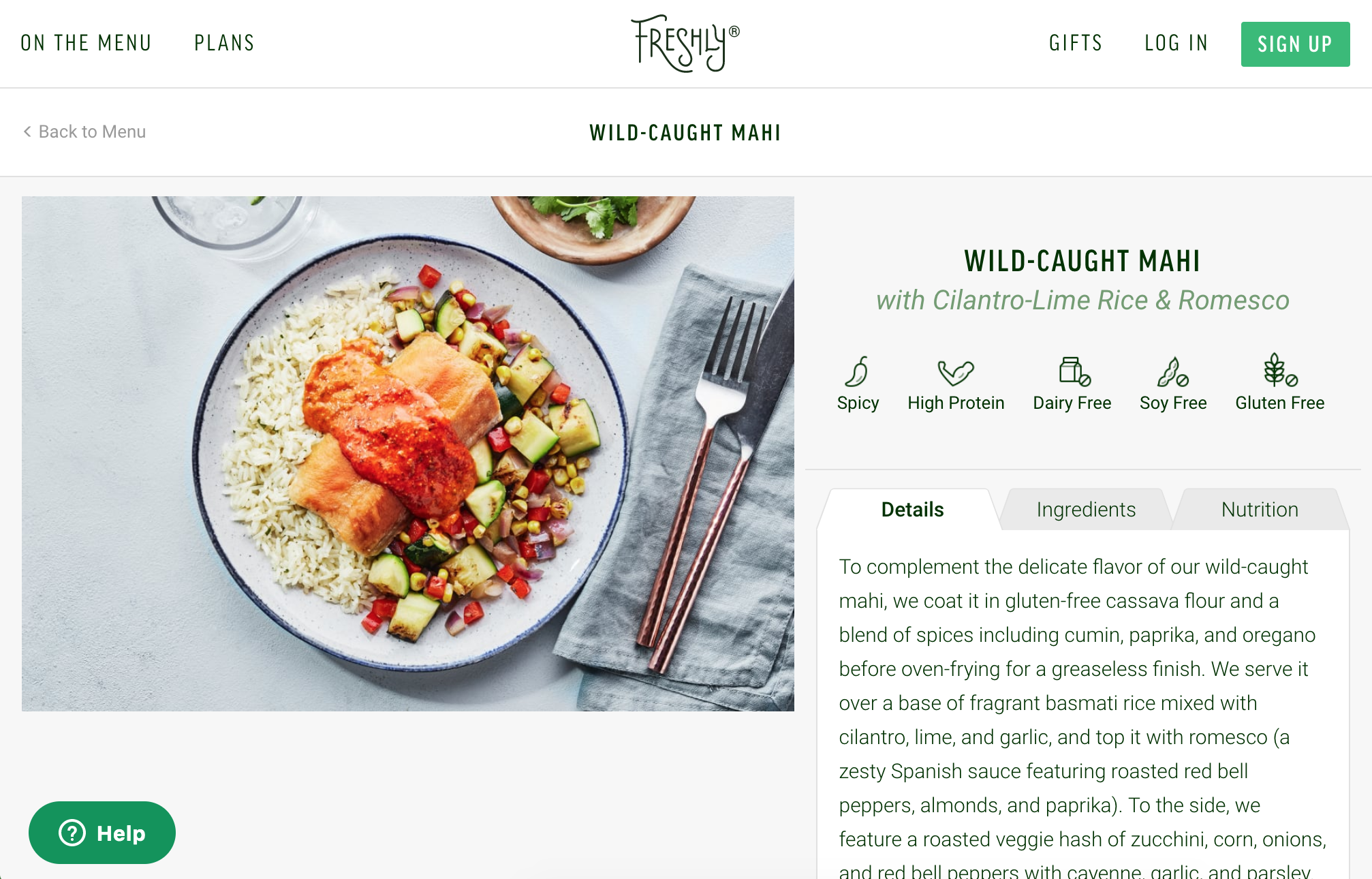
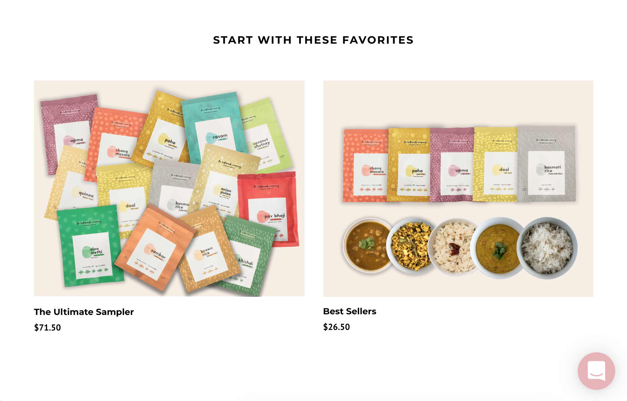
We also conducted an interaction design and visual competitive analysis to look for insights and to define shared patterns of similar food company websites. Some direct competitors we looked at were Buttermilk, Tiffin Blog, Daily Harvest, Freshly, and Bombay Takeout. Through our design competitive analysis we were able to take note of things that seemed to work well for some websites that we could draw inspiration from, including:
- Allowing customers to be able to browse products before creating an account
- Reducing the steps of the user flow from the homepage to checkout
- Providing an easily accessible itemized list and shopping cart throughout the process
- Clarifying and showcasing product and process information
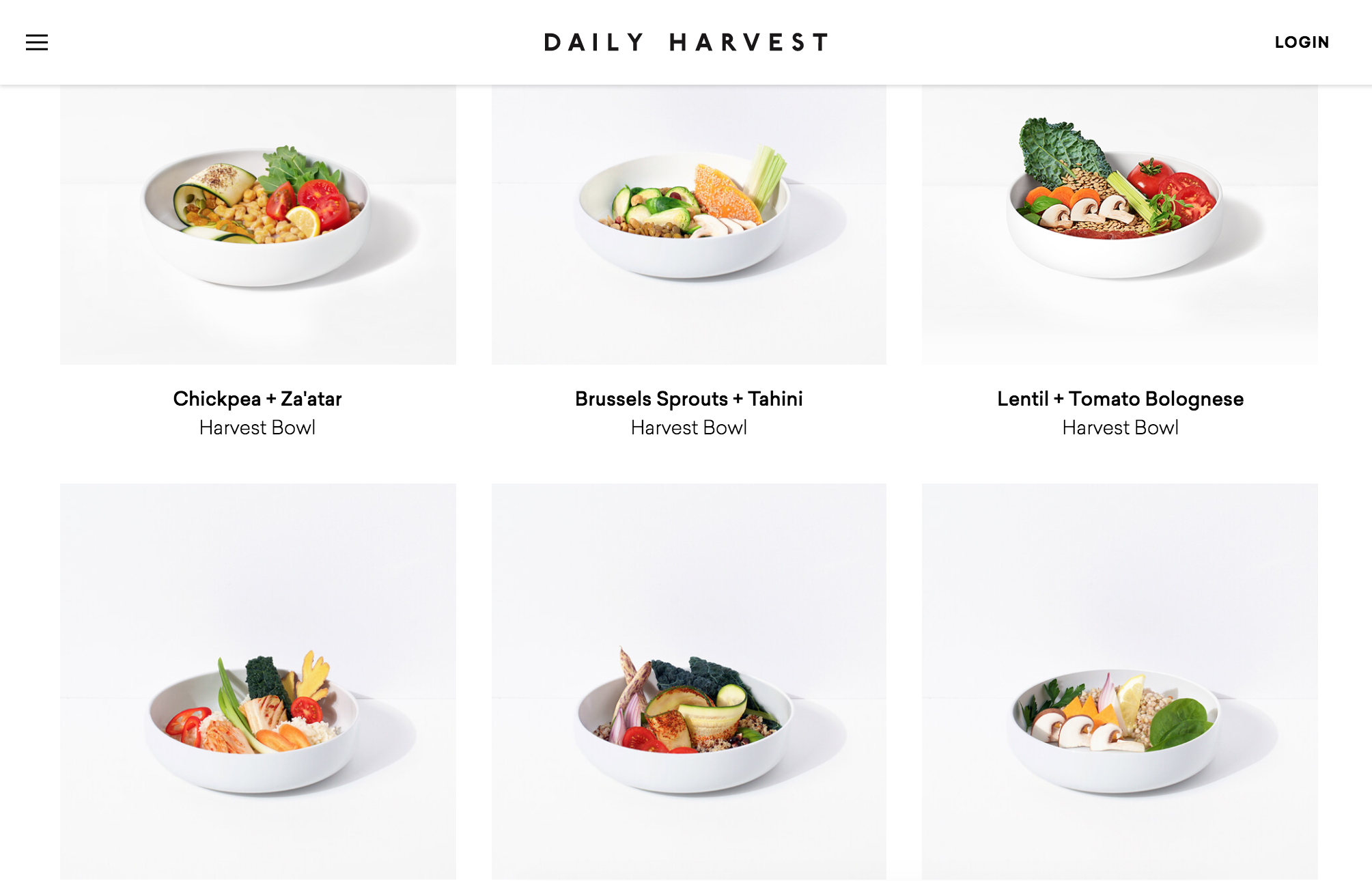
Screenshots of The Cumin Club's direct and indirect competitors featured in our VCA
We conducted usability testing to understand what could be updated or improved concerning the current website structure and how we could make optimal wireframes for our UI designs. Our aim was to discover user flow pain points and e-commerce website preferences, with the overall goal of creating user-centric wireframes. Using the current Cumin Club website and Buttermilk, a company that also sells instant packaged Indian food, we had 8 users complete 4 tasks while answering task-related questions. The user tasks were:
- Scroll through the homepage and discuss their first impressions
- Browse through the meal plans and product information
- Select their meals and add them to the cart.
Go through the checkout process
From observing the user navigation and listening to their opinions, we were able to formulate what worked well for the website and what could be changed to improve the experience.
Design Principles
Design Principles
Considering our competitive analysis takeaways and our client’s goals, we created design principles to serve as the guiding force in our design decisions:
Considering our competitive analysis takeaways and our client’s goals, we created design principles to serve as the guiding force in our design decisions:
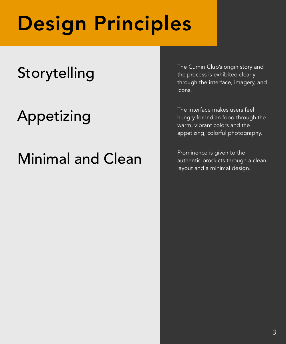
Storytelling
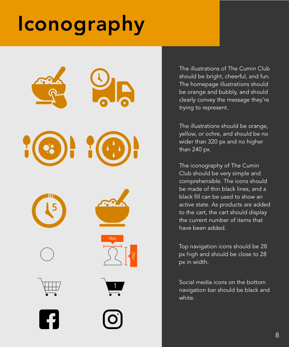
The Cumin Club’s origin story and process is exhibited clearly through the interface, imagery, and icons.
Storytelling
The Cumin Club’s origin story and process is exhibited clearly through the interface, imagery, and icons.
Appetizing
The interface makes users feel hungry through the warm, vibrant colors and the appetizing, colorful photography.
Clean and Minimal
Prominence is given to the authentic products through a clean layout and a minimal design.
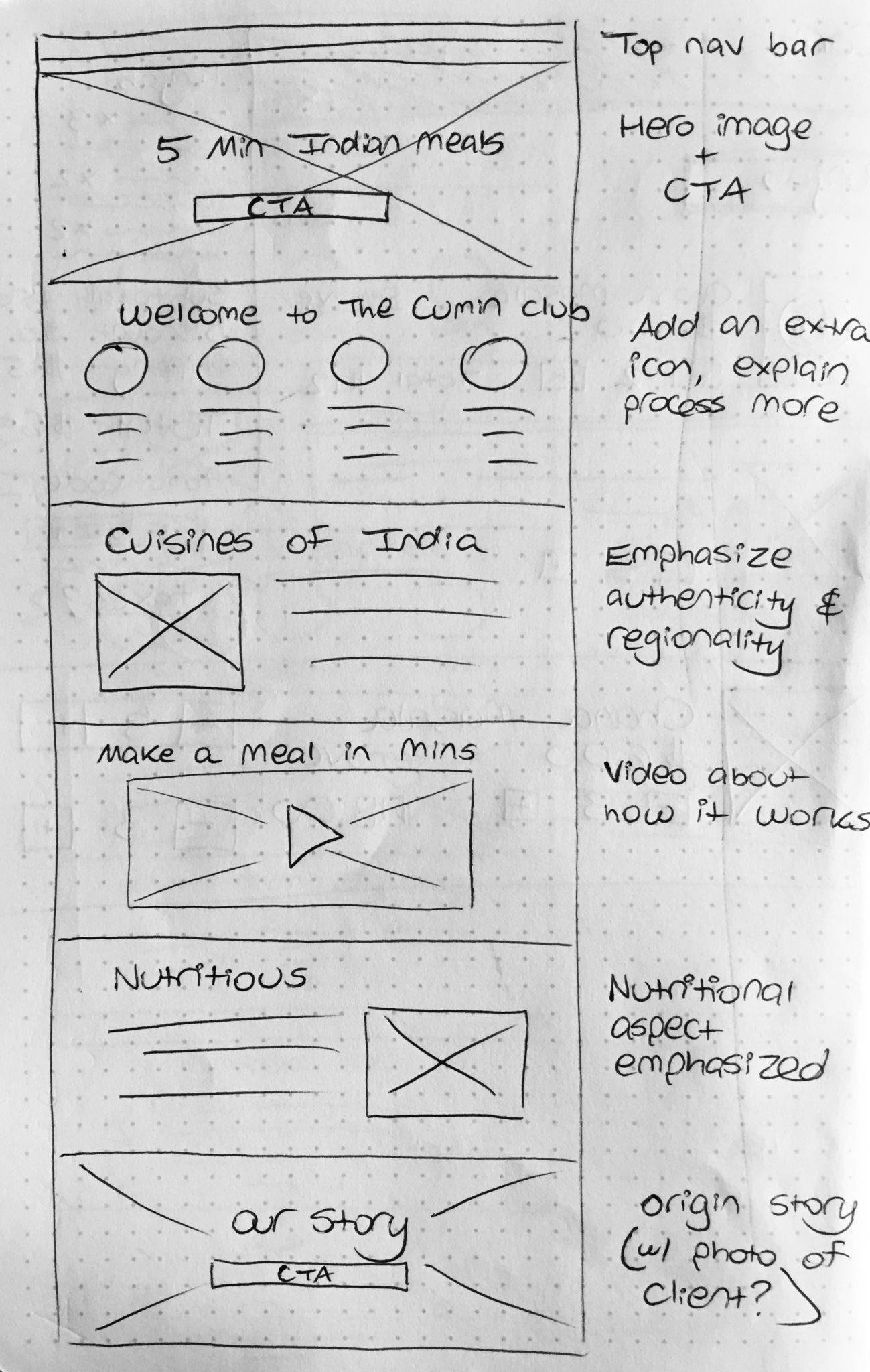
Wireframes
From observing the user navigation in our user testing and by listening to our users, we were able to formulate what worked well for the original website and what could be changed to improve the experience. Ultimately, we needed to create wireframes that considered the customer’s needs and preferences and were also aligned with the client’s expectations and startup business limitations. From these wireframes we could then embark on the UI design project and create the main visual deliverables.
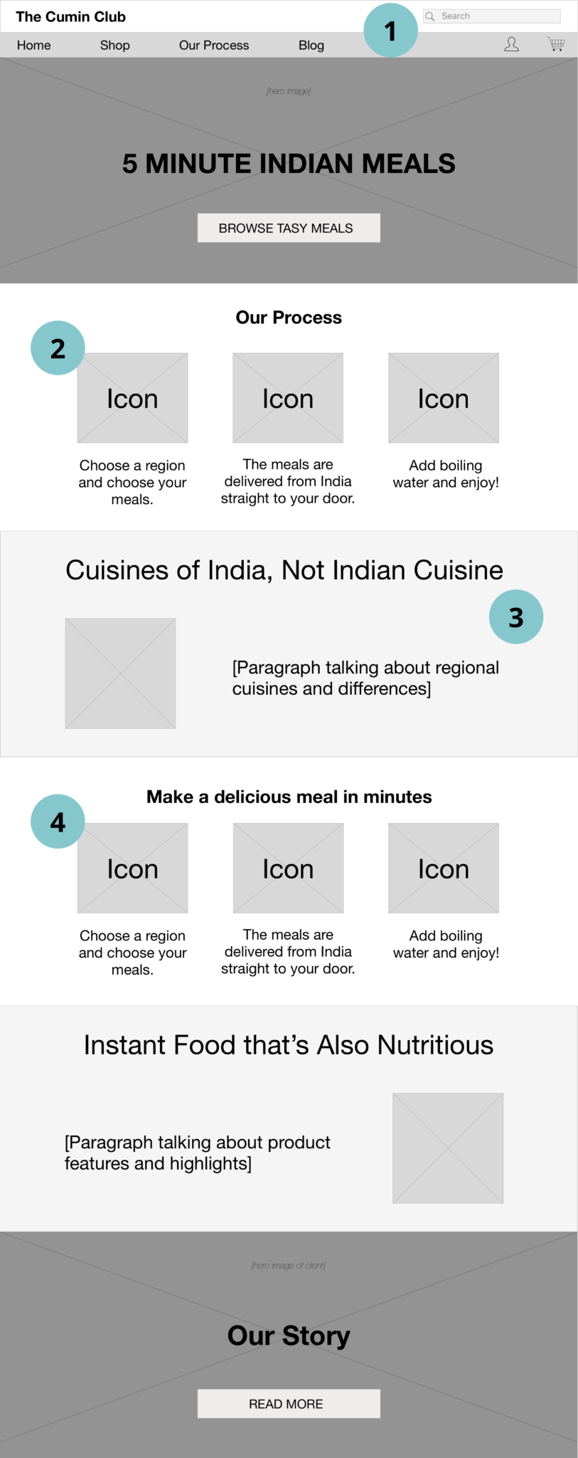
Homepage Wireframe
- Add a search bar to the top navigation for easy user searches.
- Clearly explain The Cumin Club process below the hero image so users quickly understand what is The Cumin Club.
- Place "Cuisines of India" prominently to showcase the uniqueness of the company's products.
- Clearly explain how the customer makes a meal at home.
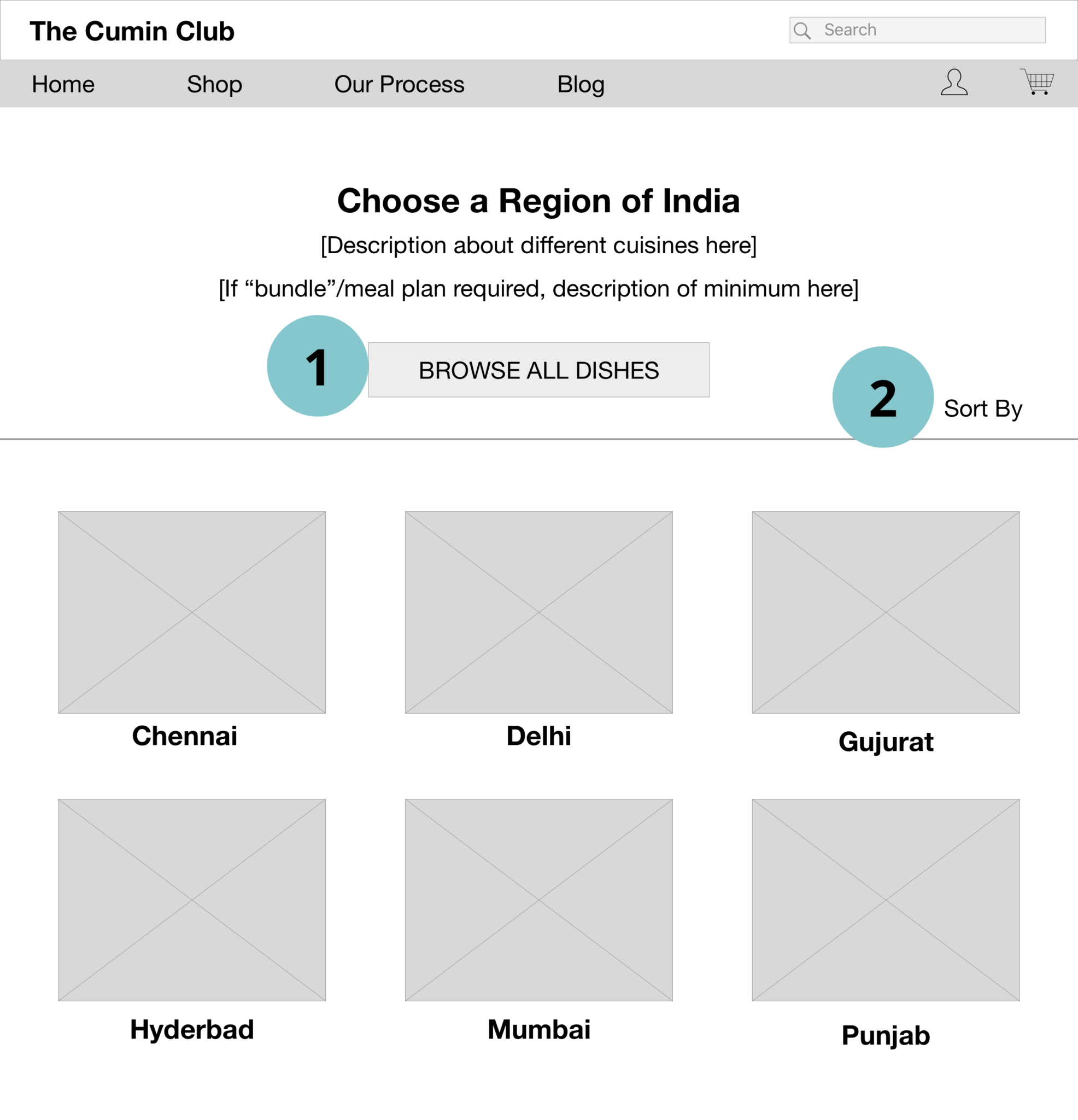
Regions Page Wireframe
All of the users wanted the ability to browse all of the regional dishes on one page, and in our original wireframe we wanted to incorporate this preference. Unfortunately, due to business constraints, we had to remove this feature.
Add a sorting/filtering component when more regions have been added.
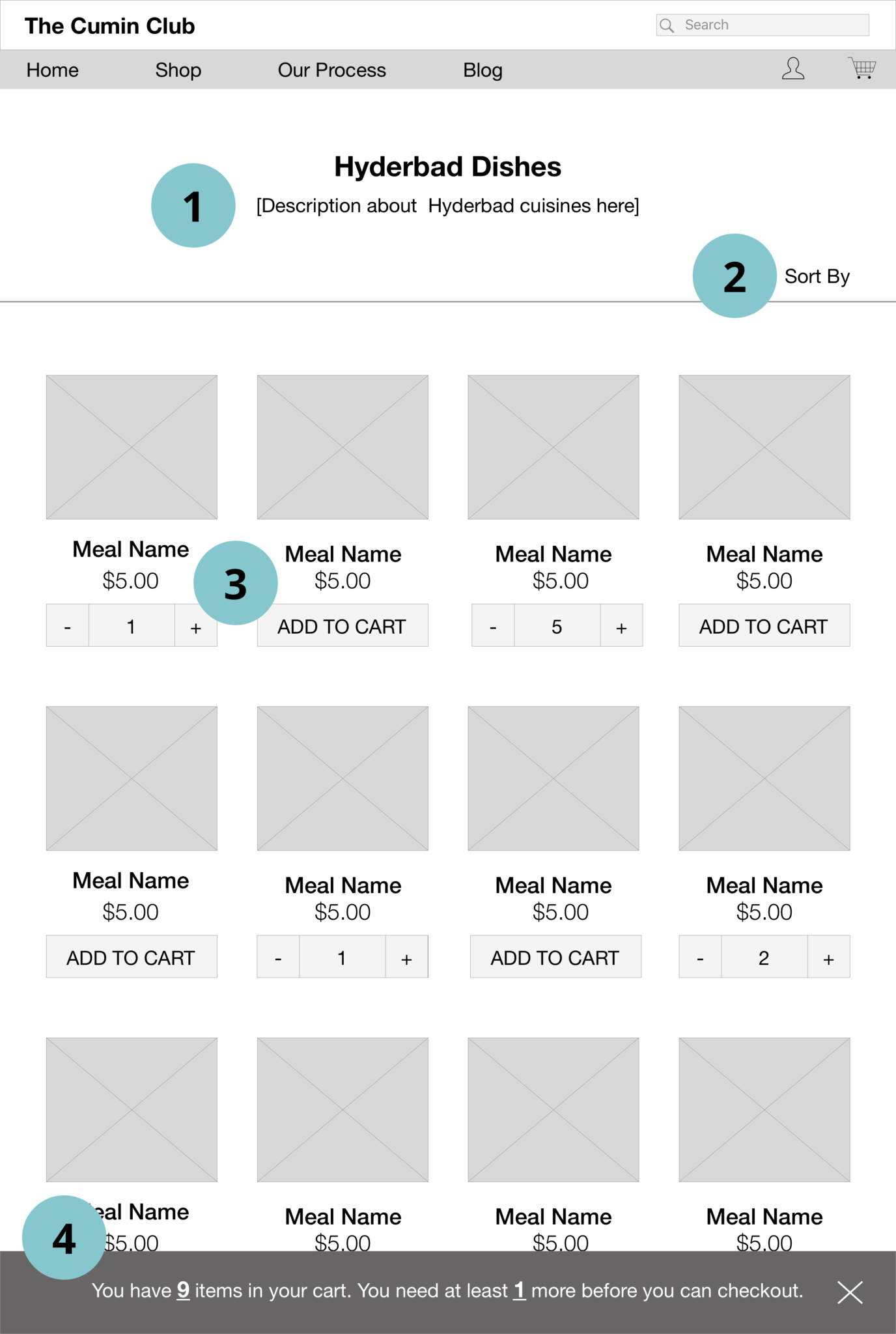
Shopping Page Wireframe
- Include a description about the particular regional cuisine so users know what to expect.
- Include a sort/filter component at the top so the user can quickly browse.
- Make it clear which items have been added to the cart while simplifying the amount of text beneath the image to prevent confusion.
- Help users keep track of how many items are in their cart and how many more items they need to add before they can check out with a fixed bottom bar that displays cart information.
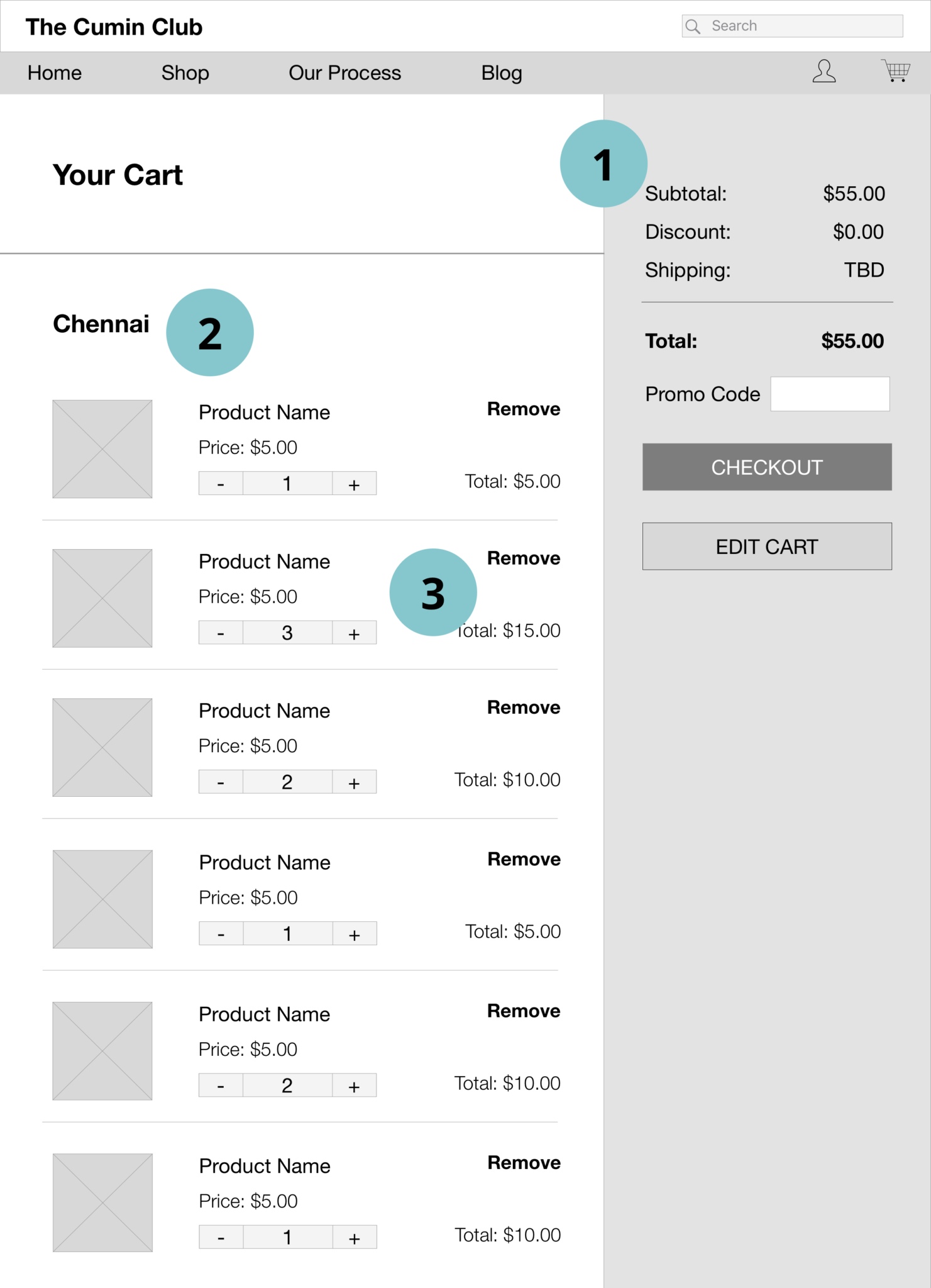
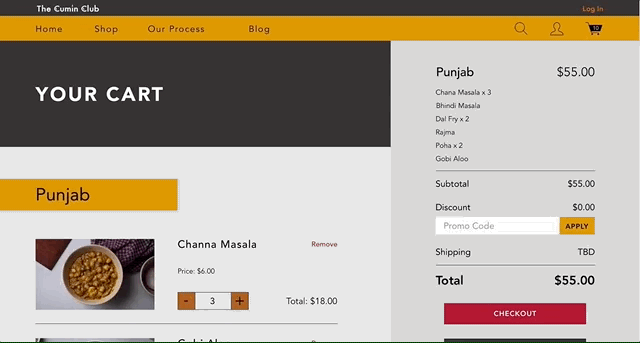
Cart Wireframe
A summarized subtotal is displayed on the right so users can quickly see the overall cost without needing to scroll to the bottom.
On the left each individual item in the cart is listed out so users are informed and can easily review everything in their cart.
Users can conveniently edit their cart on the cart page without going back to the shopping pages.
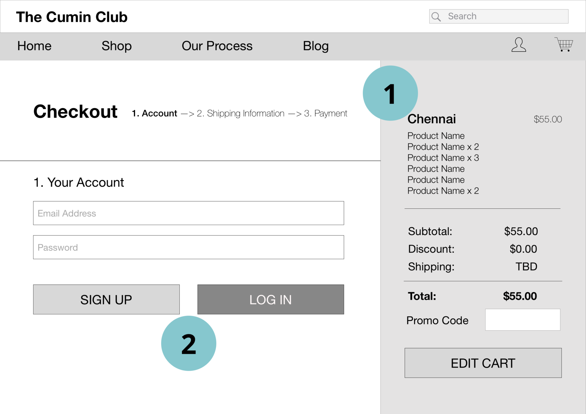
Checkout: Log In Wireframe
- Keep the summarized subtotal on the right throughout the checkout process so the users can quickly access the information or edit the cart without going back.
- Allow users to sign up or log in before checking out.
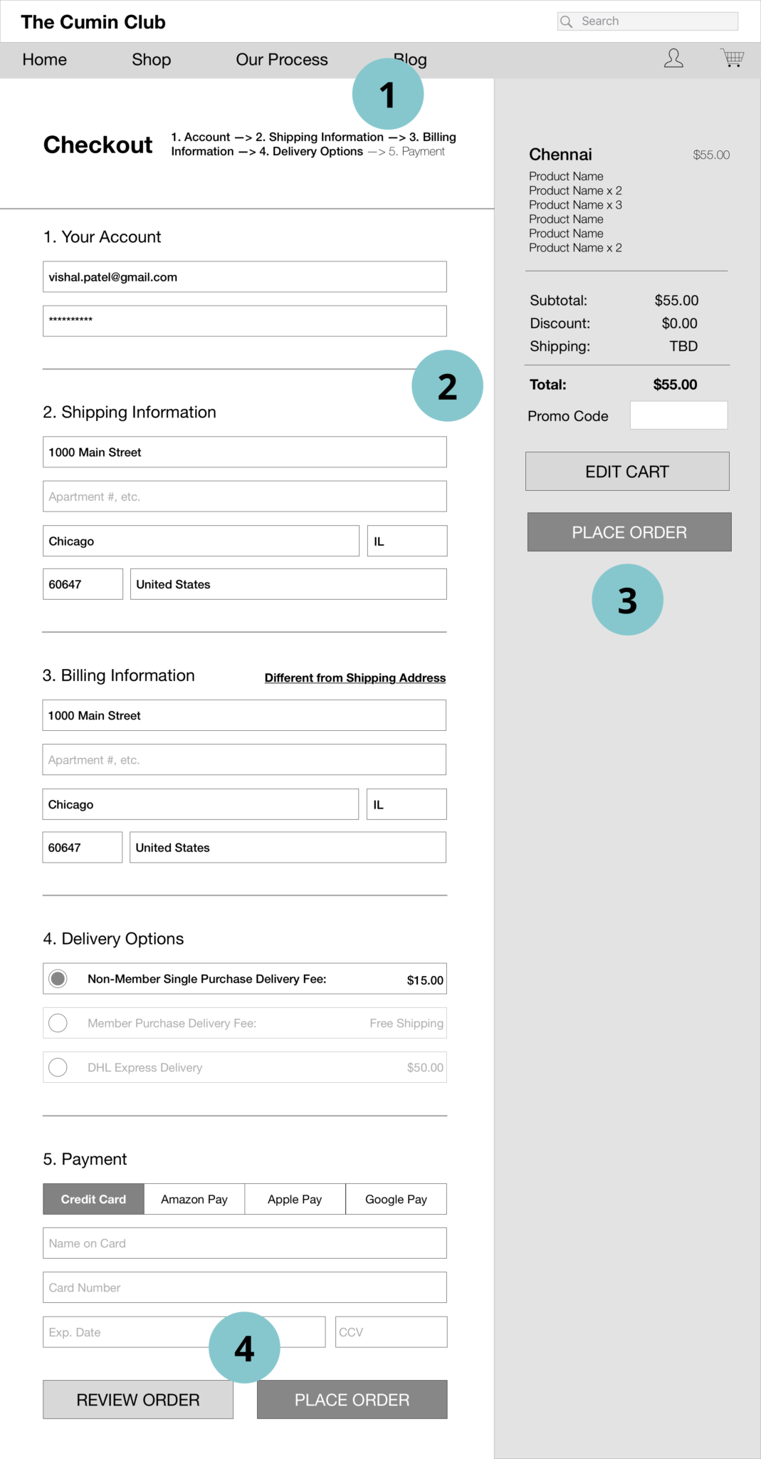
Final Checkout Page Wireframe
- Keep the user informed about where they are in the process through breadcrumbs.
- Combine the separate sections of the checkout process into one page to make it easier for the user to edit or check on information.
- Continue to display a summarized subtotal on the right for a quick reference point, and to allow users to easily edit their cart without clicking back.
- Allow users the option to review their order before placing it, to establish a sense of security and trust with the user.
Design Directions
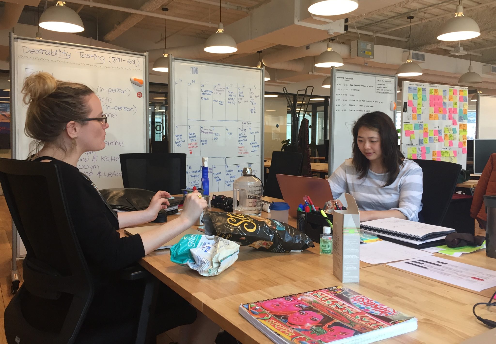
After constructing wireframes for our UI designs we were able to use our UX foundation to explore divergent design direction through moodboards and style tiles, which were then user tested to define the final design direction.
After constructing wireframes for our UI designs we were able to use our UX foundation to explore divergent design direction through moodboards and style tiles, which were then user tested to define the final design direction.
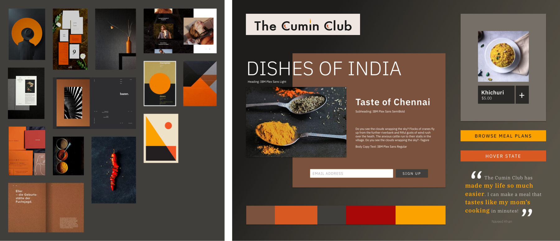
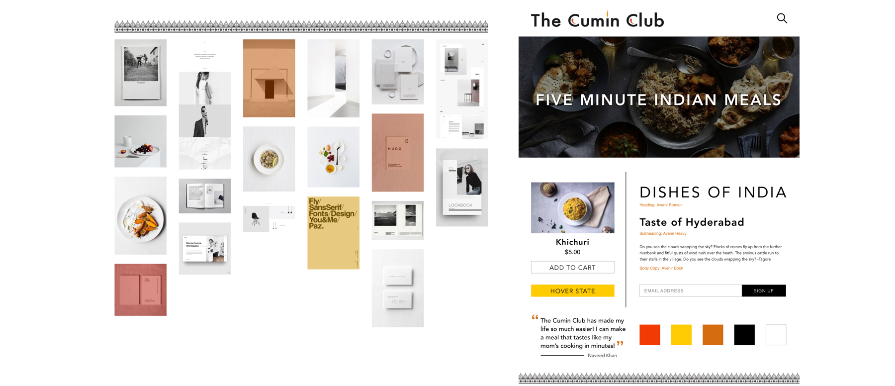
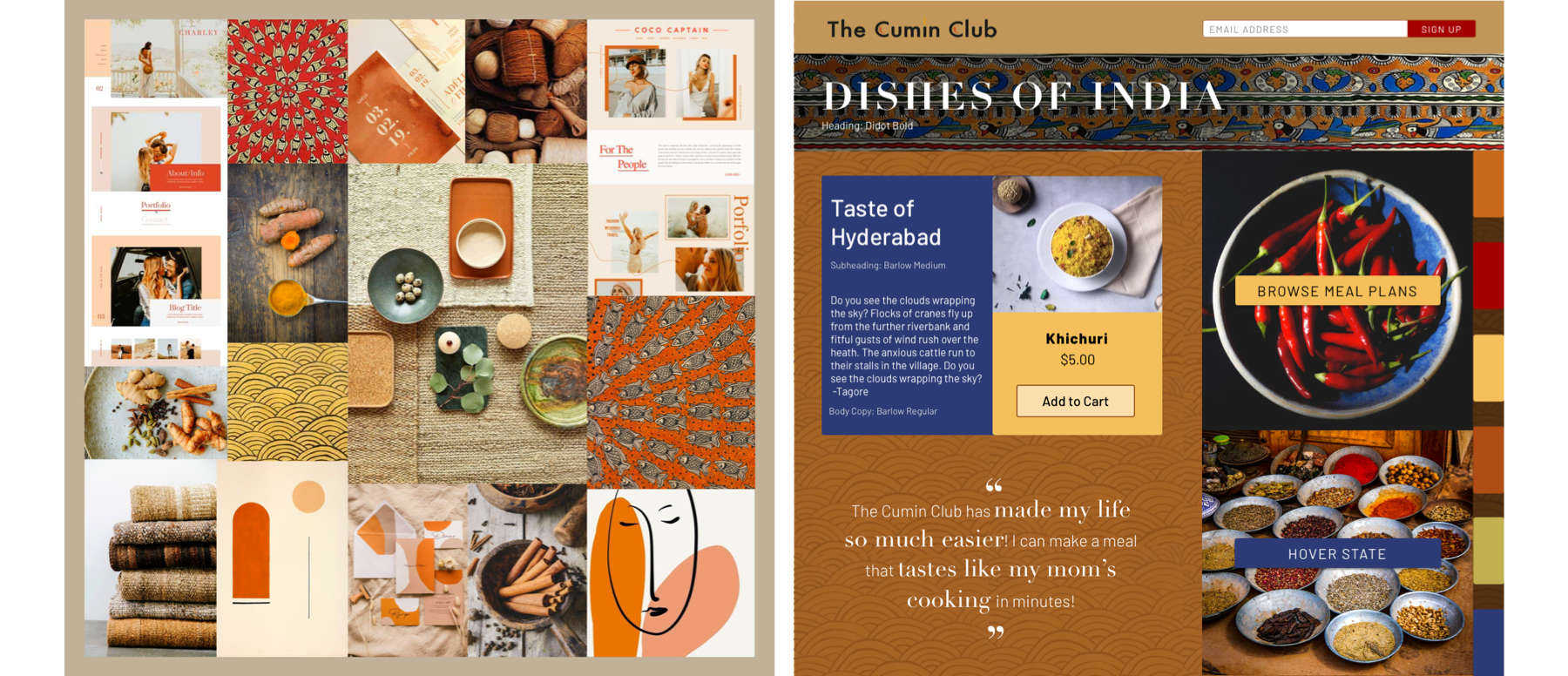
Moodboards and style tiles exploring different design directions. All of these were tested with users and helped guide the final design direction.
Users like a straightforward, easy-to-read layout, but did not like the "austere" and "boring" aesthetic of the simple designs we tested. Though the client liked modern UI designs with extensive whitespace, users stated that they thought the modern and muted visuals didn't represent the colors and vibrancy of Indian culture and food. I decided to combine the user's favorite elements of my style tiles into one design direction that would feel modern and clean, pop with Indian spice colors, highlight the food, and would use grays as a background color to avoid a barren white backdrop.
After constructing wireframes for our UI designs we were able to use our UX foundation to explore divergent design direction through moodboards and style tiles, which were then user tested to define the final design direction.
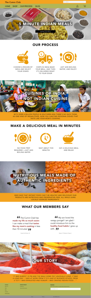
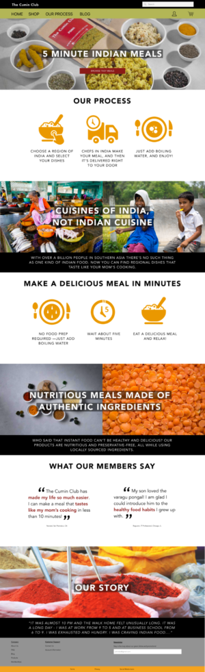
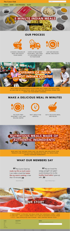

The evolution of the homepage design. The far right screen is the final homepage design.
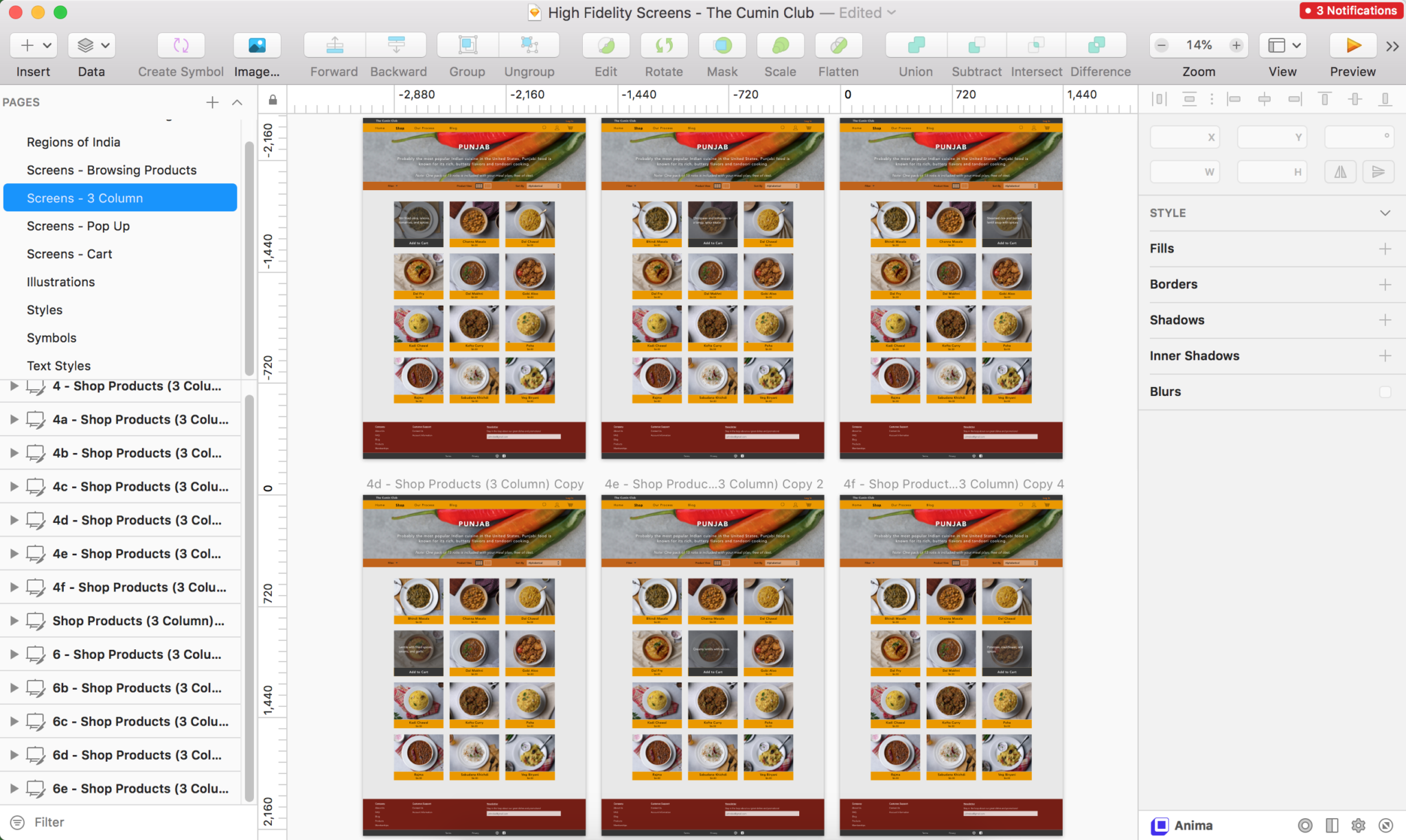
Solution
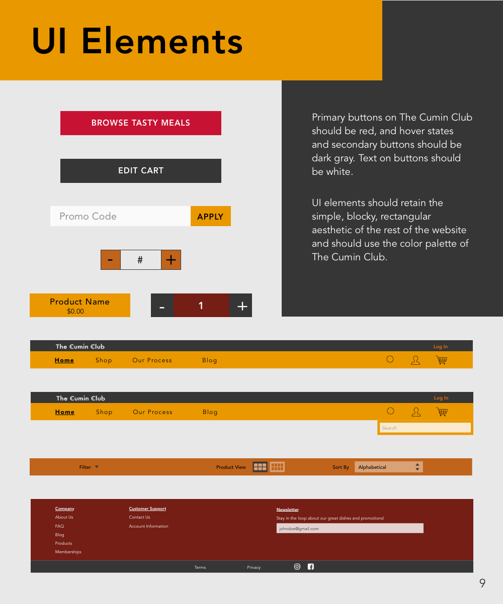
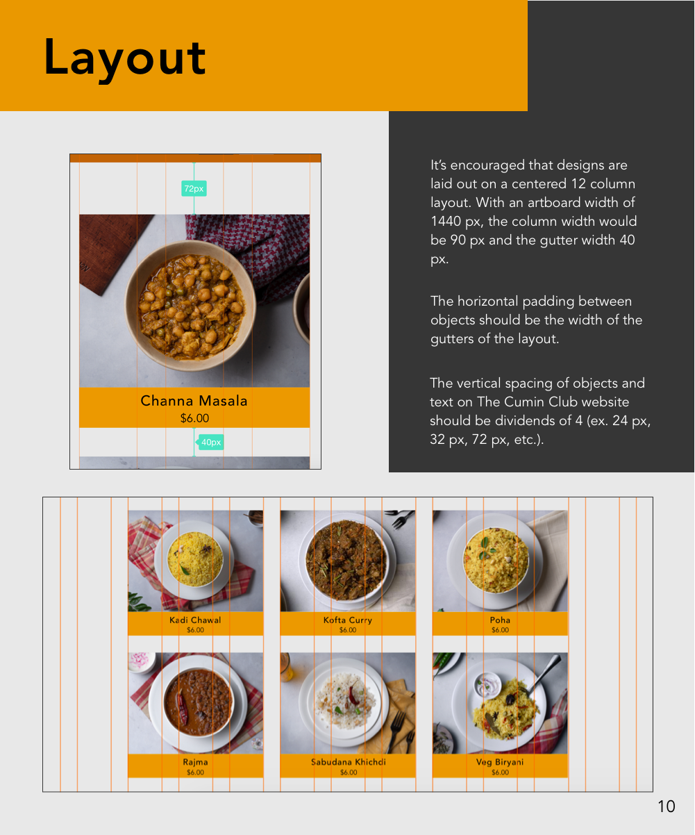
By defining a visual direction that was focused on the user I was able to create customer-centric high fidelity screens that met the goals of both the user and the client. On top of the UI design, I also created a style guide and UI kit to ensure visual design cohesion that was requested by the client, to ensure that future designers and developments who work on the website will follow the visual requirements of the aesthetic and safeguard the visual intent of the design.
Homepage Changes: The homepage was simplified and the product information was emphasized to ensure transparency, because the user had trouble understanding what the The Cumin Club is and what product they were going to receive from the original website.

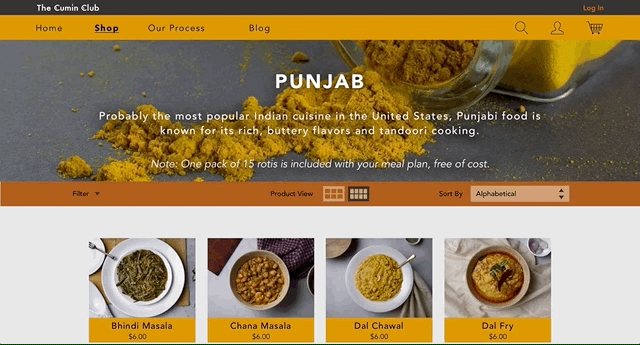
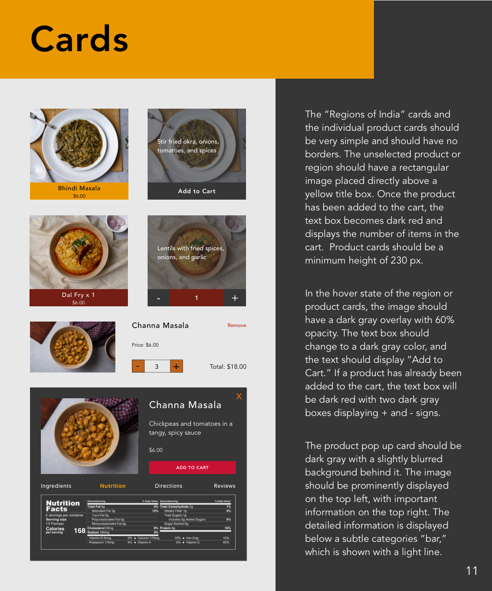
Regions Page Changes: More information was included about the different regional cuisines through hover state descriptions because most users weren't familiar with cuisines they haven't tried before.
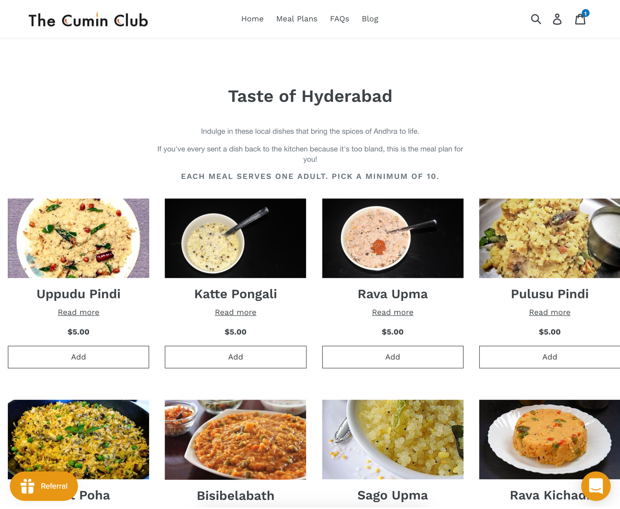
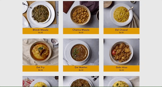
Individual Regions' Shopping Page Changes: Users can now sort and filter their searches to help them quickly find what they're looking for. They can also change the grid view to customize their viewing preferences.
Individual Regions' Shopping Page Changes: Users can now sort and filter their searches to help them quickly find what they're looking for. They can also change the grid view to customize their viewing preferences.
Product Information Changes: The original website didn't provide as much product information as users were hoping to find before they felt ready to make a purchase. Hover states provide a quick description of the meal, and by clicking on the product users can now see a popup with extensive product details.
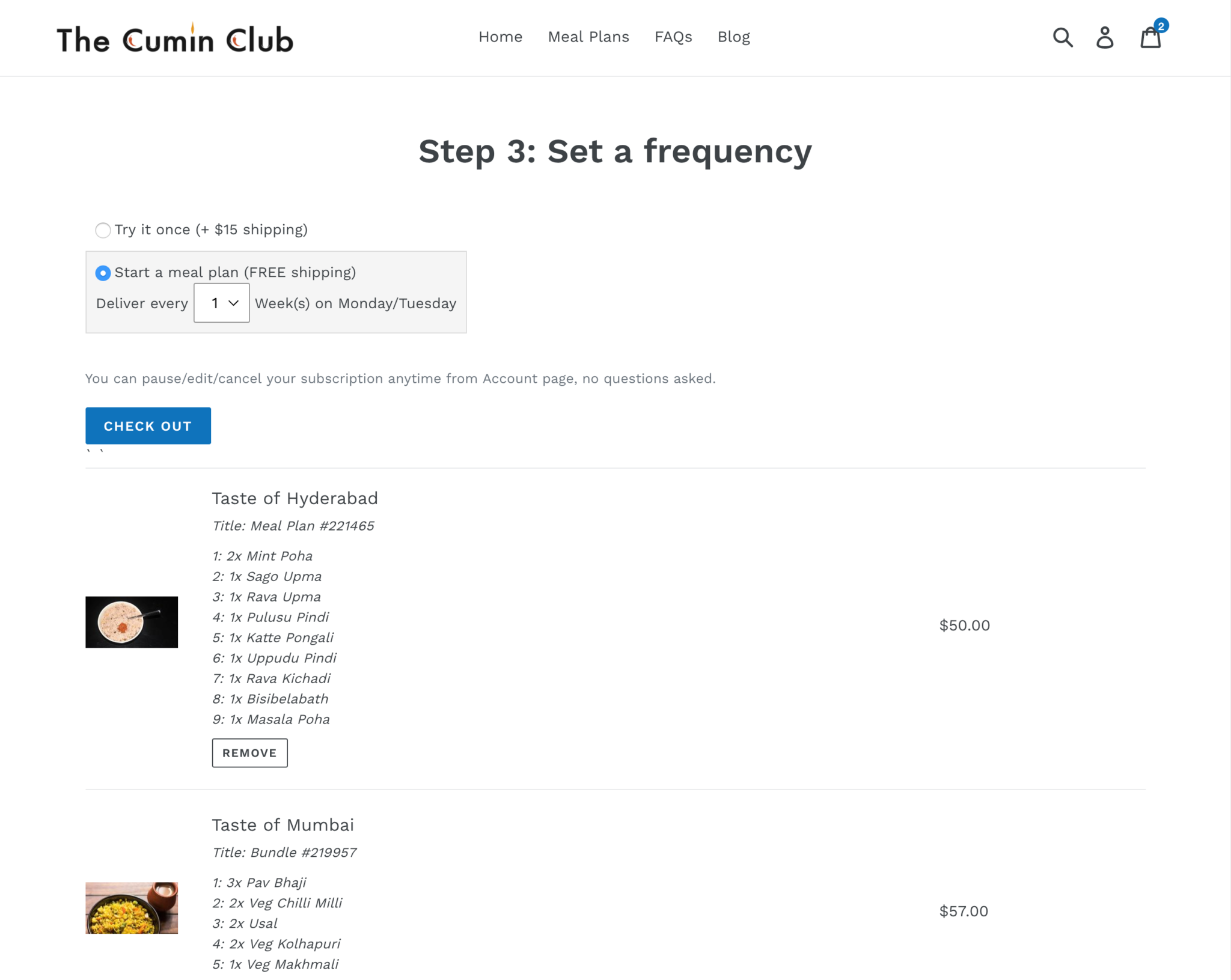
Checkout Process Changes: Users expressed that they didn't trust the checkout process of the original website. A separate webpage for the shopping cart was added to allow users to review their cart before checking out, which made users feel more comfortable with the checkout process. The final checkout process was reduced to one page, so that users can quickly check different sections without having to click back to the previous step. Previous customers can also now quickly log in to their account without having to type in their information every time they make a purchase, speeding up the transaction.

Future Considerations
Considering the short timeline and quick turnaround, my team and I are cognizant of the fact that there are further opportunities to improve the UX/UI design of The Cumin Club. Some future considerations that we shared with the client to enhance the website design and customer experience were to:
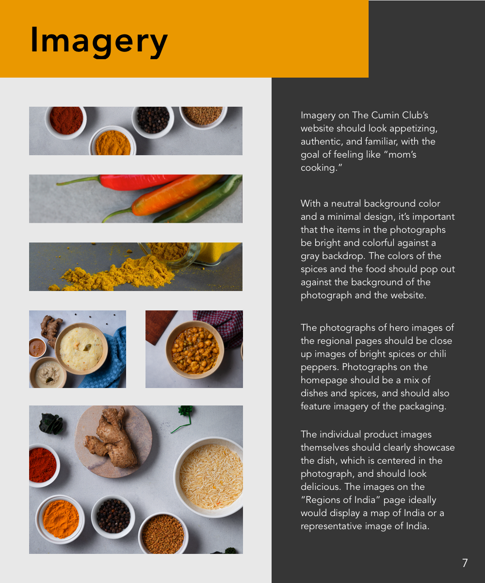
- Align the imagery and photography with the visual design of the website
- Include more lifestyle photography to make the website seem more relatable
- Clarify and explain the product and business to users through language and visuals and provide more information about the subscription service
- Provide a North/South cuisine distinction for users unfamiliar with the towns and regions
"Work work work work work"
Other Design Projects
Albert.ioUX/UI Design
Albert Academy CoursesVisual Design
Dribbble UI WorkUI & Visual Design
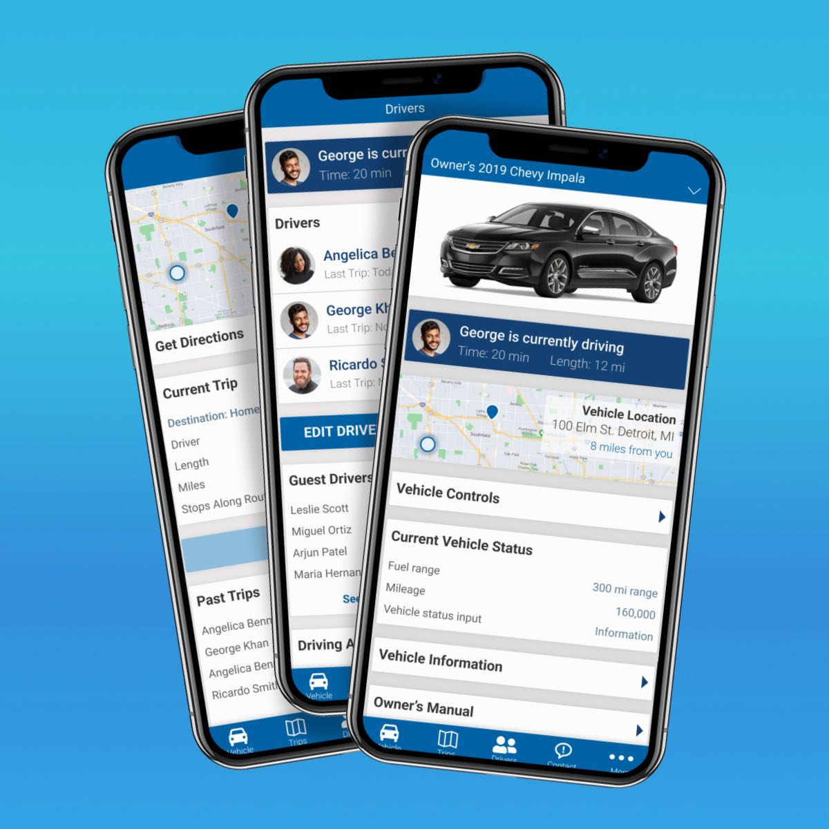
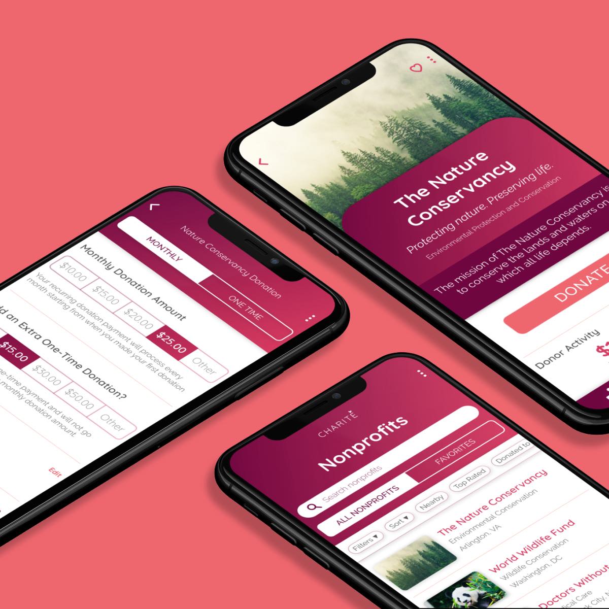
Automotive Design ChallengeUX/UI Design Case Study
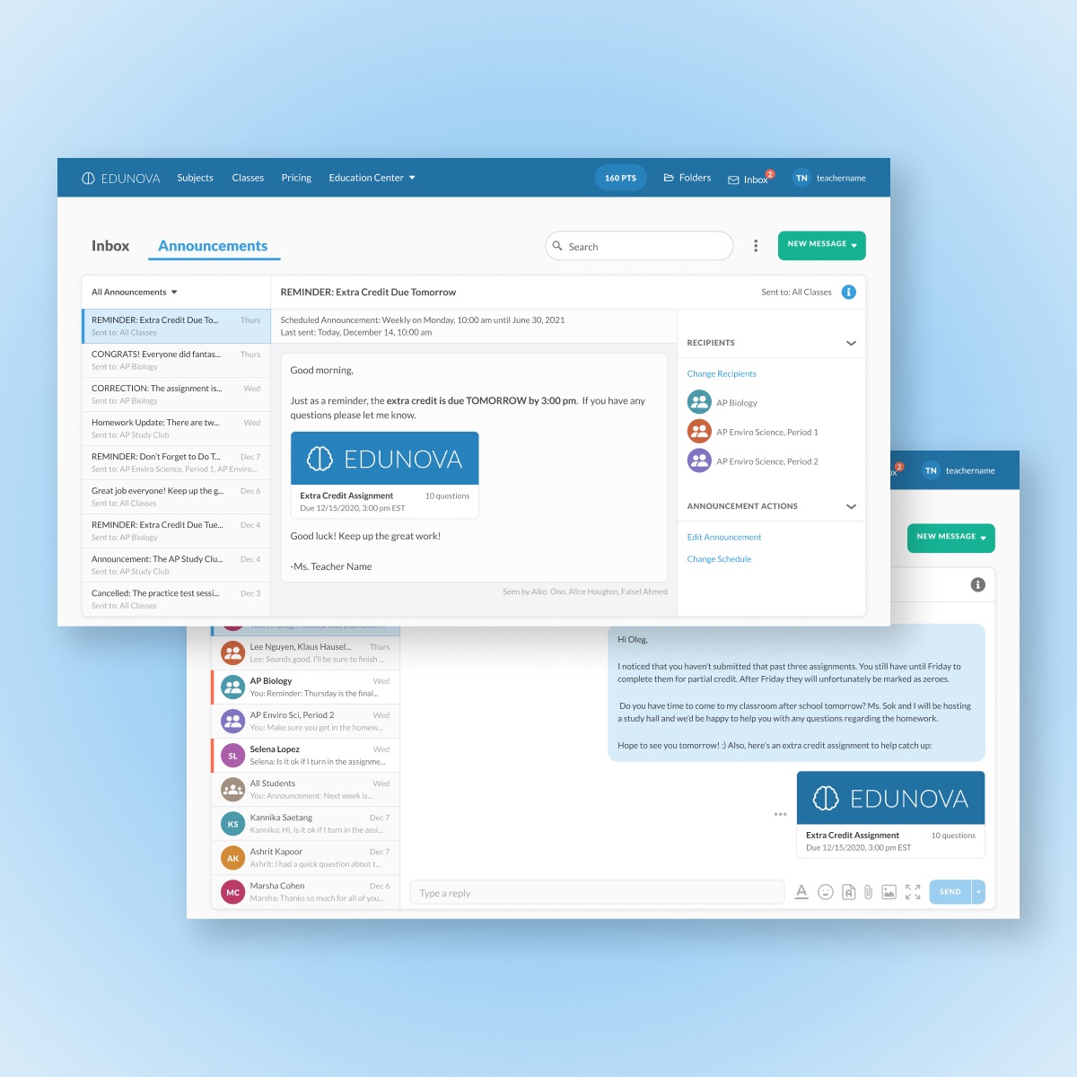
Edtech MessagingUX/UI Design Case Study
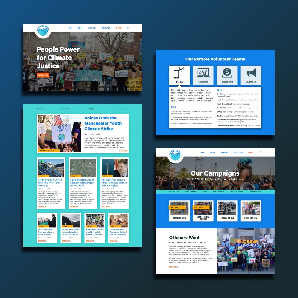
350NHUX/UI Design Case Study
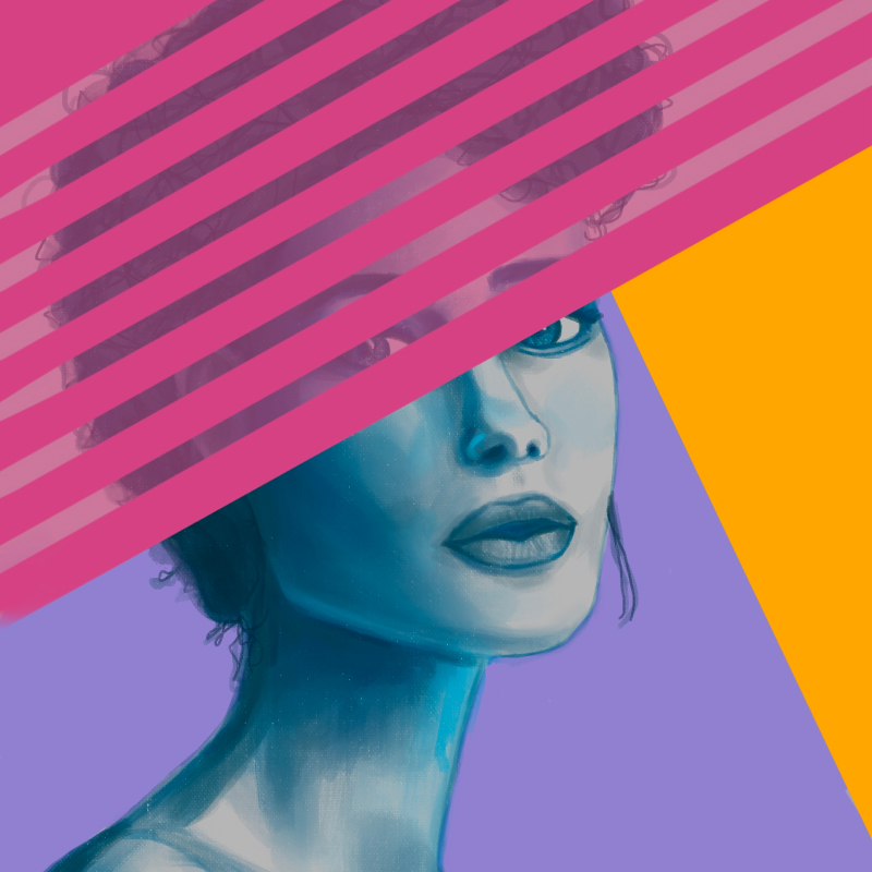
Personal ArtworkArtwork
Amazon Raise-Up BuildathonUX/UI Design Case Study
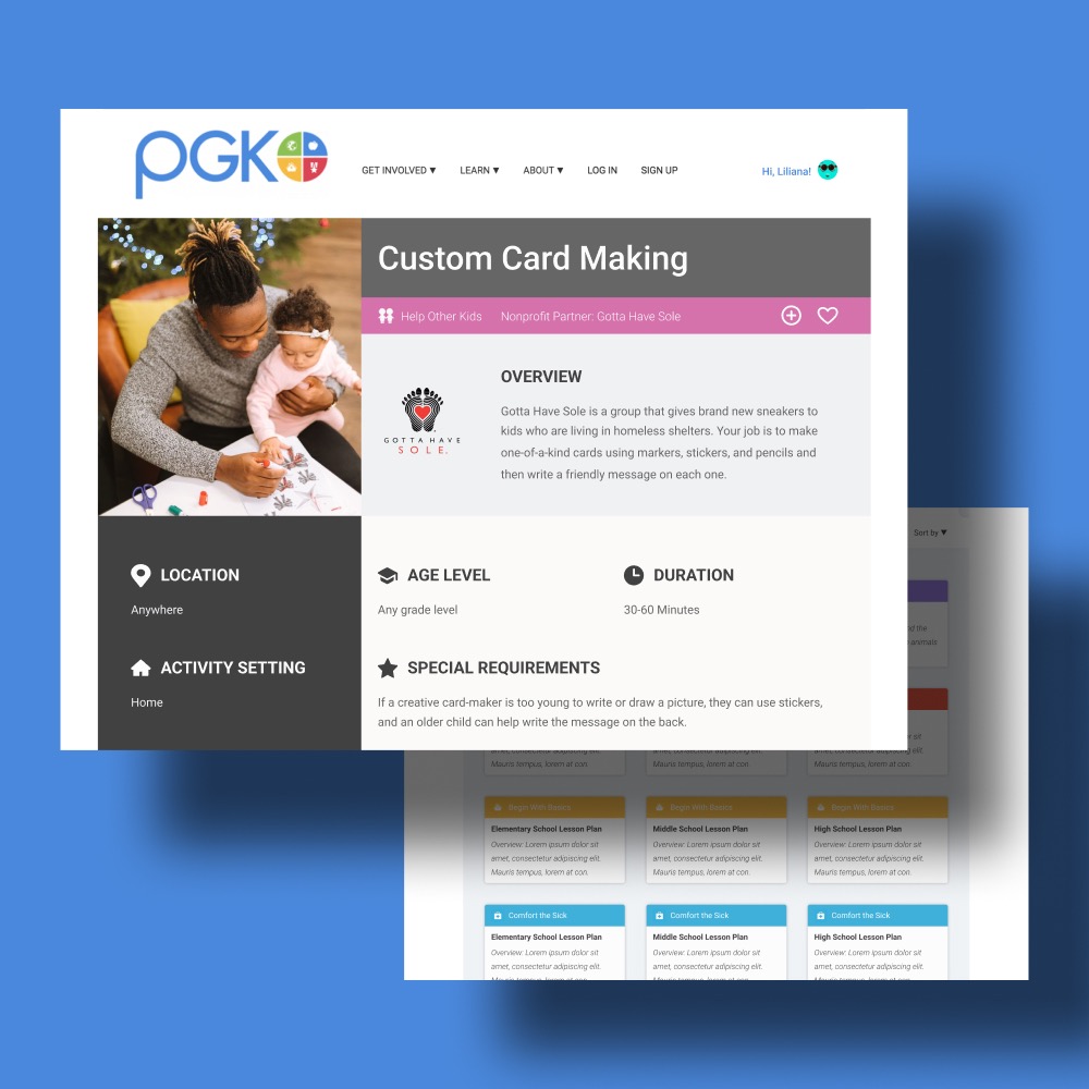
Project Giving KidsUX/UI Design Case Study
DeveloperWeek 2020 HackathonUX/UI Design Case Study
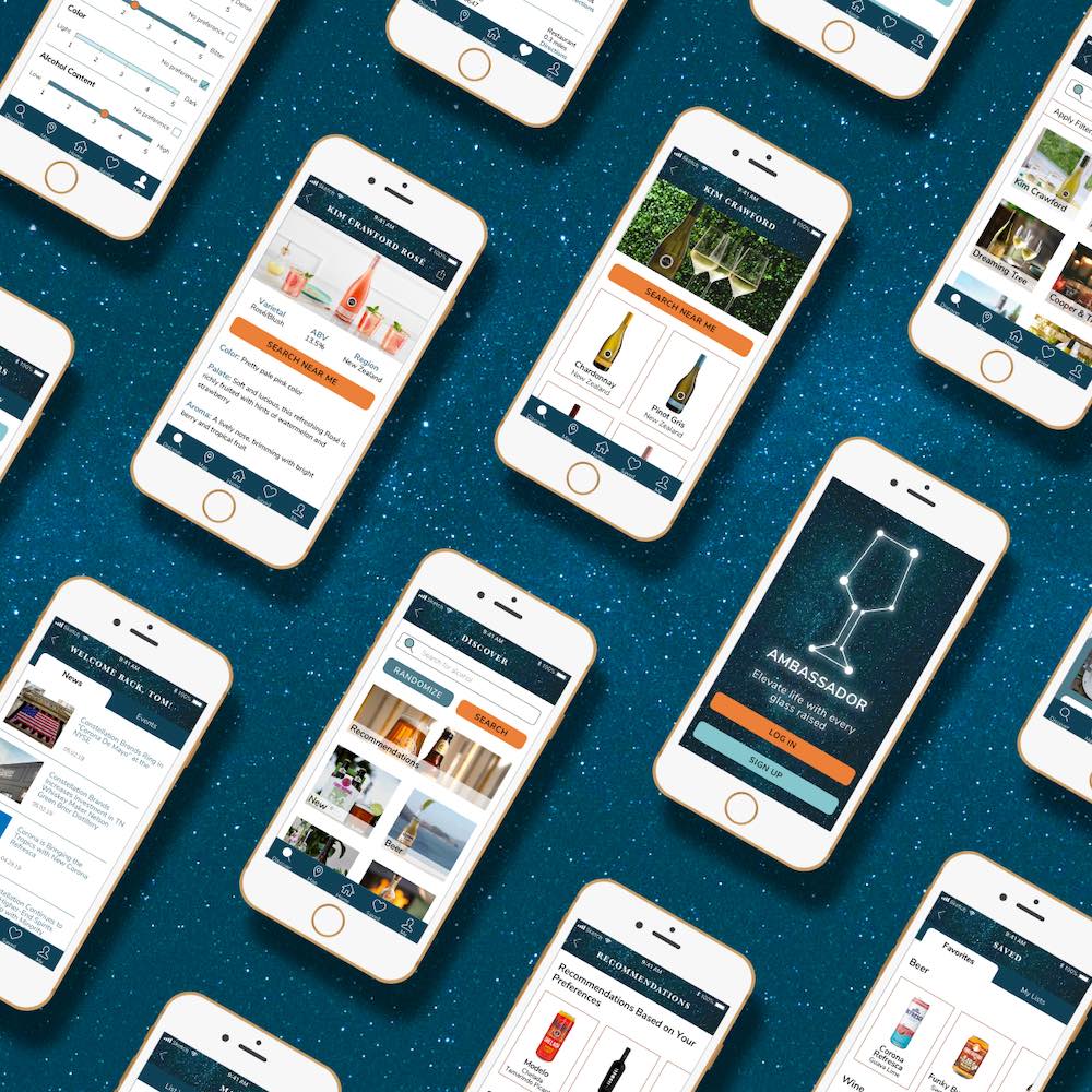
Constellation BrandsBranding & UI Design Case Study